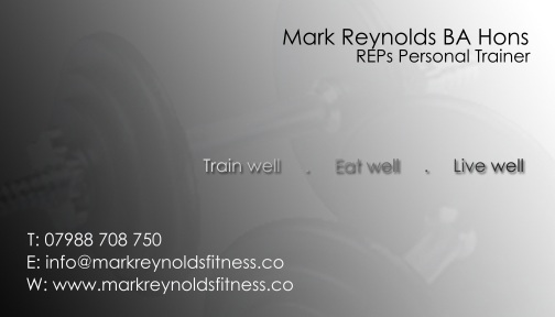
Mark Reynold's Fitness - The client needed a slick, classic looking business card for his personal training business that oozed sincerity and competency. The client also requested logo design, which is used on the client's website and uniform.
Mark Reynold's Fitness - The client needed a slick, classic looking business card for his personal training business that oozed sincerity and competency. The client also requested logo design, which is used on the client's website and uniform.
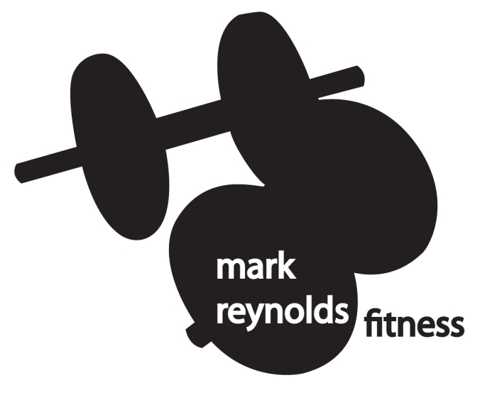
Mark Reynold's Fitness - This is the logo used for Mark Reynold's Fitness. It comes from the background image from the business card, to keep consistency through the brand.
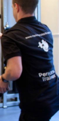
Mark Reynold's Fitness - The logo used on the client's uniform.
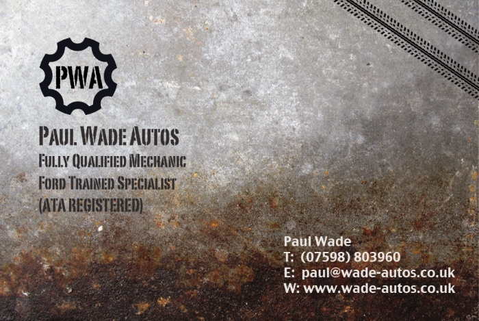
Paul Wade Autos - The client requested a rugged, masculine style business card for his mobile mechanic business. Involved in the process of card design was logo creation, at the client's request.
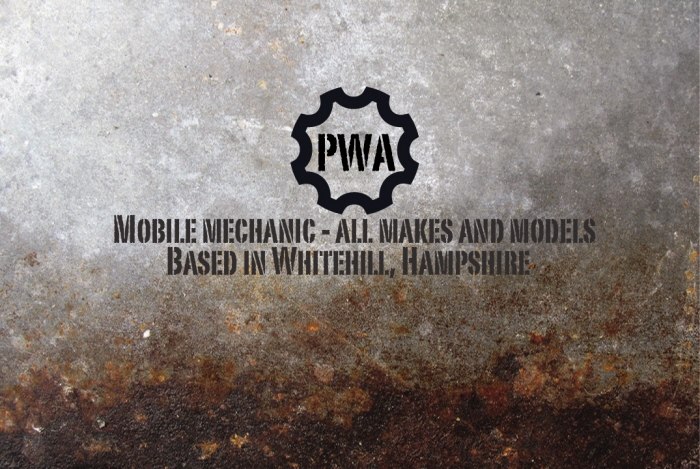
Paul Wade Autos - The client requested a rugged, masculine style business card for his mobile mechanic business. Involved in the process of card design was logo creation, at the client's request.
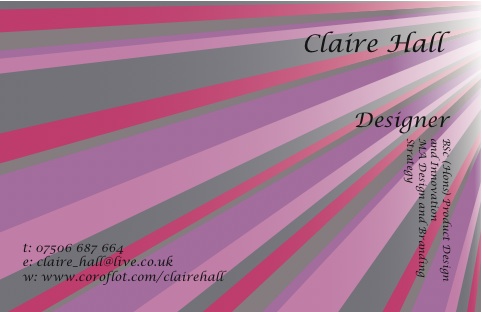
Claire Hall - Designer - I have worked on a number of projects in and outside of my MA in Design and Branding Strategy. Being a budding designer eager to break into the design world, I decided it was high time to create my own business card, since I am now working on live briefs for clients. One of the many ways to promote myself and my skills, my business card will change with time to reflect my growth in design.
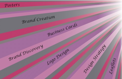
Claire Hall - Designer - I have worked on a number of projects in and outside of my MA in Design and Branding Strategy. Being a budding designer eager to break into the design world, I decided it was high time to create my own business card, since I am now working on live briefs for clients. One of the many ways to promote myself and my skills, my business card will change with time to reflect my growth in design.
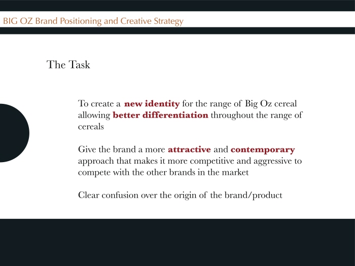
Big Oz - Big Oz are a cereal company based in West London. They need to redesign their packaging for an existing range, in order to better differentiate between each type of cereal. Working in a small group we have so far provided a creative strategy for Big Oz, which has been approved, meaning new packaging design is now underway.
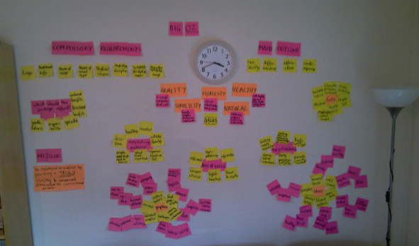
Big Oz - Covering my lounge wall with post-its is always productive! I use affinity diagrams like this one quite a lot to organise my research and create an 'at a glance' display of information. This particular one has helped with the design on the Big Oz new packaging design.
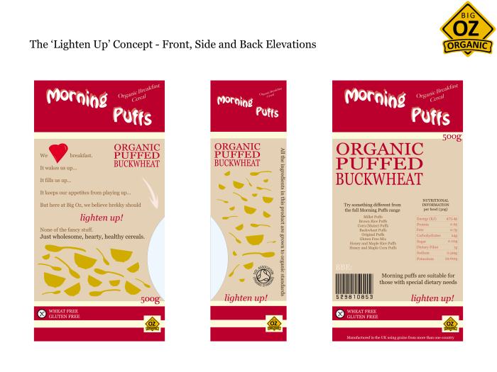
Big Oz Packaging Redesign - 'Lighten Up' Concept - Big Oz needed the packaging for their cereal products redesigned because the original design was uninspiring and did not stand out on the shelves. They needed to reflect their healthy attitude through their new packaging. This design was my 'Lighten Up' concept entry. My colleague's entry was taken forward, and my copy was taken forward. (Copy taken forward is different to copy on this design)
View PDF
View PDF
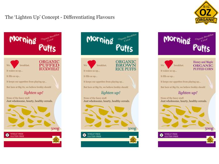

JT Personal Training - The client was specific about trying to incorporate his initials in the logo. You can see JT creates a person here, in a not so unfamiliar image associated with health and fitness. The client did not want to be too outrageous, however did want to appear fresh, transparent and altruistic. The colours reflect this, as does the organic shape.
View PDF
View PDF
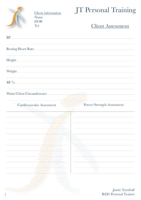
JT Personal Training - JT Personal Training's business stationery will take this form for the start-up of the business. The client wanted the logo watermarked, and manipulated to look like a scribble to indicate that this stationery is for both himself and his clients to write or draw on.
View PDF
View PDF
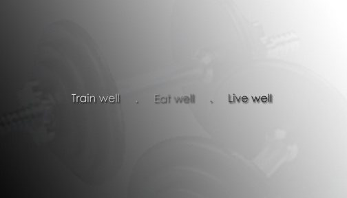
Mark Reynold's Fitness - redesign - The client - mentioned before in this portfolio - wanted a redesign for 2012. This is the result, the client is very pleased.
Mark Reynold's Fitness - redesign - The client - mentioned before in this portfolio - wanted a redesign for 2012. This is the result, the client is very pleased.
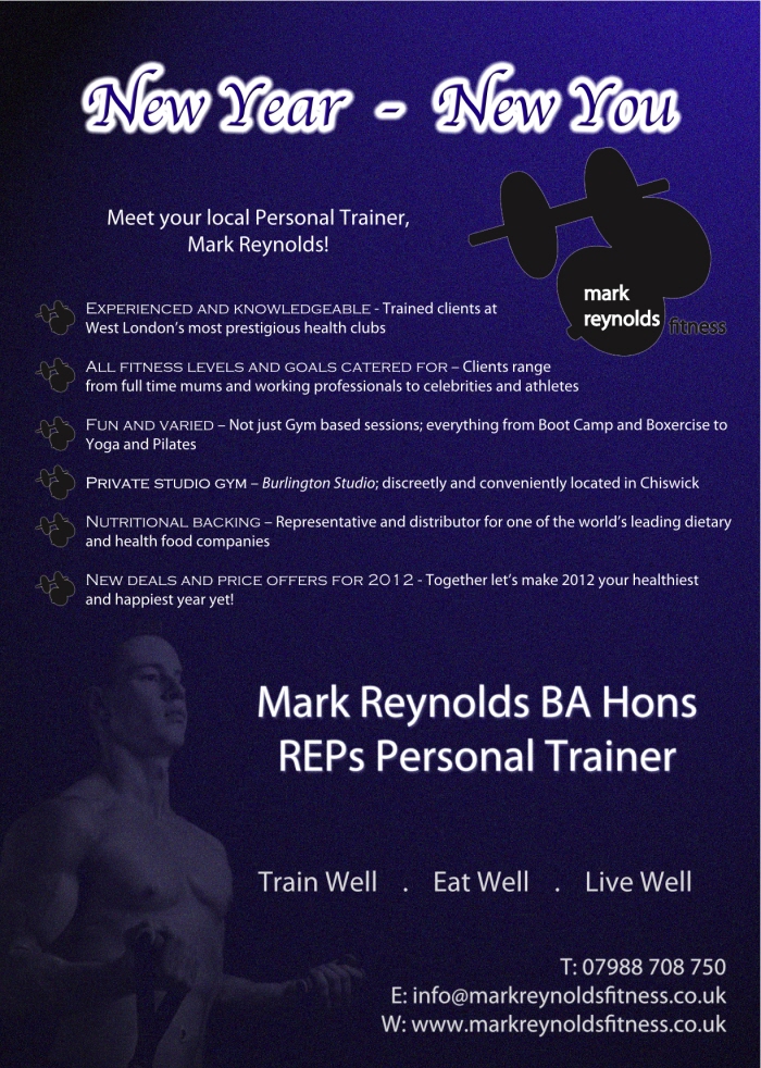
Mark Reynold's Fitness - redesign - Along with the business card redesign, the client wanted a poster to promote his facilities and offers for the new year, and this poster was created for that purpose.
gLike
Freelance