
Concept 1: Contemporary. This is the cover image from the first concept which uses angular blocks of colour and contrasting illustrations to infer a feeling of modernity and precision engineering.
The colours were also deliberately chosen to reflect these ideals, as well as to compliment the existing logo.

Concept 1: Contemporary. This is the double-page spread image from the first concept which uses angular blocks of colour and contrasting illustrations to infer a feeling of modernity and precision engineering.
The colours were also deliberately chosen to reflect these ideals, as well as to compliment the existing logo.
The contemporary ideal is further reinforced by allowing the images and layout pattern to flow across the two pages.

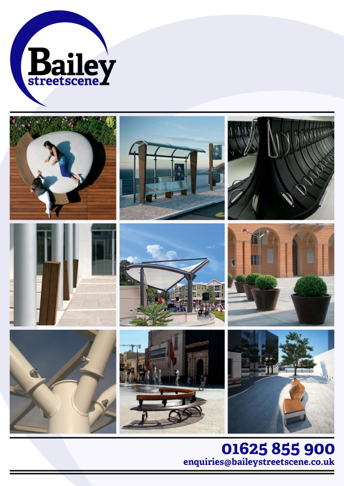
Concept 2: Minimalistic. The second concept makes blatant use of geometric shapes and minimal colouring which provides the design with a modern, uncluttered feel. This is very much in line with Baileys desired customer perception and also reflects their product range.

Concept 2: Minimalistic. The second concept makes blatant use of geometric shapes and minimal colouring which provides the design with a modern, uncluttered feel. This is very much in line with Baileys desired customer perception and also reflects their product range.
The double-page spread uses the rectangular images as borders for the text. This helps the page feel connected and effectively laid out.
Concept 3: Website-esque. The third concept is deliberately similar to the existing Bailey website in order to create a sense of consistency throughout their communications.

Concept 3: Website-esque. The third concept is deliberately similar to the existing Bailey website in order to create a sense of consistency throughout their communications.

gLike
Bailey Streetscene Brochure Design
Initial brochure designs created for Cheshire-based street furniture company Bailey Streetscene.
The brief involved creating three separately styled concepts, displayed in a cover image as well as a typical double page spread.