


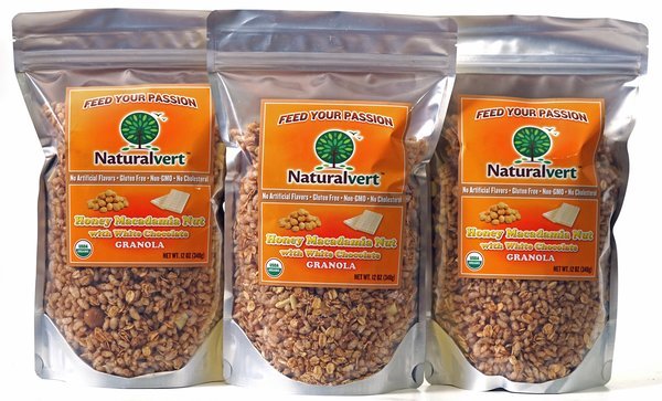
Before: Each flavor had an orange label like this, so it was hard to distinguish between them. I improved the look and feel as well as making each flavor distinct from the others.
gLike
Naturalvert granola packaging
The client came to me with a logo and simple labels for his light, crunchy granola. He wanted to keep the logo, but wanted bags designed, to take the product the the next level. He had trained as a chef, and his philosophy is that healthy, good quality foods fuel people so they can achieve their dreams. With that in mind, I designed bags that show a burst of energy emanating from the product name. I incorporated a window because the client wanted people to be able to see the product. I drew the flavor cues on the fly in the computer, to stay within budget. The client is very pleased with the outcome.
View WebsiteAvailable
Freelance, Full-time, Moonlighting
Diane Benjamin
Freelance Graphic Designer / Packaging Designer
New York, NY