
Here's one of three labels for a line of flower and plant food products. I thought the owners idea for a name was great. After a few typical looking labels that you might see for a product like this at Home Depot I felt it might be fun to go with the whole 50's Atomic Age vibe. With a name like Nuclear Bloom how could you not, right? The client loved it!
This is for flowers!

This is the second of the Nuclear labels. This one's for shrubbery!

Here's the third of the three labels. This one's for epic fruit and flowering!
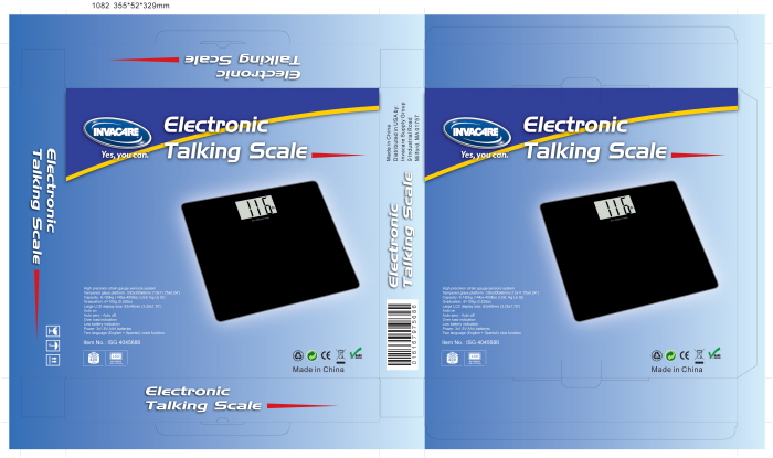
Design work for a "Talking Scale". Marketing needed something very simple but retail looking.
gLike
Package Design
Package design is like doing CD covers. I can never do too many of these projects. It feels great when you see the finished product and it really looks sharp.