
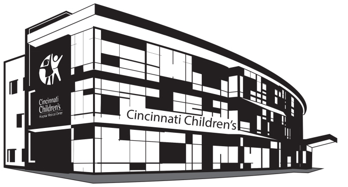
Building
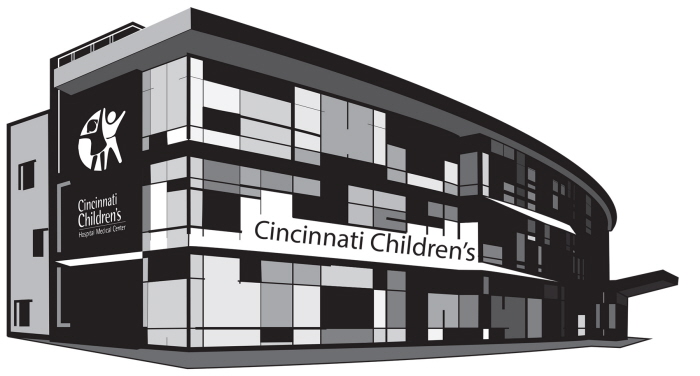
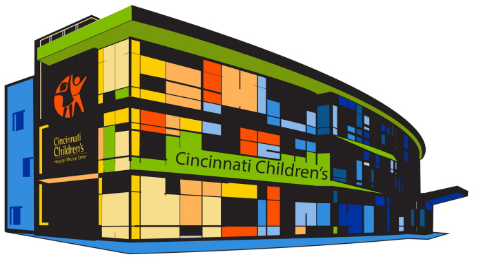
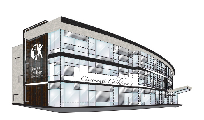
This piece is of the CCH in my eyes. There is a set of 5 different designs of the building. The colors of the building are actually colors from the CCH brand. I wanted the building to seem warm and welcoming because a hospital usually isn’t a place a child would like to be. I created this piece with Illustrator.
2nd Building
3rd Building
4th Building
5th Building
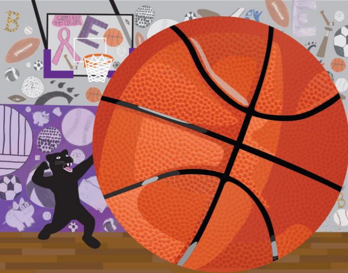
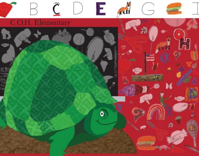
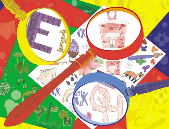
Cincinnati Children’s Posters
The posters were to be designed as a series of three, incorporating design elements that visually represent the Cincinnati’s west side. After researching the history of Cincinnati’s west side and participating in a project charrette, I created three icons to be employed as a dominant element within the poster composition. Secondary and tertiary elements were to be “hidden” in a way that young people and their parents could have fun seeking them while recognizing a connection to the west side of town. The secondary level elements were developed from found or original photography, and images created by local high schools, middle schools, elementary schools, and community art making events hosted by ArtWorks. My goal was to consider representations of the background elements, utilizing a micro to macro perspective, and to strive for environments that go from concrete to abstract. The entire project was created through Illustrator and Photoshop.
View PDF
View PDF
Poster 2
View PDF
View PDF
Poster 3
View PDF
View PDF
gLike
Cincinnati Children's Hospital Work