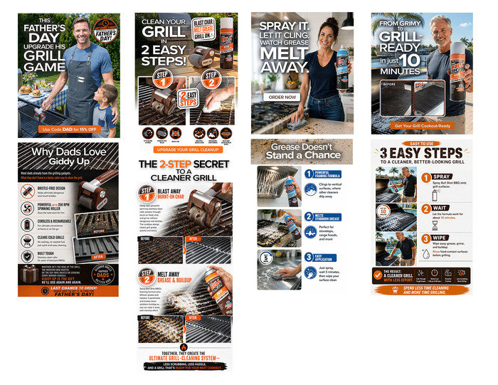
This series shows recent email designs created for the same product family, with a focus on strong headlines, clear selling points, consistent branding, and quick-read layouts built for digital campaigns. I used AI-assisted workflows to help enhance imagery, create related campaign assets, and keep the look consistent across multiple emails while still applying hands-on art direction, product accuracy checks, and final design polish.
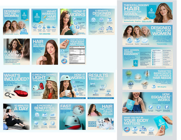
This launch project started with limited supporting assets, so much of the visual story had to be developed from the ground up. I used AI-assisted workflows to help build lifestyle imagery, supporting visuals, and campaign consistency while keeping the design focused on clear product benefits, customer need, readable hierarchy, and accurate brand presentation. The final system included Amazon listing images, A+ content, and digital assets that made the product easier to understand and stronger for launch.
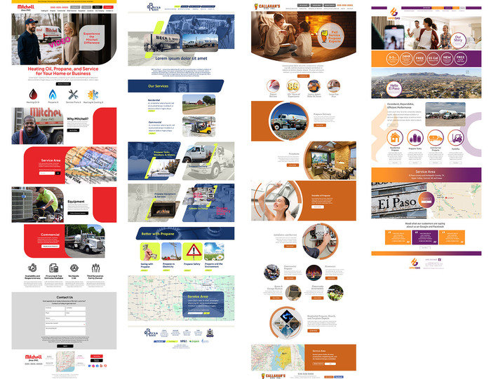
These are homepage design concepts created for Warm Thoughts clients, with each layout built to give the brand a more modern and memorable digital presence while still being practical for responsive development. The designs focus on clear service messaging, strong calls to action, trust-building sections, service-area details, and an organized page flow that makes the site easy for customers to understand. These concepts were well received and accepted for their creative direction, while also being structured for clean developer handoff and responsive implementation.
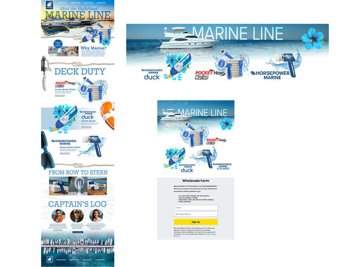
This landing page and email concept show how I approach product storytelling beyond a single item. I bundled several related products into a lifestyle-driven “Marine Line” campaign, using visual theme development, product grouping, clear messaging, and a flow to create a more complete digital experience. The project demonstrates campaign thinking, brand-building, hierarchy, and conversion-focused layout across landing page and email touchpoints.
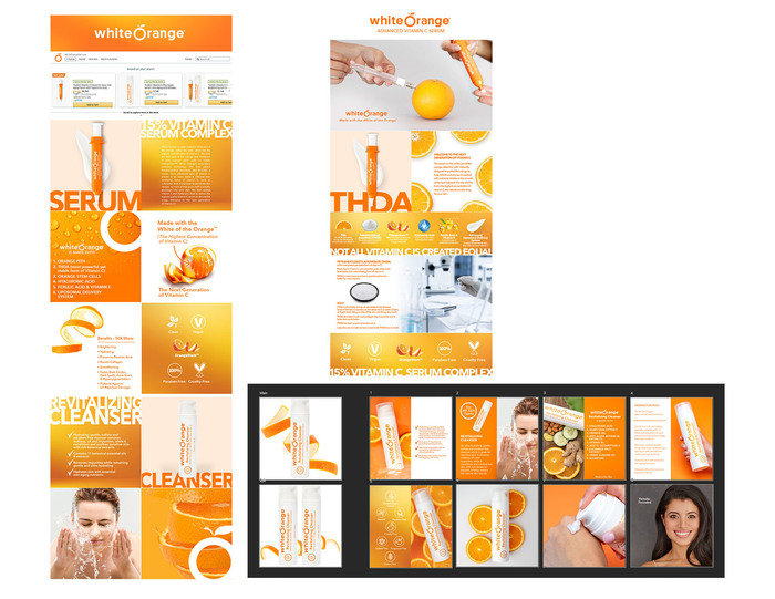
This project shows my ability to build a distinctive digital brand system and carry it across multiple channels. For this beauty line, I pushed beyond traditional soft beauty imagery and developed a bold, high-energy visual direction using bright color, oversized typography, clean product storytelling, and strong benefit hierarchy. The system was applied across marketplace assets, landing pages, emails, and event graphics, creating a consistent brand experience that felt modern, memorable, and easy for customers to understand.
gLike
DZ Portfolio Samples 26