
Dysyght Logo. The blue circles represent the "Y" in Dysyght. The "Dy" in the company name came from "di" meaning a prefix occurring in loanwords from Greek, where it meant “two,” “twice,” “double” (diphthong). While the "syght" comes from "sight" or "vision" meaning to perceive with eyes. Therefore the company name means to see in two sights i.e. hot and cold, left and right, up and down, and zeros and ones. That is also why blue and orange were chosen for the colors in representation of hot and cold.

A quarterly statement e-mailer sent out to all company employees.
View PDF
View PDF

A quarterly statement e-mailer sent out to all company employees.
View PDF
View PDF
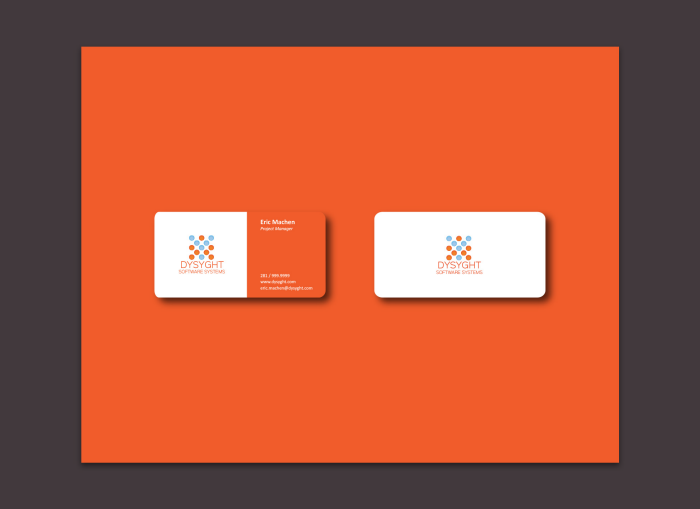
Business card - Orange
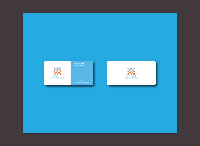
Business card - Blue
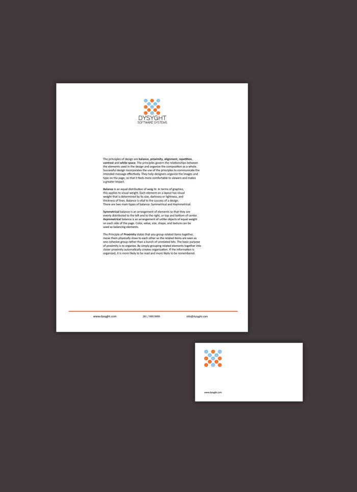
Letterhead and Envelope
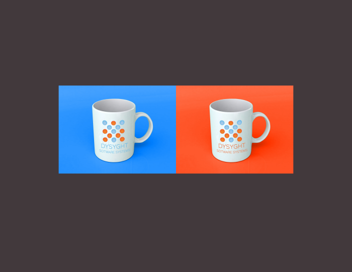
Coffee cup mock-up

Small business flyer.
View PDF
View PDF

Small business flyer.
View PDF
View PDF
gLike
DYSYGHT - Software Systems Company
A brand identity for a software company.