Final logo presentation including font and color options
Finalized logo options - You can see that the final logo choice was tweaked significantly from the prelim - In this situation, the professor had the final say on these choices - I was partial to...well any of them except the actual once chosen, but I do believe I made it into something successful.
Part of the process was to create 100 logo variations
Direct Marketing campaign piece - I wanted to go bizarre with this, make it something that would stand out in the junk mail AND be something that people would be inclined to keep up on their fridge - also totally got to work in the adorable walking cups from my logo trials.
Various transport methods for delivery and marketing needs all skinned to represent the brand.
Various in-store products that continue to have the bright, unique and slightly goofy edge as the rest of the brand.
Employee apparel options (for both men and women) that keep the location low key and accessible.
Continued merchandising
And pretty much every other visual that was created for the project including: letterhead, mailers, gift cards, napkin, sandwich board and business card.
gLike
Gallery Espresso

Gallery Espresso is a real coffee joint in Savannah, Georgia. This branding campaign is not. This was a student project meant to involve us in almost every aspect of branding a company to hit the market. We did market and product research and were tasked with creating a standards book that covered all materials involved with our new brand from ideology and mood, logos and fonts to apparel and marketing materials.

While I'm familiar with this idea as a consumer, this was a new concept for me as an artist and designer. I tried to remain consistent, unique and true to the concept I developed for the brand strategy.

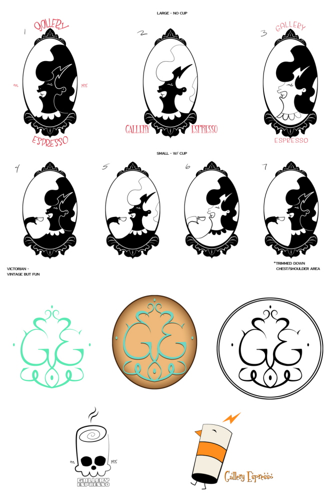
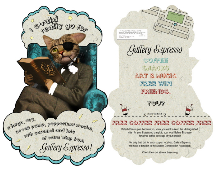
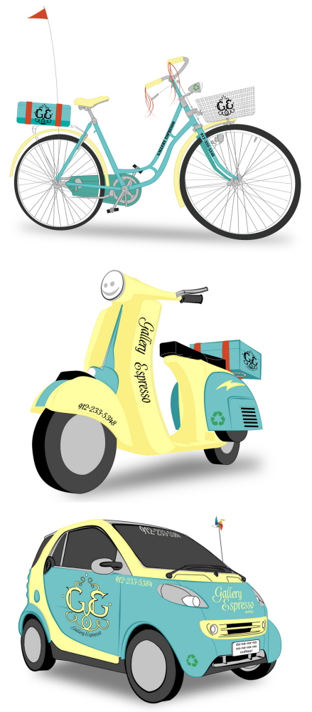
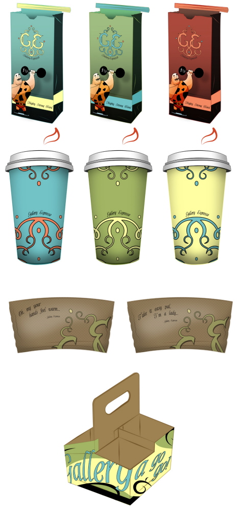
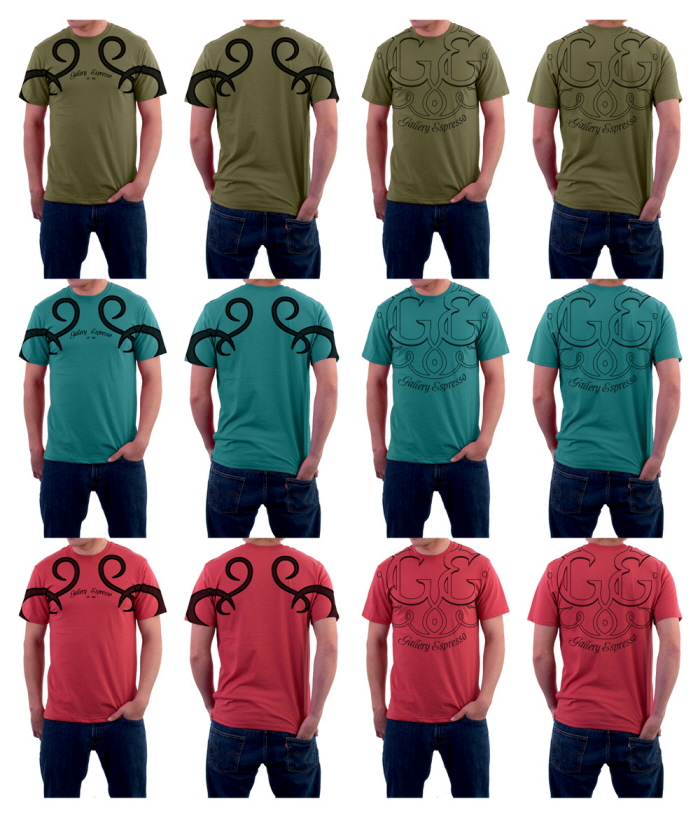
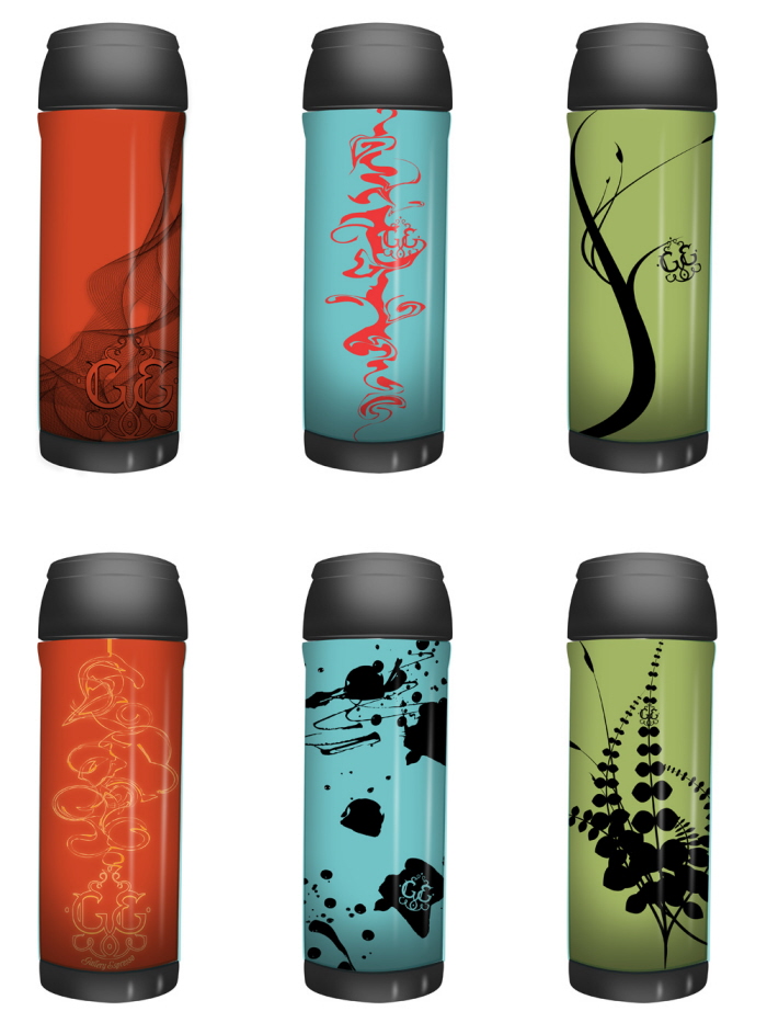
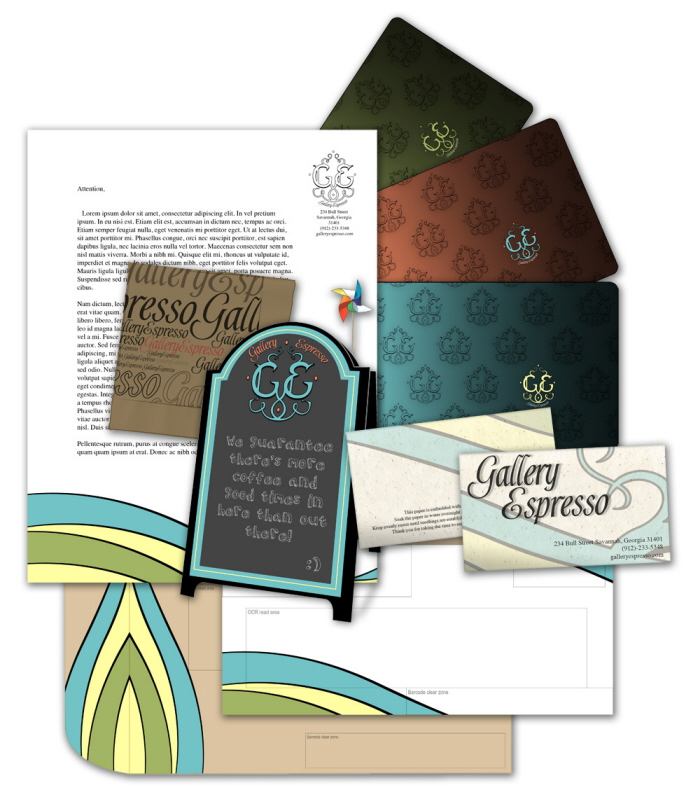
What follows is a sampling of the visual materials created for the project.

Pencils, Adobe Photoshop/Illustrator CS5

Eric Warren
Illustrator at Floyd County Productions Atlanta, GA