
The Wine Route Online Logo Design Competition 2009 - To incorporate elements of fun and professionalism, and stand out for being “classy†without being too serious, colours are included to enhance the beauty of the logo to replace the use of dull red colour for the red wine in the logo design (which most wine companies do). It allows the company to stand out from the rest with a logo that is more special than any other companies’.
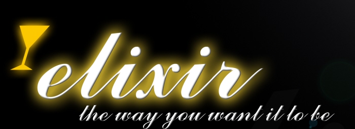
Elixir Martini Lamp Logo Design
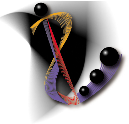
Course Logo Design (Product Design & Innovation - PDI) - The curvy structure is a combination of the letters ‘P’, ‘D’ and ‘I’ and has strong connections with the things we have learnt in this course. It is made of many different lines with different colours which thus emphasizes on the essential elements of design. The black and white at the back is used for background as contrast so as to give more emphasis to the logo. The way how the lines, colours, and shape fitted nicely to each other brings out the unity and harmony as a whole logo.
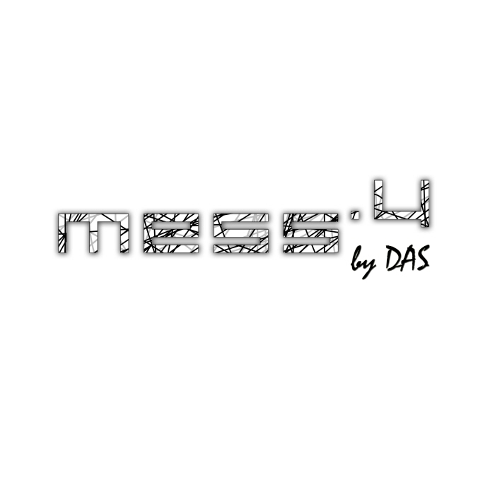
DAS Youth Logo - We were trying to find a suitable name for Designers Association Singapore (DAS) Youths. Someone mentioned that we should be extraordinary and be unconventional. That's when someone came out "Messy" this name for the group and I came out with the logo, with emphasis on the letter Y, symbolizing youths.
gLike
Logo Designs