
At first I wanted to do a logo for my step-dad's message therapy clinic. As the clinic's name is "Valmuen Massage", and 'valmue' means poppy in danish, I wanted to draw a poppy and somehow connect it to the words. However, I quickly abandoned the project.

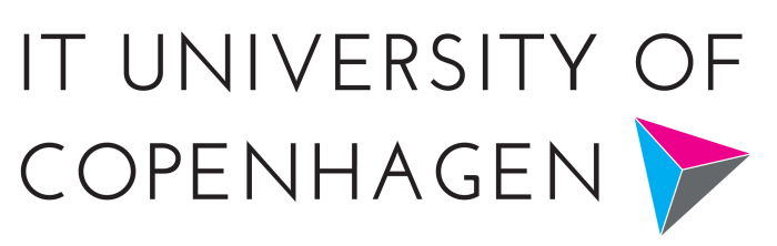
Instead I decided on making a new logo for my home university. Personally, I really dislike ITU's current logo, which is nicknamed "the flying turkey" by students.
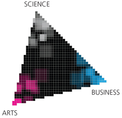
Everything at ITU is based around the "ITU Triangle" - our programs, the research, etc. Because the triangle is such a big part of ITU, I wanted to base my new logo around that.
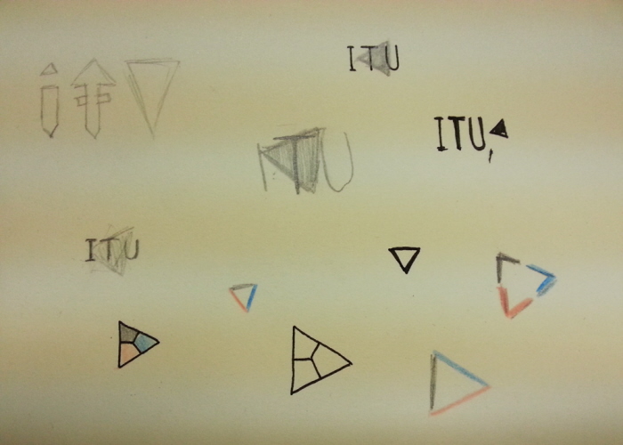
I started sketching some different ideas. Originally I wanted to write "ITU" in a triangular-ish font, but I decided on making a graphic logo instead.
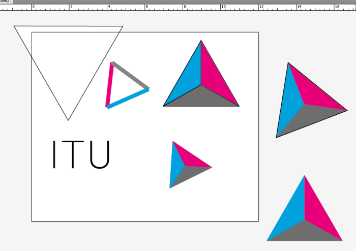
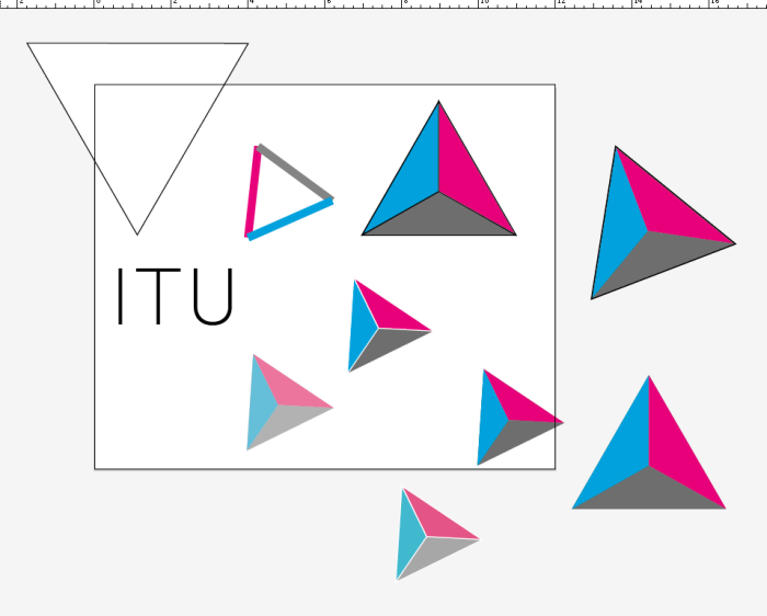
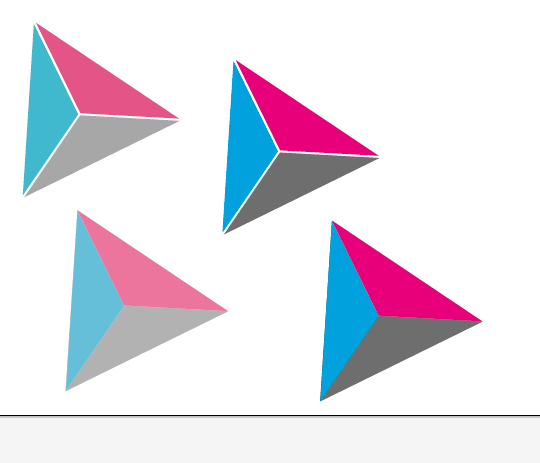
I experimented a lot with the colors in the triangle.
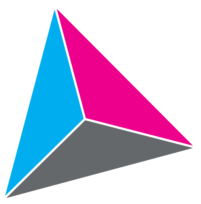
At the end, I decided on pure Cyan and Magenta, to make the logo look eye-catching and modern.
gLike
Logo Project