


Tony Moon is a driven man. English by origin, he immigrated
to Canada in the 70’s, Jaguar apprenticeship in hand, to pursue
his passion for the automobile - preferably British, if you please.
His garage, The Mechanics, is atypically not so much a dealership
that sells used cars but more a place where English automotive
history is proudly perpetuated.
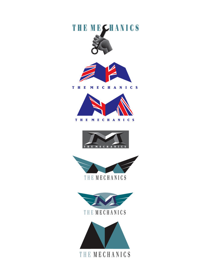
The Mechanics’ new logo is comprised of the identical graphic
elements of the previous variant (name, flag & car) but newly
modified and proportioned to present a more modern visual.
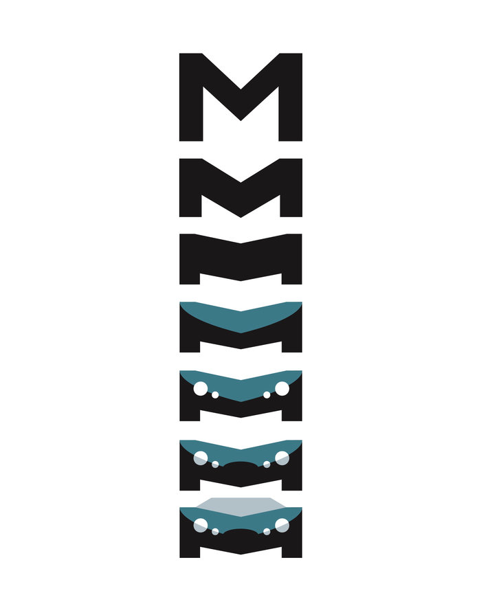
My first inclination was to create an automotive-oriented car
badge but the gradual morphing of the capital M into a more
recent Jaguar sportscar turned out to be irresistable and a far
faster piece of identification and communication.
As part of the assignment, I was also commissioned with the
design of the dealership showroom.
