
DKRRA revamped logo - Client wanted a new, fresh logo to go with the revamped downtown. The logo represents the 2 groups working together, and also mimics the architecture of downtown.
View PDF
View PDF
AIP LOGO AND WEBSITE OPENING - new brand and website concept for AIP.
although the project focuses on "American Issues" its really a place for global converstaion. i wanted to use the speech bubble to represent voices, from every corner of the globe. using flash as the website opens to illustrate movement- symbolizing the ongoing conversation and evolution.
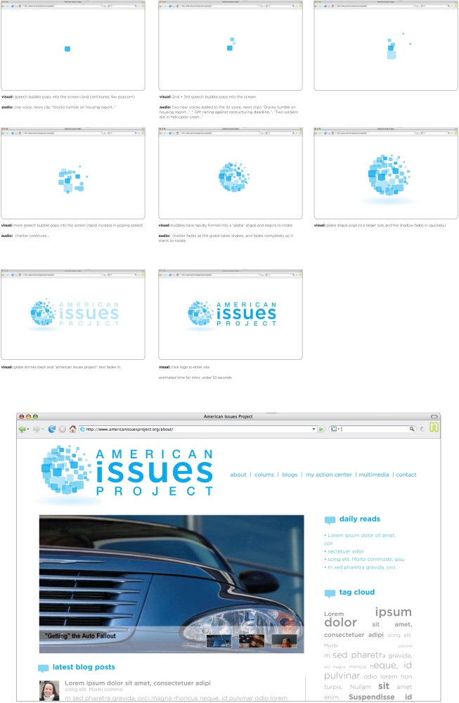
Iyzaq'x art logo - traveling in kenya i met alot of talented people. Isaac was an awesome wood carver and painter- really had a personal touch. wanted to make him a logo that would be professional, but keep that graffiti flare he likes so much!
footsteps in kibera programme logo - a friend of mine started this NGO to increase awareness of several amazing businesses growing out of the Kibera Slum. The program is gaining alot of attention and needed a professional polish.
sharelight solar project logo - a NGO in Kenya started to provide solar lamps to several slum families. this program is completely volunteer based, and requires a team to complete the NGO mission.
direct aida - a NGO running in Kenya that includes several projects to bring aid directly to kenya from all over the globe. the founder is also named "adia" so it was a play on words, as well as a personal touch to the program.
the naked bakers - bakery with an edgy name, but wanted a classy way to play with the idea of "naked bakers" without being over the top.
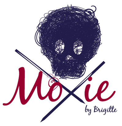
moxie - a dedicated knitter, trying her hand in the etsy crowd and wanting to stand out. not your average knitter sipping milk and munching on fresh baked cookies, brigitte wanted something edgy for her hard-core knitwear
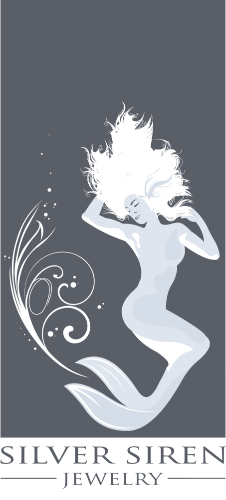
SILVER SIREN JEWELRY LOGO - New to the craft scene, this client wanted to stand above her fellow jewelry makers, and tell shoppers that her jewelry was elegant. (side note: she later used my illustration for a tattoo)
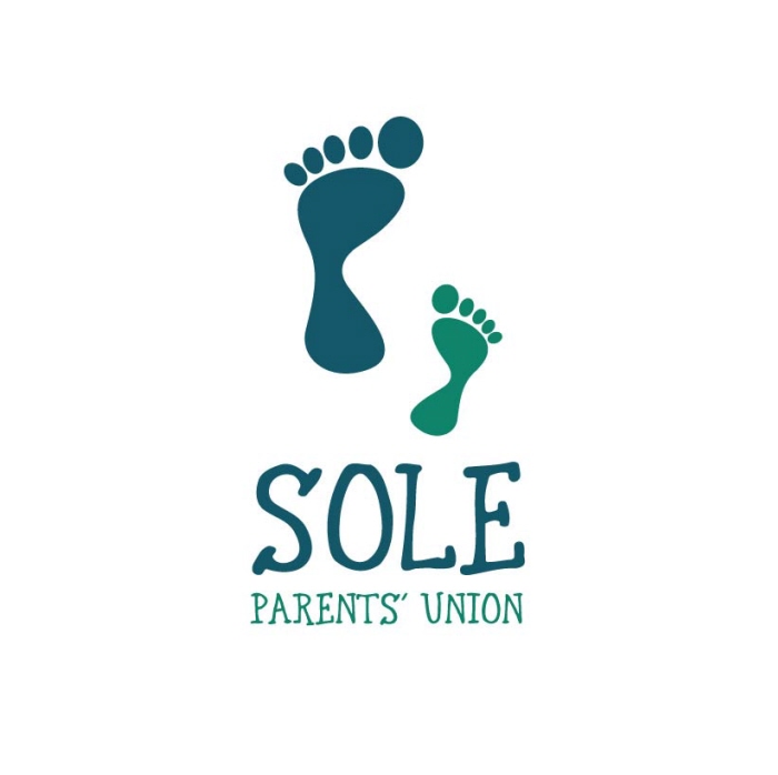
concept logo - This concept was runner up in a logo contest for SOLE PARENTS' UNION. I wanted to play on the idea of single parents, and the soles of your feet, creating one icon, representing 2 people.
concept logos - With all my clients i like to give a range of options throughout the process. the "original" design was the choosen concept, but they wanted to explore a more edgy option as well. although they did not choose the 2 other options, they are 2 of my favorites.
concept logo - logo concept for a cafe in CA on atlantic blvd. wanted to create a nautical theme, without being too literal, using the spoon as an oar, and a wave shaped knockout at the bottom to create the illustion of water.
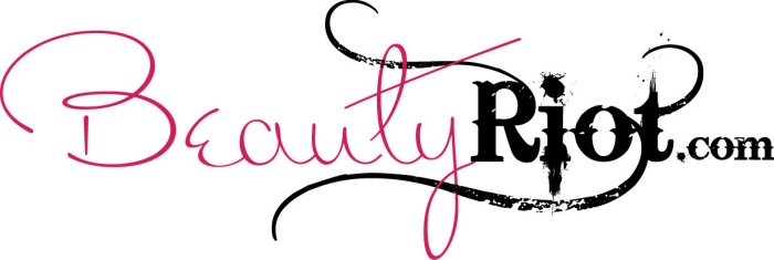
concept logo - this concept was created for an alternative beauty website, offering unique ways to be beautiful. wanted to create a grunge logo that was still beautiful.


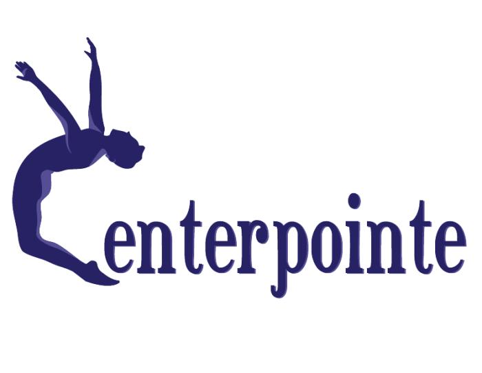
centerpointe logo - the dance center wanted to revamp their logo by using a photograph of the clients father in a backbend in pointe shoes. it was a challenge to keep the integrity of the photo, and create a strong illustrated perspective
View PDF
View PDF

waking web.com logo - logo design for a webdesigner i work with
readingresources.net - logo design.
the butterfly was a suggestive reflective "R", which worked nicely to display the hopeful feeling the site offers educators
dentist logo - client wanted the skyline to be the bristles of the toothbrush.
DiamondCore logo concept - DiamondCore specializes in marathon training and prep.
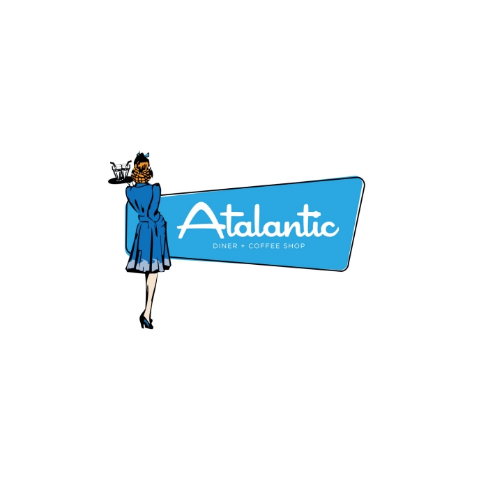
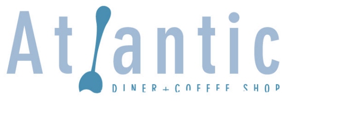
atalantic diner logo concept - Atalantic wanted something retro, and bright. Utilzed a drawing my grandmother did, as the waitress.
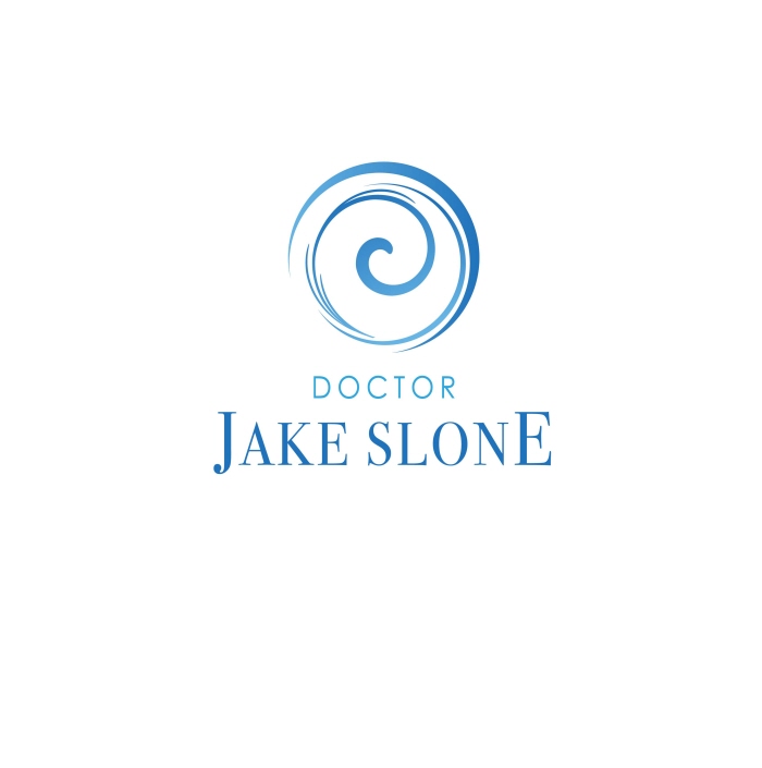
Dr. Slone logo concept - plastic surgeon, waited a modern, clean, calm, young looking logo to promote his new practice.
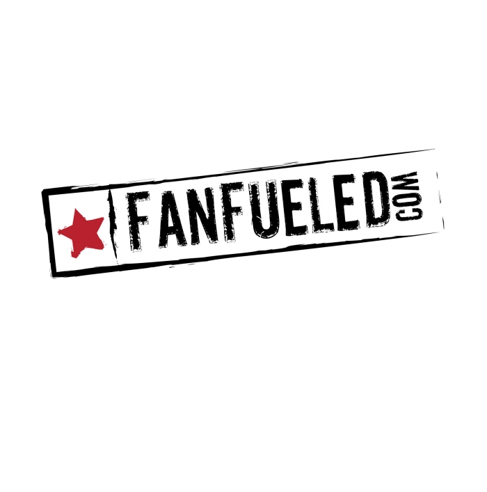
fanfueled.com logo concept #2 - an online ticket site. wanted this logo to look like a VIP hand stamp. destressed after a night of up-close action with your favorite stars.
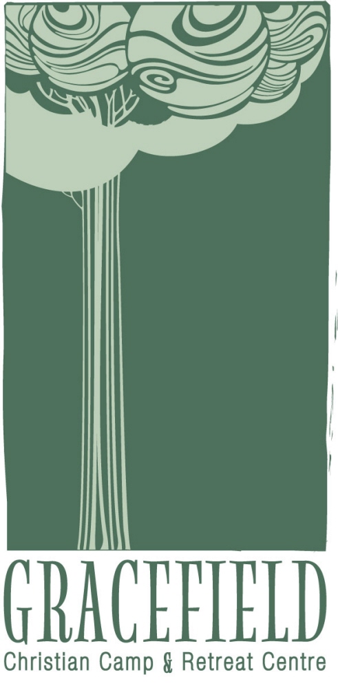
gracefield logo concept - gracefield known as a retreat for relaxing and self meditation. wanted something "homemade" looking to give it a more personal feeling. keeping it simple, to avoid clutter or distraction.
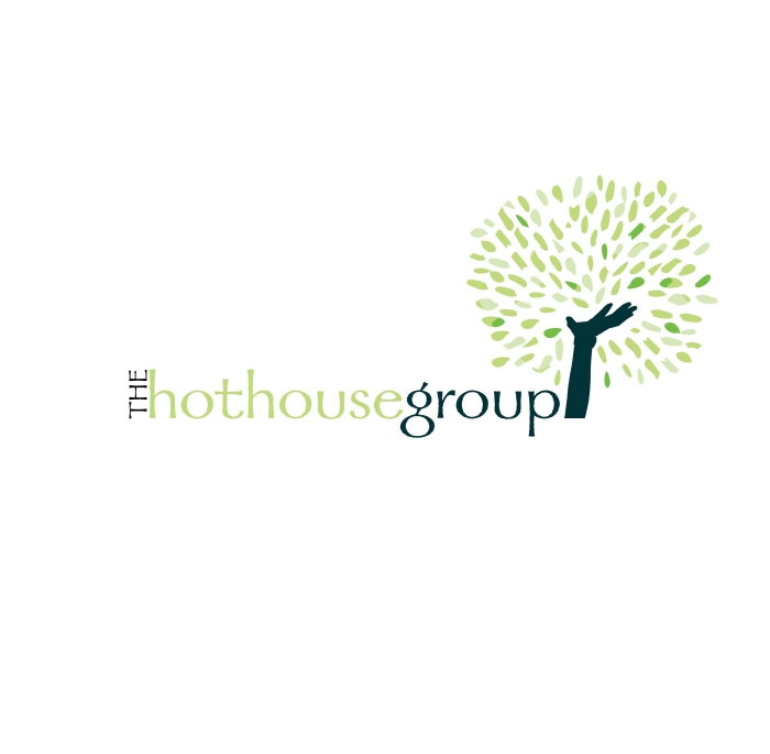
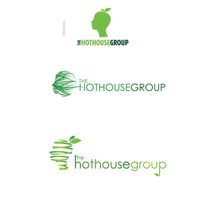
the hothouse group logo concept - one of MANY concepts for hothouse. this group specializes in corporate training and team building.
wanted to use the idea of the hand reaching out and accomplishing something exciting. also using the tree symbol to represent growth and strength.
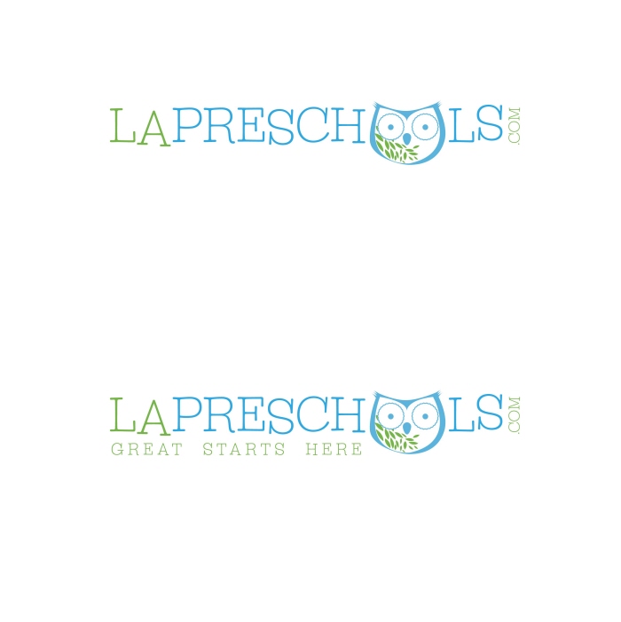
LA preschool logo concept - online preschool finder. wanted to create something fun, and playful without being too childish. wanted to give it smart colors, and design elements, with a touch of childlike imagination.
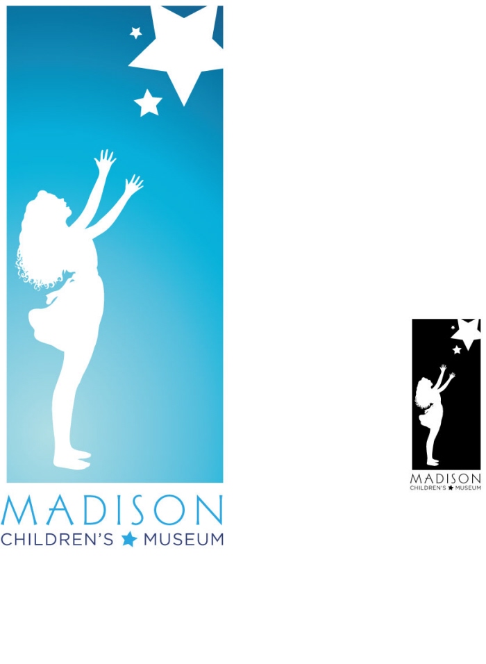
madison chilren's museum - concept for madison's children's museum. wanted to show a child interacting with science- learning in a hands on way without showing cliche handprints or primary colors. striving to create a magical scene.
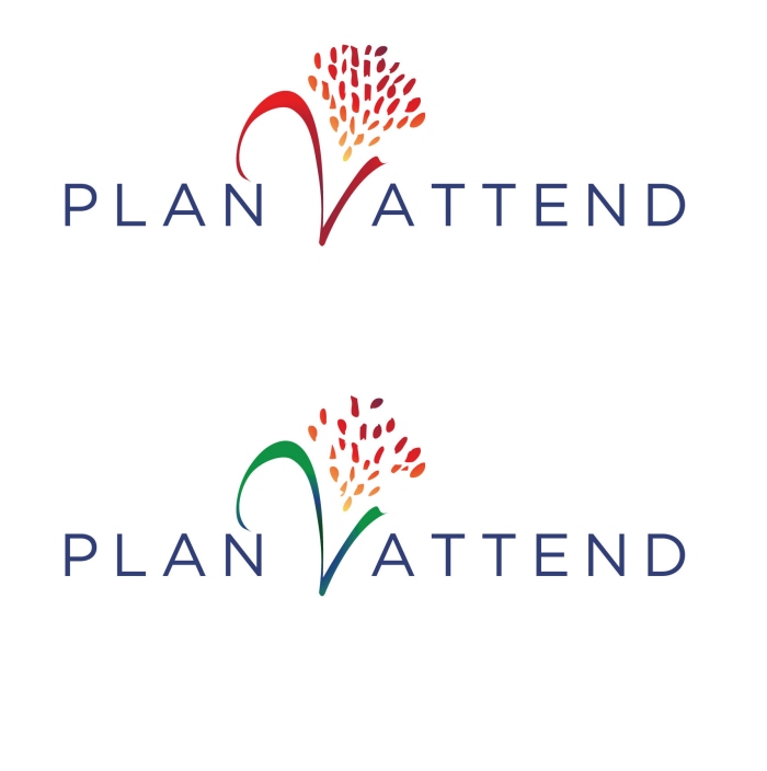
plan 2 attend #2 - event planning group. wanted to create a design element out of the #2 by creating a flower center piece like you would find at a fancy event. on second look its the "2" in the logo.


gLike
logos AND MORE LOGOS