
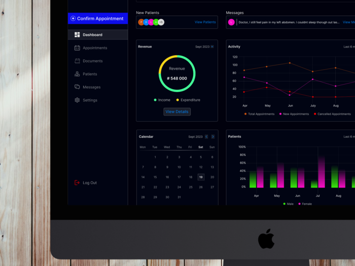
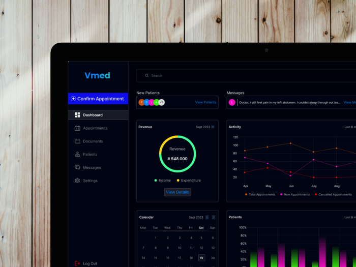
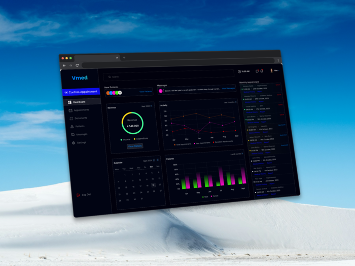
This section emphasizes the analytical and reporting features of the Vmed dashboard. Design Goal To provide administrators with the necessary tools to monitor clinic performance, identify bottlenecks, and plan resources effectively. Analytical Components Activity Trend Analysis: The Activity line graph tracks Total, New, and Cancelled Appointments over the last six months. This visualization is key for predicting peak times, managing staff scheduling, and understanding patient retention/cancellation rates. Patient Demographics: The Patients bar chart breaks down monthly patient visits by gender (Male/Female). This demographic insight is vital for marketing efforts, resource allocation (e.g., specialized services), and clinical planning. Calendar Integration: A fully integrated Calendar module, prominently displayed on the dashboard, allows users to check daily schedules without navigating away, tying long-term data directly to the immediate schedule.
This description highlights the efficiency gains delivered by the dashboard's layout and organization. Workflow Enhancements The Vmed Dashboard is designed as an administrative command center, structured to manage the flow of information from a high-level overview down to individual patient tasks: Priority Alerts: Urgent data is flagged with color and placement. The Messages panel shows a clear preview of the latest communication ("Doctor, I still feel pain in my left abdomen..."), prompting immediate action. Patient Segmentation: The New Patients panel uses colored avatars to quickly differentiate new users or segments, with a clear 'View Patients' CTA for deeper review. Immediate Action Button: The prominent 'Confirm Appointment' button is strategically placed to address the core transactional flow of the clinic, minimizing the steps required to onboard a new booking. The entire layout facilitates a rapid, left-to-right, top-to-bottom scan for operational checks.
gLike
Vmed – Clinic Management Dashboard

his project focused on designing the Vmed Dashboard, a comprehensive system aimed at enhancing the efficiency of clinic and hospital administration. The goal was to transform complex operational data—appointments, revenue, and patient activity—into an easy-to-digest, actionable interface for healthcare staff and administrators.Problem/ChallengeHealthcare professionals and administrative staff often face information overload and must manage high-stakes tasks quickly. The challenge was to create a dashboard that could surface critical, time-sensitive information (like messages or new patient status) while providing long-term analytical data (like monthly revenue and activity trends) without overwhelming the user.Key Features & Design Solutions
High-Impact Data Visualization
Intuitive Information Architecture
Dark Mode for Focus
Task-Oriented Components

Braimah Salami
Product Designer Kano, Nigeria