
The Logo
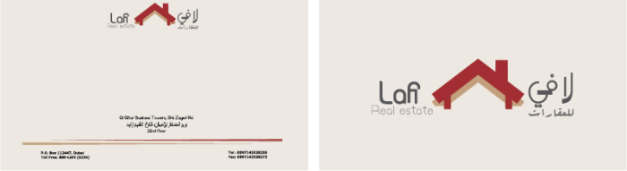
Business Card
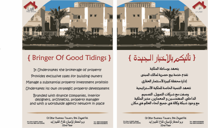
The Flyer

The LetterHead

StreetSign
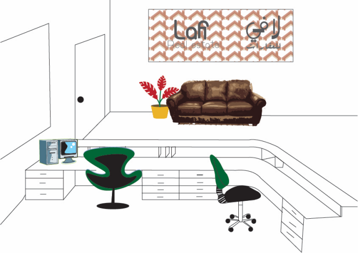
The Interior
gLike
Lafi Project
My project is to rebrand a business logo to make it more successful. I chose the Lafi Real estate Logo because of the light colors they use, even the two houses are not clear, the one have to zoom it to understand what the logo stands for. Also, the tree doesnot make any sense in here, because its not a resort its a real estate brand. In addition, the logo contains details this makes it hard for the clients to memorise it and this makes it unsuccessful logo. So, i started working on rebranding it by creating another form in simple way, I draw a roof of a house and used only two clear colors, then i insert in each side
the business name, the english on the left and the arabic on the right.