
Champan Financial Wealth Management : Logo - Created for a Wealth Management Agency called Chapman Financial.
This is the second concept pitched to them. Although the client chose another version, this remains my favorite.
Designed while at Visualink Creative

Owens & Minor Supplier Diversity Symposium Logo/Icon - This logo/icon was designed for Owens & Minor's Healthcare Supplier Diversity Symposium.
The design shows multi-colored arrows, which represent the minority and women owned businesses the symposium targets, moving toward a central location. As they do this, they form the shape of a star, representing the symposium's continual focus on excellence.

Africana Hymnal Compilation Study Logo
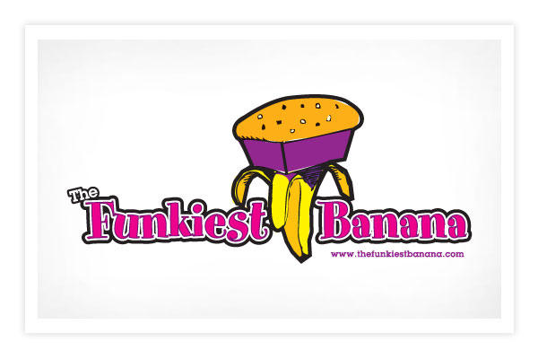
The Funkiest Banana : Logo - Created for a Banana Bread company in Toronto Canada that specializes in unique flavors and varieties.
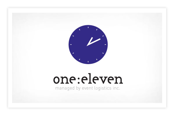
One Eleven : Venues and Event Spaces

SBC21 Logo - Logo for a United Methodist Program whose function is to provide predominantly Black churches with tools, advice, and resources they need to effectively serve African American communities in the 21st century.
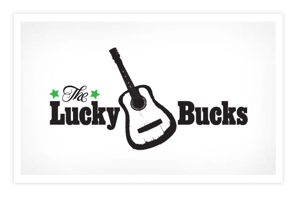
The Lucky Bucks : Logo - Logo design for country/rock group The Lucky Bucks".
Designed while at Visualink Creative

Construction Consulting Associates - Logo design for a Construction Consulting Firm based in Raleigh, North Carolina.

YOUTH2011

SBC21 Stationery - Stationery design for SBC21. Centered the layout around a 2-Color concept to keep printing costs low.
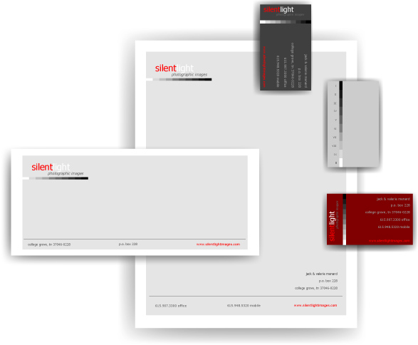
Silentlight Photographic Images : Identity Pkg - Created for Silentlight Photographic Images, the core criteria was to use an element from photography that wasn't cliche and incorporate Bahaus design principles. I decided upon the Gray Scale/Zone System. Probably unknown outside the school of photography, yet a vital part of their tool kit. Emphasis was placed on being minimalist, modern, and functional to evoke the Bauhaus ideology. The package consisted of three different cards, and on the back of each is a small Gray Scale/Zone System.

Earth Construction : Identity Pkg - Created for a Construction company, whose emphasis is site excavation. The yellow with black gradient stripes create a color scheme that people automatically associate with construction. A clean and minimal layout gives this Identity Package that touch of professionalism to appeal to the company's "hi-end" target market.

Echoview Fiiber Mill Stationery : Concept 1

Echoview Fiiber Mill Stationery : Concept 2
gLike
LOGO & STATIONERY