
Untitled - I created this font starting with a flyer I found with Armenian characters on it. The characters were so wildly different that using them together would have created a strange font. So, I ended up choosing just one character to base the whole font on (lowercase e). I've been slowly working on this coming back to it now and again for the past few years. I have to finish the ligatures and punctuation but this gives you a pretty good idea of where I am taking it.
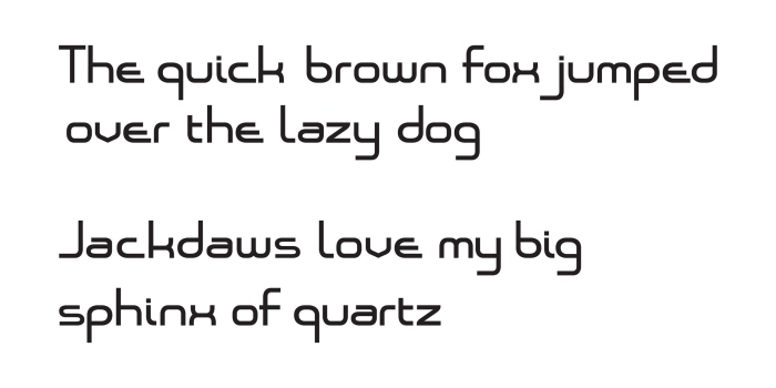
Font set in phrases - I just wanted to see what it looked like when I set it in phrases. Still not 100% on the lower case i. Not sure if it should be curved on it's lower end. The curve definitely adds to the overall movement and feeling of the font.
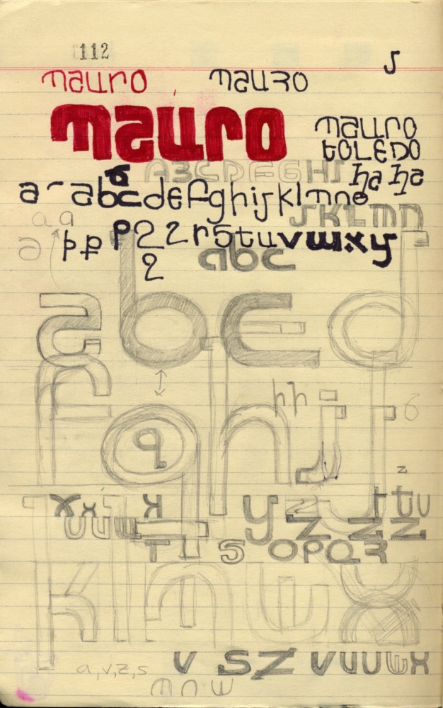
Sketch of Untitled Font - This is a page out of my sketch book at the time when I started the design of this font. As you can see my initial idea was to go with a more circular feeling but it became more squared, expanded font. The lower case e is largely unchanged. When I can, I'll scan and upload the flyer which was pasted on the opposing page of this one in my sketchbook. The flyer is what sparked the creation of this font.
gLike
Font Exploration