
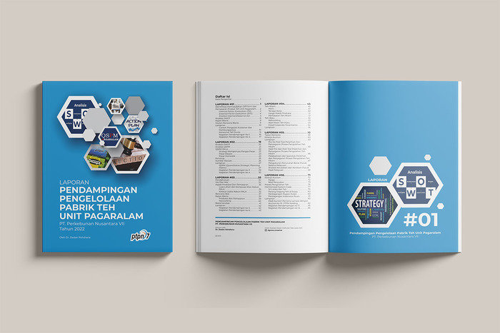
A technical report unified through a consistent visual tone aligned with the client’s operational identity.
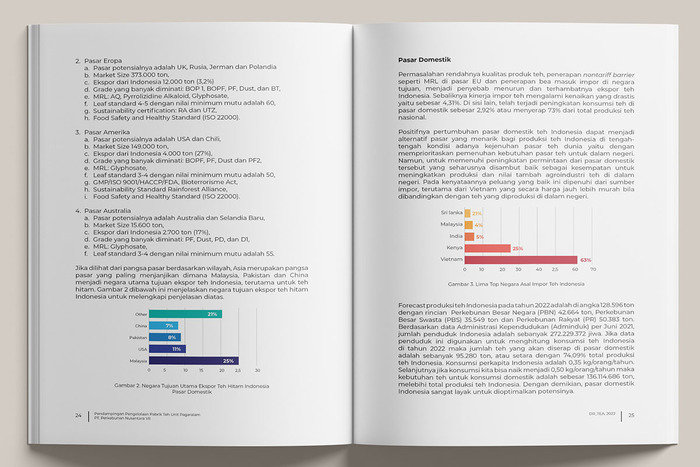
Color grading, imagery treatment, and layout rhythm ensure coherence across technical documentation.
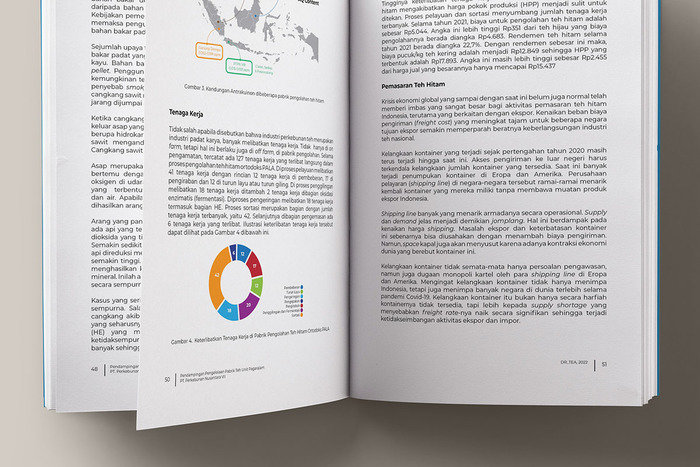
Consistent typographic and color application reinforces institutional professionalism.
gLike
Technical Assistance Report – PTPN VII Tea Processing Unit
This technical assistance report documents operational evaluations and development recommendations for a tea processing unit.
Given the mixture of photography, technical explanations, and institutional reporting, maintaining visual tone consistency was critical. A unified color palette, disciplined layout rhythm, and controlled imagery treatment were applied throughout the publication.
The outcome is a technically structured yet visually cohesive document aligned with the client’s operational identity.

Available
Freelance, Full-time, Moonlighting
Iwan Kartiwa
Visual Communication Designer Specialized in Editorial & Publication Systems
Bandung, Indonesia