
Line: (2013) The lines of the parking spaces are the main focus of this photo because they are repeated and ongoing. I adjusted the exposure, brightness, and contrast of this photo.
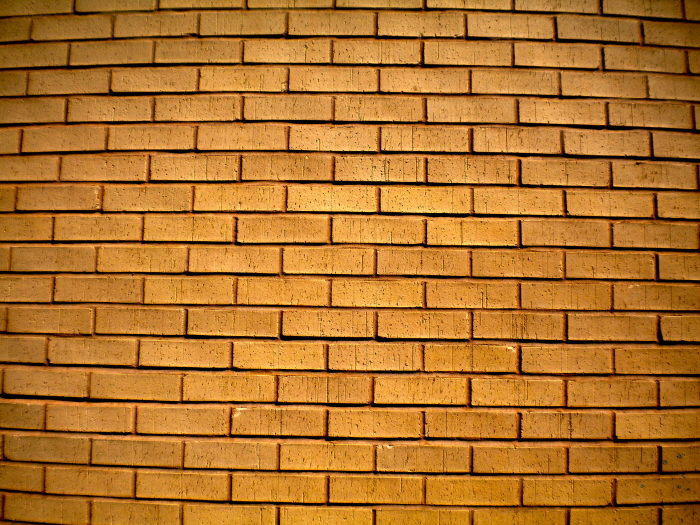
Shape: (2013) The shape of the bricks is repeated throughout the photo. I adjusted curves and exposure for this picture.
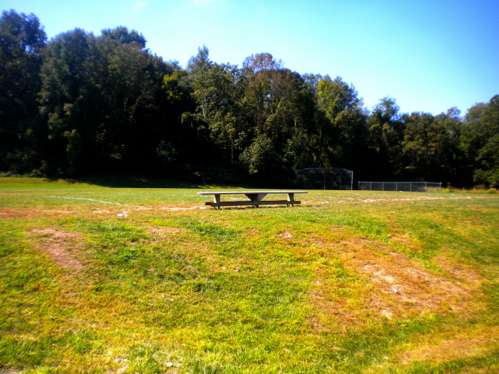
Space: (2013) The focus of the picture is on the bench, while there is plenty of negative space around it. I adjusted the levels, hue, brightness, and contrast.
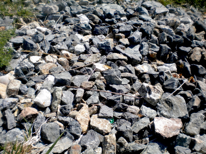
Texture: (2013) The texture of the rocks, a rough texture, is repeated throughout the photo. I adjusted the brightness, contrast, and levels.
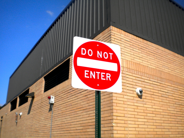
Color: (2013) The red in this picture stands out above the other colors. I adjusted the vibrance, brightness, hue, and exposure.
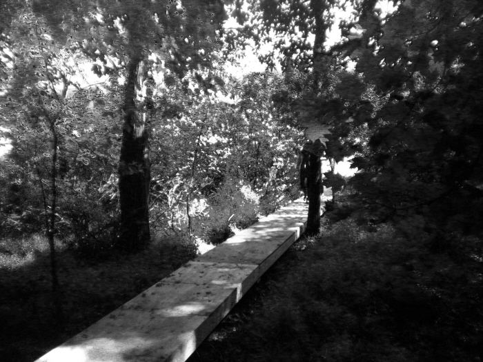
Value: (2013) There is a clear distinction between the light areas and the dark areas due to the lack of color and drastic change in lighting. I adjusted the brightness, contrast, curves, and made it black and white with the green colors standing out the most.
gLike
Elements of Art
Line, Shape, Space, Texture, Color, and Value.