
considering the scope of representation and publicity //
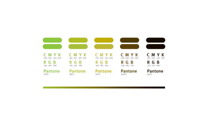
To re-define the Brand philosophy, visual strategies and identity guidelines to locate them to various possible applications // To set a standard system, on which the language could be extended to the next level of product categories if required.
The whole process of the project is also a part of curriculum for design learning and experience in industry. It has gone through various stages of design research. Based on the current and futuristic trends in digital media and telecom industry, the projected design has been taken forward as per the design requirement developed in the creative brief.
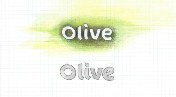
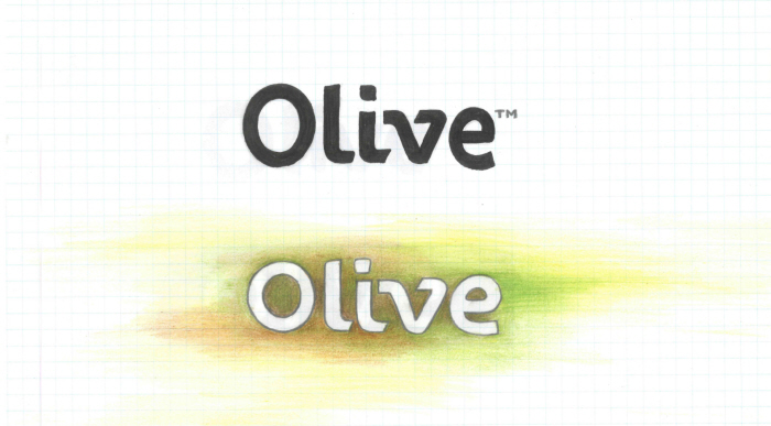
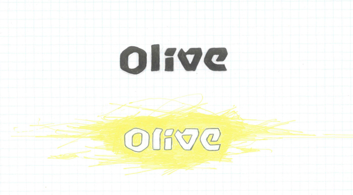
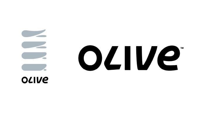
Redefined
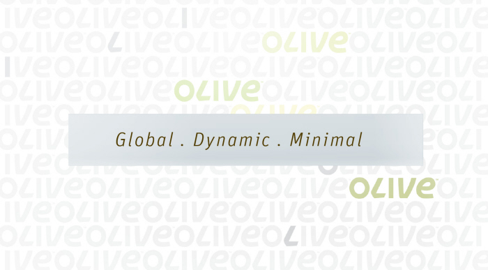
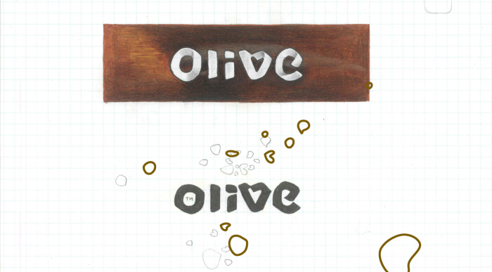
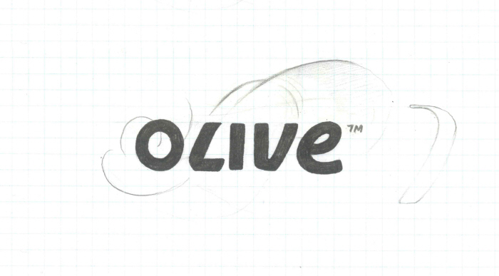
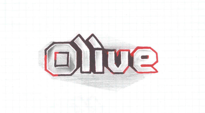
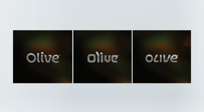
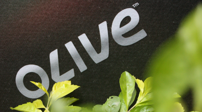
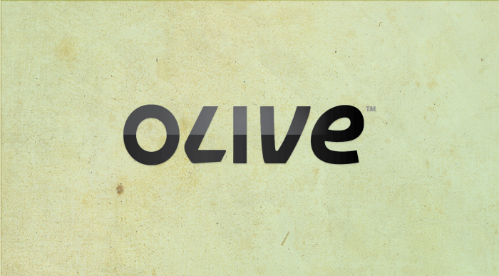
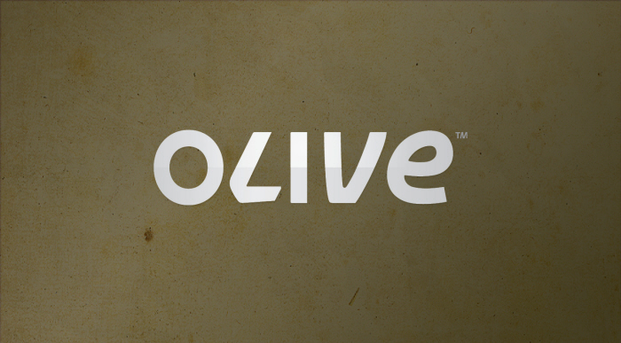
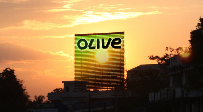
Olive // The name Olive carries attributes such as evergreen, significance, healthy and reliable. It gives an essence of purity in terms of thoughts and values.
Indian Multinational //
An Indian multinational through the roots of innovation and innovative products to un-complicate and make simpler lifestyle. A brand, carries the present scenario of the local values forward but represented as a global phenomenon, considering the usability and user perceptions of the mass. Covering a broad market of mobile phone users, considering the variety of daily life values and needs. It builds up its culture and the bottom line value in consideration to that.


gLike
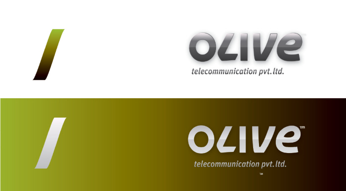
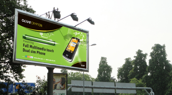
Olive telecom
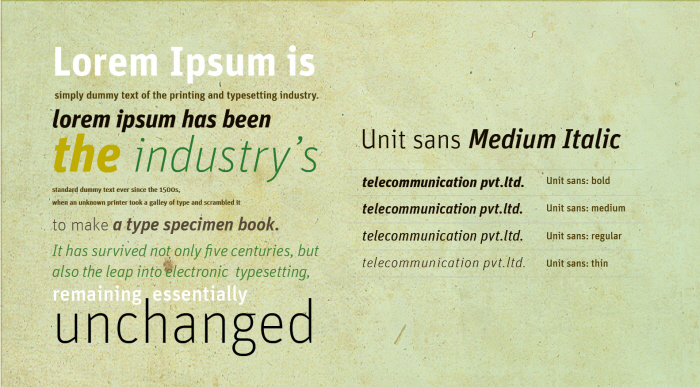
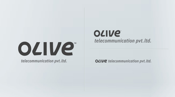
Visual Identity & Brand Language for ‘ Olive telecommunication Pvt. ltd’,