
This is the overall brand look and feel. I did not personally create every piece pictured above. I did design the jogger pant pictured on the large left side image, as well as the raglan crew neck sweatshirt with stretch leather front panel pictured on the center bottom row.

I designed this tricky light weight wool jogger for our Rogue Collection. It has trouser pockets, zipper pockets on both thighs, and small bellowed zipper pockets with dart details around the side ankle areas. The back pockets are pieced in double pockets with leather binding and side zipped welt pockets with rib knit binding. This jogger has a very intricate tech look with Mad Max flavor.

This is a true indigo knit long sleeve hoodie with moto styling. I had it potassium sprayed in selected sections to give it an authentic looking indigo fade. As always the trickiest part is getting them to use the proper potassium solution strength and having the perfect hand for spraying a nice face so that it doesn't look like fake bleach blotches. A great wash house is key to getting these things right.

DEPTH & DIMENSION. From 2014 to the present, we shifted the ROGUE line towards a more sophisticated target which means that our usage of graphics tends to now be geared towards repeat patterns or texture prints. But, every collection still needs at least a few good old graphic driven pieces. Being that our diffusion line ROGUE STATE is heavily graphic driven, I needed to figure out how to make sure the ROGUE graphics would differ and have an elevated feel to reflect the higher sophistication and higher price point. So beyond the bodies, my concept and solution is depth and dimension within the artwork. Detailed art with dimension in the subject, textures, and execution of the print. Above are 3 examples of this.

You can make the nicest looking graphic in the world but without the right color separation, mesh and screen printer it'll never come out the way you designed it. Used 4 screens here. Softly printed white base, a nice cool gray, then a black even the the ground is black, and 1 last white hit to bring out the highlights. Ink was plastisol with the right amount of diluting to make the hand feel soft, and the mesh count was 305. You don't always have to use waterbased inks or discharge on black or dark grounds. As long as you have the right company or person printing it, you can get that soft hand feel.

Raglan sweatshirts have been on fire the past couple of years. I designed this body with a graphic center front panel. The arms and back panel are garment dyed 100% cotton fleece. And the front panel is poly cotton to take the multicolored sublimation print.
When printing multiple colors you have a few options. 4 color process printing, digital printing, or sublimation printing. Each has it's own pro's and con's regarding pricing, size, limitations, output control or desired techniques. I wanted this to be a full printed panel so I chose to use a sublimation print. The more poly in the fabric the more vivid the print and color. So we had to find the right content to get a nice print. The downsides of sublimation can be the perception that poly equates to cheap. Also sometimes the fabric can pill after washing. These are all factors that need to be tested before final production stages to ensure a quality product.

Another Rogue tee graphic with lots of depth and dimension through shadowing and highlights. It's photorealism mixed with almost a surreal graphic vibe. To achieve the correct print I had the printer use a high mesh count. We used diluted plastisol and 6 screens. light gray, brown, red, white, black and of course the base.

The mens allover floral print explosion was in full swing and we wanted to get in on the action. Allover florals weren't exactly the Rogue customers cup of tea but I came up with the idea to do this edgy hand drawn japanese tattoo style floral. I hand drew it in graphite and created a repeat pattern out of it to use as a panel sublimation print for a cut & sew tee. To do the sublimation the fabric had to be poly cotton. We chose to use a 65/35 plyctn so that it wouldn't be too slick and shiny. Also we planned to garment dye some extra color ways after sewing. This gives it a nice heather look. Another interesting thing that happens after garment dying a sublimated print is that some of the dye gets absorbed into the ink. This creates a tonal print instead of a dark contrasted black print.
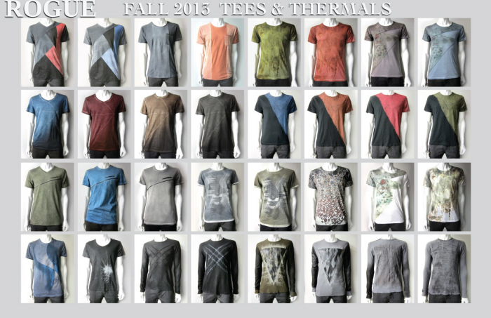
This is Rouge's Fall 13 Fashion Tee and Thermal line. I provided Art Direction and Design. Mixing Cut and Sew with various embellishment techniques, we created a distinct and edgy look. We gave the tees and thermals an elevated sophistication to fit with the upper tier department stores and boutiques. The main concept behind the line is TEXTURE. Texture in the washes, texture in the imagery, and texture in the embellishments. I wanted to create tees that were visually interesting enough for people to want to walk up and touch. The challenge was to use embellishments without what I like to call over cooking.
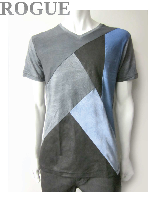
This is a multi-paneled V-Neck tee. I used a black and a blue pigment spray on the fabric rolls. To create the multiple tones, designated panels are using the sprayed side as the face, and contrast panels are using the reverse side as the face. The dark black panels with a leathery appearance are wax coated jersey.
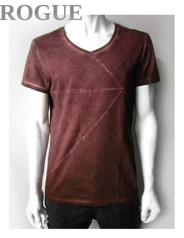
This tee is a rounded V-Neck with a lower neck drop. I added horizontal and diagonal pin tucks across the front & back, then garment dyed and oil washed to give it the highs and lows. From the wearer's bottom left is a wax coat spray gradient.
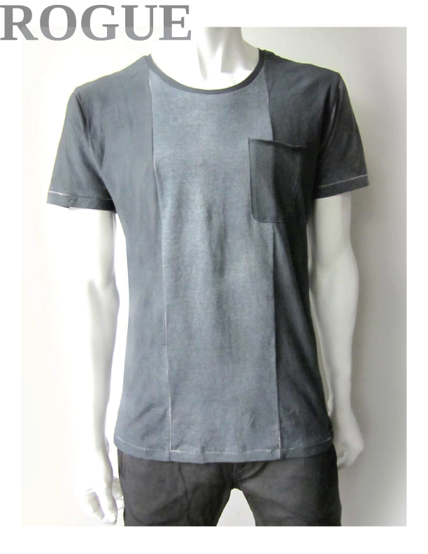
This crew neck pocket tee has 3 front panels. The fabric roll was pigment sprayed and I used the sprayed side as face and reverse side of fabric as face on certain panels to give it the contrast. The panel seams, arm hole seams, side seams, and neck seam have an exposed blind stitch. The exposed blind stitch shows unevenly to give it a natural looking wear effect. The top of the chest pocket is raw edge and rolls.
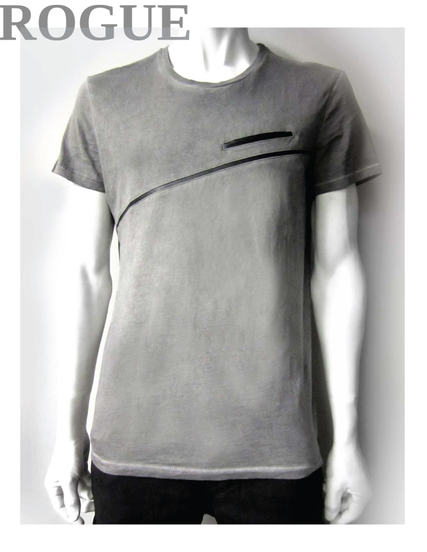
The Rogue Collection uses lots of leather. It is practically our signature fabric. For this crew neck tee I incorporated a thin diagonal inset leather panel and leather welt pocket. The garment is oil washed with a gradation dark to light from top to bottom.
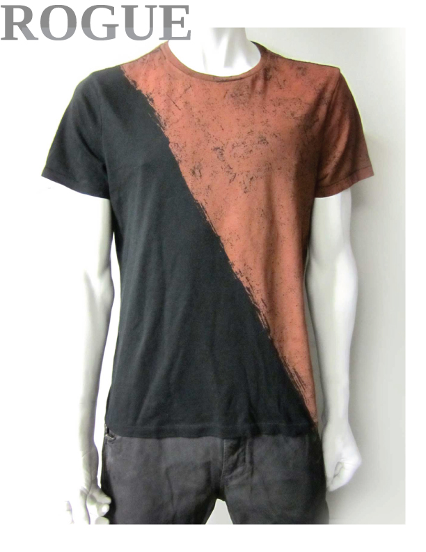
This crew neck tee has a 1 color Jumbo Size textured diagonal discharge print. Just a sleek but rugged 2 tone look.
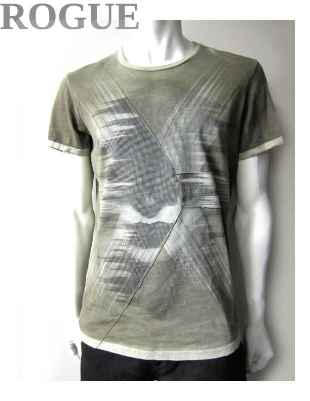
This crew neck graphic tee is reverse pigment sprayed. We used various embellishment techinques. Angled pin tucks, screen print and high density print. If you look carefully you can see the tiny raised black dots that make up some of the imagery. Texture in the print as well as on the fabric was a focal point in our graphics. I wanted to create tees that were not just visually stimulating. I wanted to create Tees that people wanted to come up and touch.

All over sublimation tee. I love using sublimation to capture a wide color range. The artwork itself is just a grungy texture I created from photographing the grunge and grime I walk by on a daily basis in New York.

Allover sublimation grunge texture with angled pin tucks incorporated for depth.

Allover sublimation is big these days.

I shot this full page Ad for WWD announcing our Fall 13 Denim launch at Project Las Vegas.
gLike