
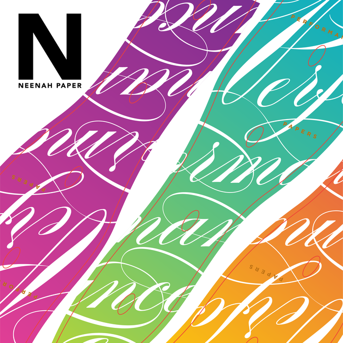
Neenah Dispersa project objective was to show how the paper holds bright colors and behaves well when die-cut. My role here is the typography and color choices, as well as supplying the mechanical.
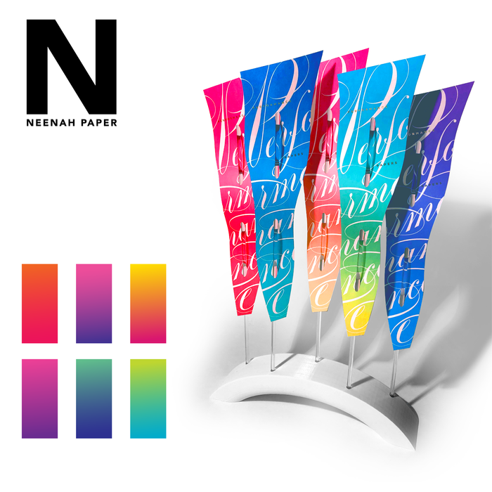
Shown here is the end product. The paper is scented and produced as a give-away.

FiDi stands for financial district. This a is a fragrance for men. To the right are some earlier solutions. The bottom two are inspired by suit labels and include a stylized stitched border.

Harrods 10th Anniversary offered this special edition Bond gift box.

options for Lancome compact counter display

options for Lancome compact & brush combination – vector drawings in illustrator

these are 3d models to show the display solutions for existing products – one challenge for the model is the reflection and liquid in the bottle

The Origins logo was done in brush and ink. It was part of the product launch that also included package design, comps, and production. Below are other solutions leading up to the final design

Pieces above are explorations in color and material. The image is a 3D model.

To the right is a gift package concept. To the left are repeat patterns for the product line.
gLike
cosmetics
Available
Freelance
Jeff Morrow
branding, style guides, presentations, packaging, design, direction, ...