
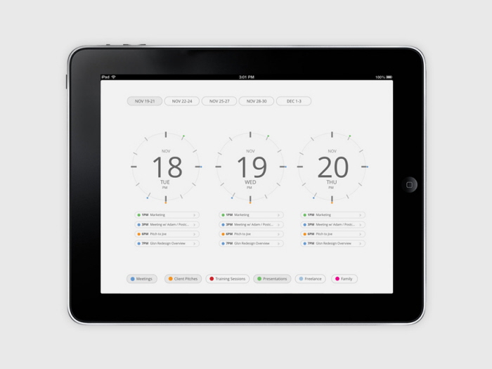
The initial app page. This screen provides information about the current and upcoming days. It shows calendar items in the form of a clock and uses color-coded circles to indicate the calendar item’s category. Categories are shown at the bottom with their respective color. The categories can be toggled, to show or hide items in a specific category.
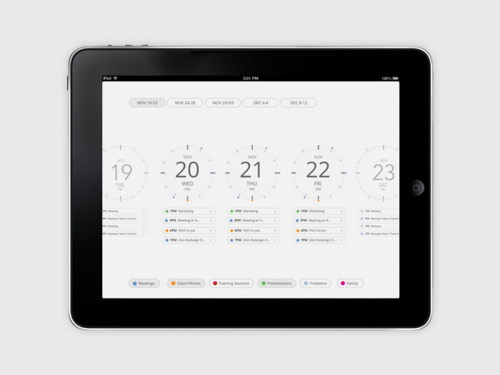
Pinch out and the calendar will zoom out to display five days (instead of three).
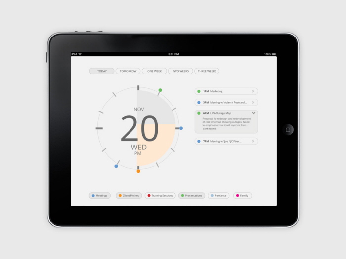
Tap the day or pinch to zoom in brings the user to the day screen, where it shows the same clock graphic and calendar events for that day. Categories are displayed at the bottom of the screen.
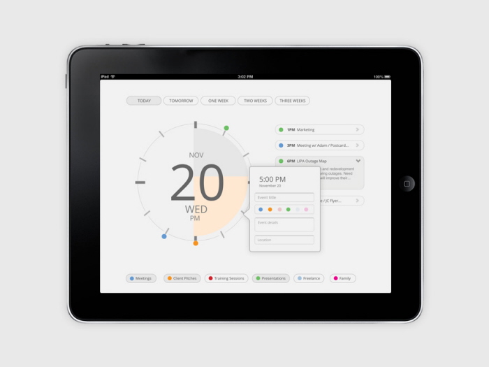
Tapping an empty area on the calendar displays a pop out window to add a new event. The user can specify a title, category, details, and location. The app will determine the date and time from where the user taps, but it is editable by tapping the time.
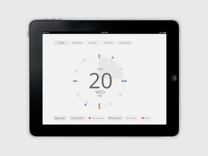
Pinching in again to zoom brings the user to an expanded date screen, showing only one day and the category toggles.
gLike
iPad Calendar App
Building a better calendar app. This iPad application aims to create a calendar app that does not resemble a grid of dates, as seen on a physical print calendar. Instead, this application presents each day as a clock, showing the events for the day. It also lists a few upcoming events below the clock. The “default screen” is a screen with three clocks, but by zooming out by pinching out, you are presented a view with five clocks.
