
movies - The American Film Institute celebrated in June 2005 "100 Years ... 100 Quotations" with a 3-hour TV special that aired on CBS. The colors chosen were based off the different colored films that were used. Some of those that are listed were taken from the 500 nominated quotes provided by AFI.
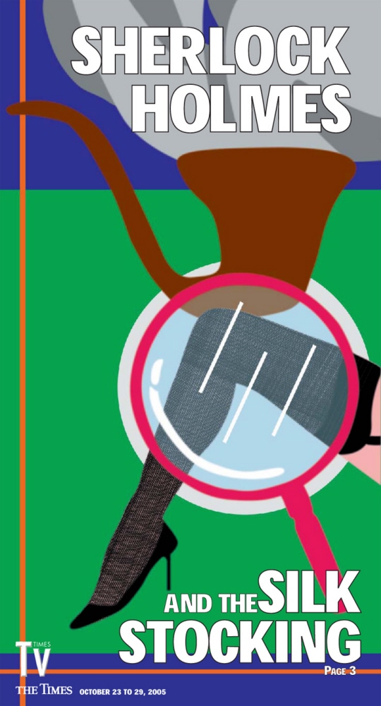
PBS' Sherlock Holmes and the Silk Stocking - I designed this TV Times cover to mimic Art Deco poster designs. I created the illustration in photoshop and did the fonts in Quark.

Grammy Awards - I wanted to take a different approach to the Grammy Awards, so I painted several images of the gramophone on paper with watercolors and acrylics. I asked my coworkers which they preferred and then scanned the images. This was a TV Times TV book cover design.
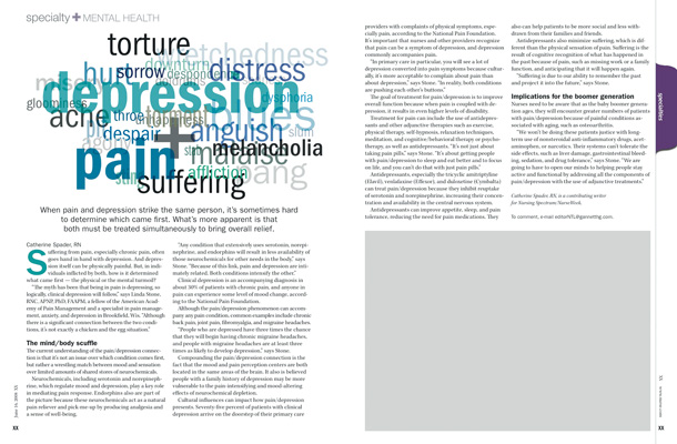
depression + pain - This story is about depression. I researched other words that could describe the symptoms a person can suffer from in addition to alternate words to describe depression. Then, I used colors that evoked the feeling of those words. This was a page designed for Gannett Healthcare Group's NurseWeek/Nursing Spectrum magazines. The gray box on the right side of the page was a placeholder for an ad since advertisements weren't added until after the editorial content was designed.
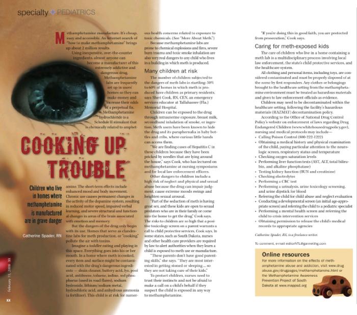
crystal meth - This design, which was printed in Nursing Spectrum/Nurse Week magazines in 2008, helps illustrate the story about how children exposed to the manufacturing of methamphetamines can be harmful. It also provides nurses with what the proper procedure is to handle such a case.
View PDF
View PDF
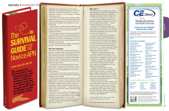
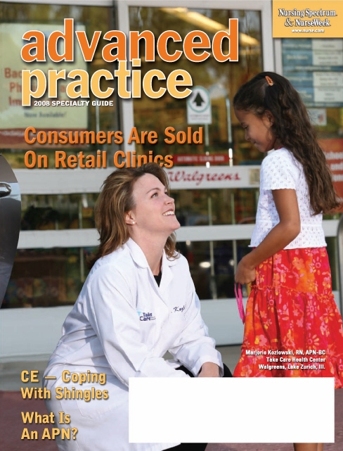
Advanced Practice Nurse survival guide - This design printed in Nursing Spectrum/Nurse Week magazines. I thought of an alternative approach to running an image of an Advanced Practice Nurse since from sight many wouldn't be able to tell the difference from one nurse to another, thus I developed this design.
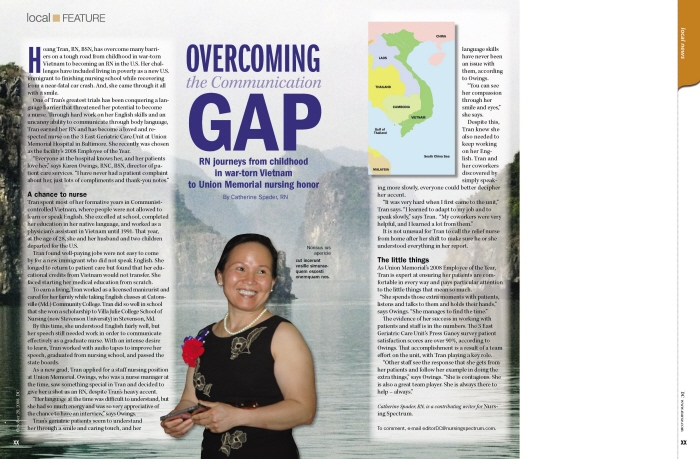
Vietnamese American nurse triumphs - The background image is a landscape shot of Vietnam. I strategically placed the nurse in between the mountainous island structures and underneath the headline to indicate the visual sense of "overcoming ... the gap." It was my idea to also include the Vietnam map to give the readers a sense of location. The blank white space to the right of the design is for an ad.
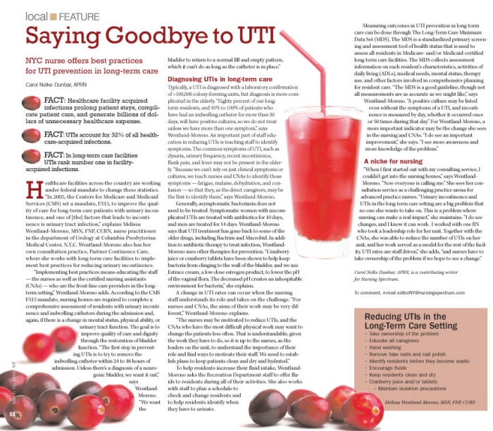
urinary tract infection prevention - Cranberries and cranberry juice are well known for their healing properties with regards to urinary tract infections, or UTIs. This is a Nursing Spectrum page design that I executed after I was advised to redesign it because the editors weren't happy with the original artist's imagery illustrating UTIs.
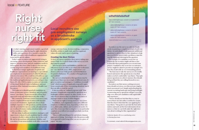
personality assessment - I executed this design for Nursing Spectrum magazine. Since stock imagery was often used, I tried to take a different approach by creating the rainbow illustration, which was to symbolize the different types of personalities that pre-employment surveys establish in an effort to place each nurse in a position that fits them. (The Greek copy is a placeholder for utility information.) However, it never went to print because some editors felt that it didn't illustrate the copy appropriately.
advanced practice specialty guide
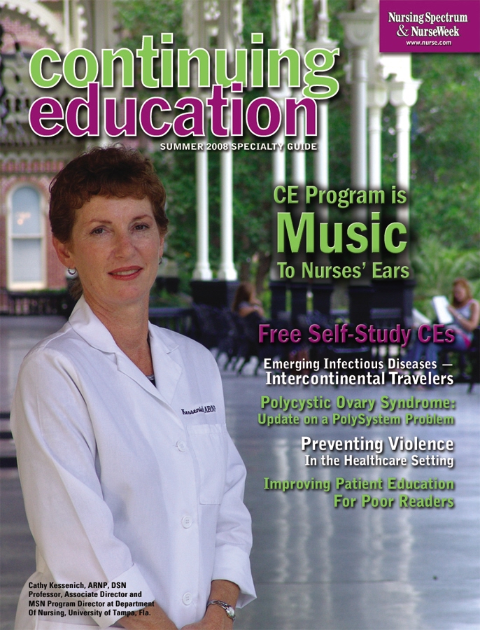
continuing education specialty guide
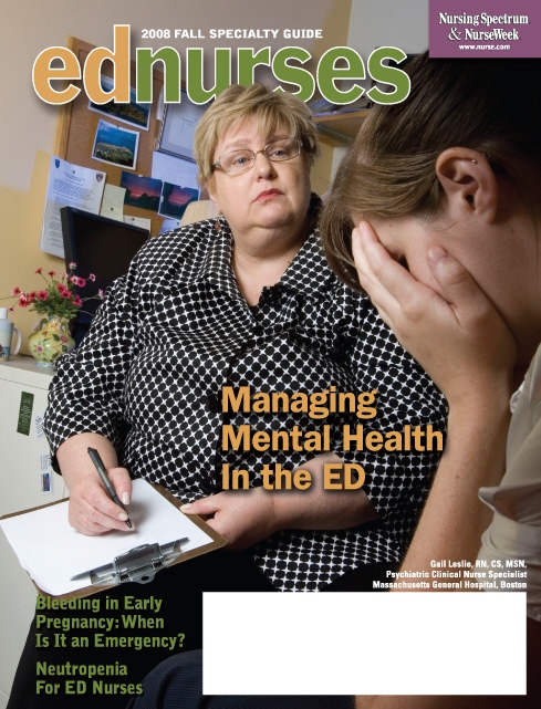
With this ed nurses specialty guide, I directed the photo shoot for this cover image and designed the page.
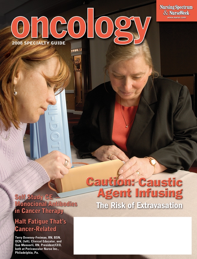
WIth this oncology specialty guide, I not only designed the cover, but I also directed the photo shoot.
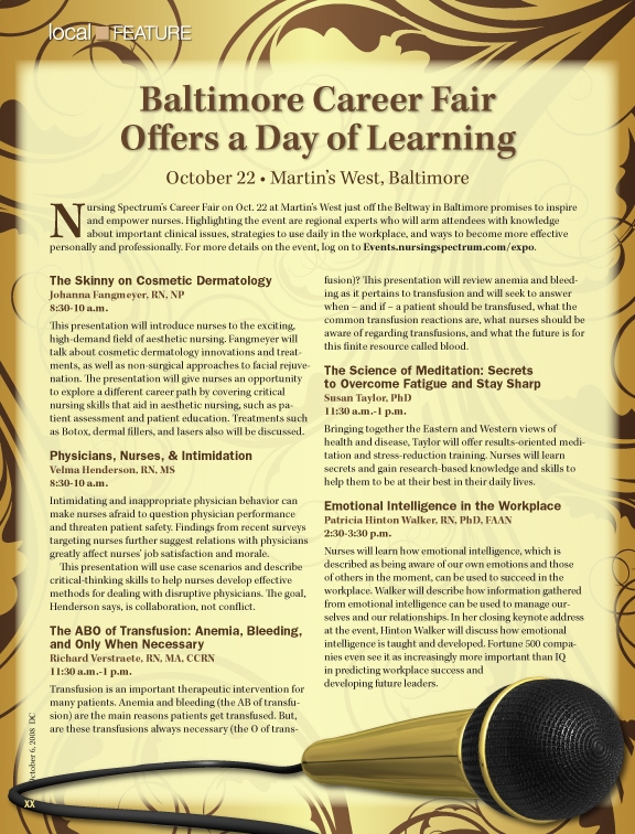
Baltimore career fair - This is the first of two designs I executed for Nursing Spectrum/NurseWeek magazines' career fairs. The previous design included an old-school microphone, which I was asked to update. Since career fairs typically take place in hotel meeting rooms, I opted for a repeat pattern that reflected the style of a high class hotel with a more modern microphone to match. Though the editors liked the design, they decided not to use it.
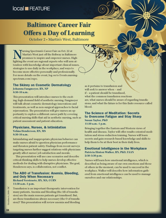
Baltimore career fair no. 2 - This is second of two designs I executed for Nursing Spectrum/NurseWeek magazines' career fairs. The previous design included an old-school microphone, which I was asked to update. I chose this illustration from a stock site because it evoked high-end hotel style, then I manipulated it for the design. Had it gone to print the second leg of copy would have been filled out. Though the editors liked the layout, they determined they wanted to be consistent with previously designed career fairs.
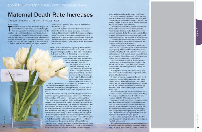
maternal death rate increases - This is the final design for this health article about maternal death, which printed in Gannett Healthcare Group's Nursing Spectrum/NurseWeek magazines. The editors had wanted a more somber feel. I superimposed the sympathy card and card holder into the bouquet and extended the background for the image. I intentionally had the copy line up with the table's edge.
post-traumatic stress disorder in the ICU - This design was executed for Nursing Spectrum/Nurse Week magazines. It was the first of three designs created for the story. I chose the image because the story describes how some patients who suffer from PTSD have hallucinations of bugs - among other symptoms. The green color is taken from the eye's iris. Though initially approved, the design was later revoked because one of the editors was concerned about how the image was going to be received by nurses.
View PDF
View PDF
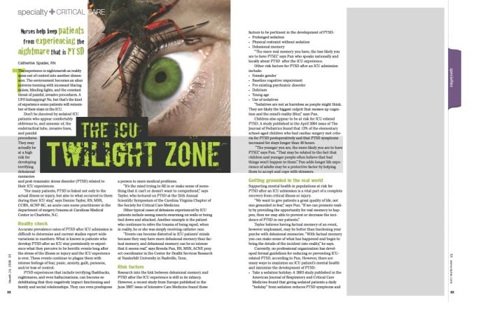
post-traumatic stress disorder in the ICU no.2 - Patients in the ICU who suffer from post-traumatic stress disorder can sometimes hallucinate that bugs are crawling on or near them. This is the second design of three that I executed for this story. Some didn't care for the frightened patient.
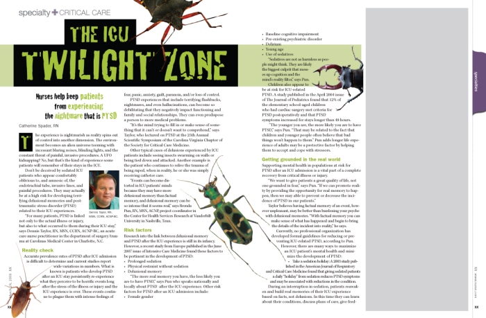
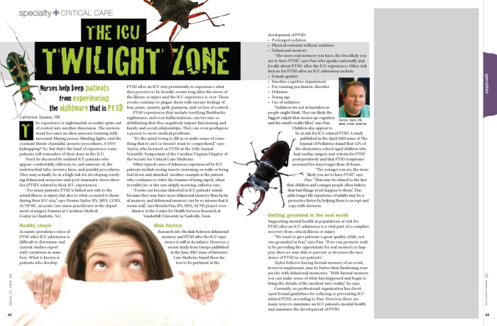
post-traumatic stress disorder in the ICU no. 3 - This is the final design of three that I created for Nursing Spectrum/NurseWeek. The bugs relate to the hallucinations that some patients can suffer when hospitalized in the ICU.
gLike
magazine designs