
Turkish Architecture Center - I designed this logo as an optical illusion. Not only does the 'A' shape represent the name but also creates an infinity shape. It signifies the infinity of architectural development that Arkitera stands for.
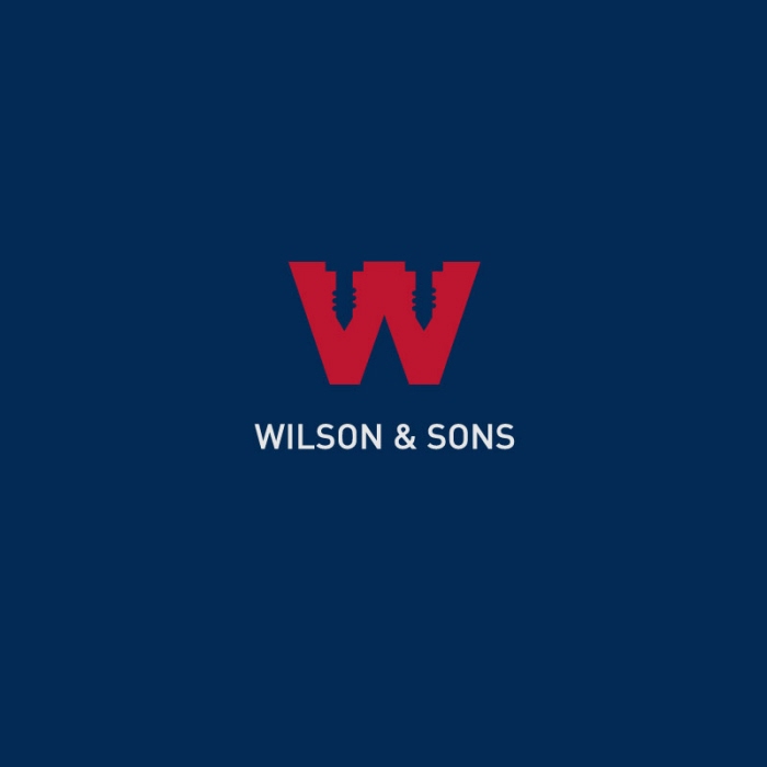
Wilson & Sons Hardware - Wilson & Sons is a local hardware store. I played with the negative shapes in the W illustrating screws to represent the hardware store. The red, grey, and blue colors stand for the stability and all American strength of the company.

WifiBee - WifiBee is a Wifi locater that finds the local Wifi hotspots. For this logo design I created an icon in the shape of a honey comb. I illustrated a bee icon with the stripes of the bee as the RSS feed.
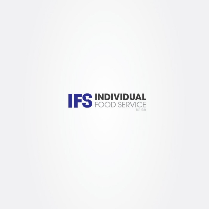
IFS Individual Food Service Logo - IFS is a company that manufactures paper cups, take out containers, plastic cutlery, etc. For the design of their logo I wanted clean bold initials to be the forefront read. I hid a silhouette of a cup icon in the shape of the S to illustrate the industry of the company.

Puma - Boston Marathon 2008 - While interning at Puma North America, I designed this logo for the 2008 Boston Marathon. I illustrated a silhouette of the Boston skyline to represent the city.
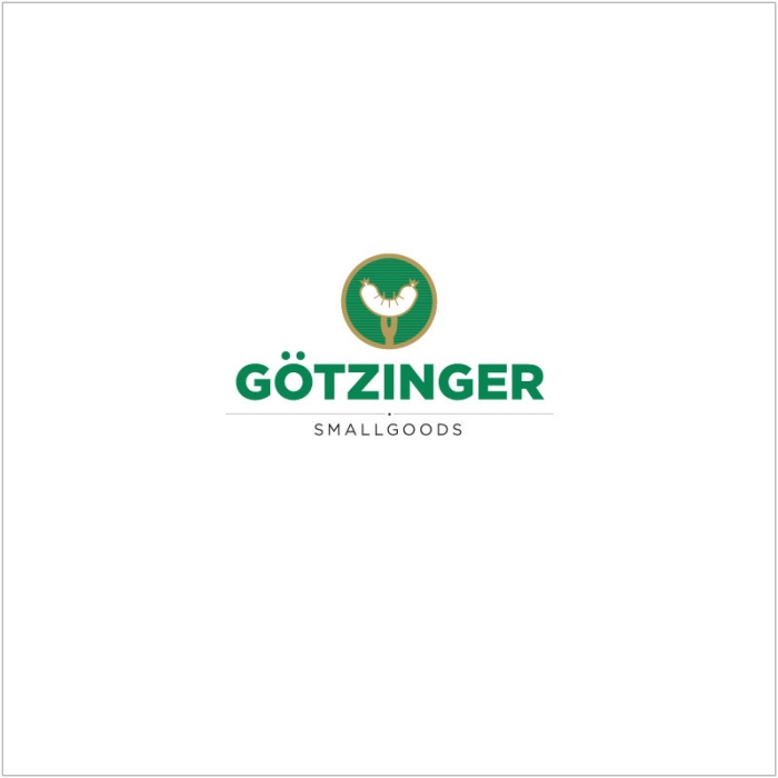
Gotzinger Small Goods - Gotzinger Small Goods is an Austrian deli. I refreshed their design keeping with the same bold green and gold colors but updating the typeface to a clean bold and recognizable symbol. I also mimicked the umlaut in the sausage illustration.
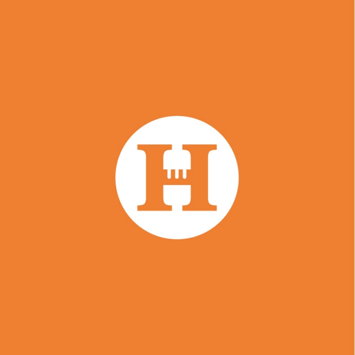
Howard Electrical - Logo Design for Electrical Company
gLike
Logos