
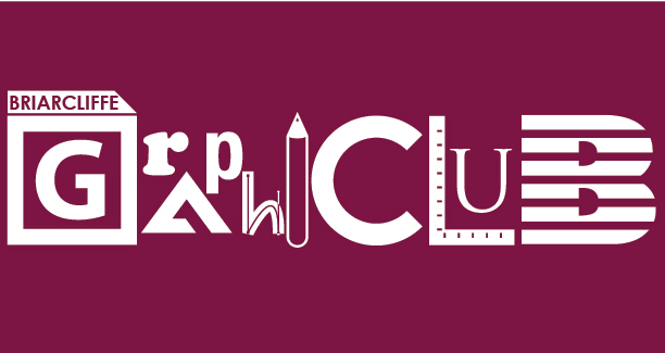
The standard version of the logo, for use against light-colored backgrounds.
An inverse of the logo, for use against dark backgrounds. Several letters, such as the pencil for "I," were altered to display better in the inverted color scheme.
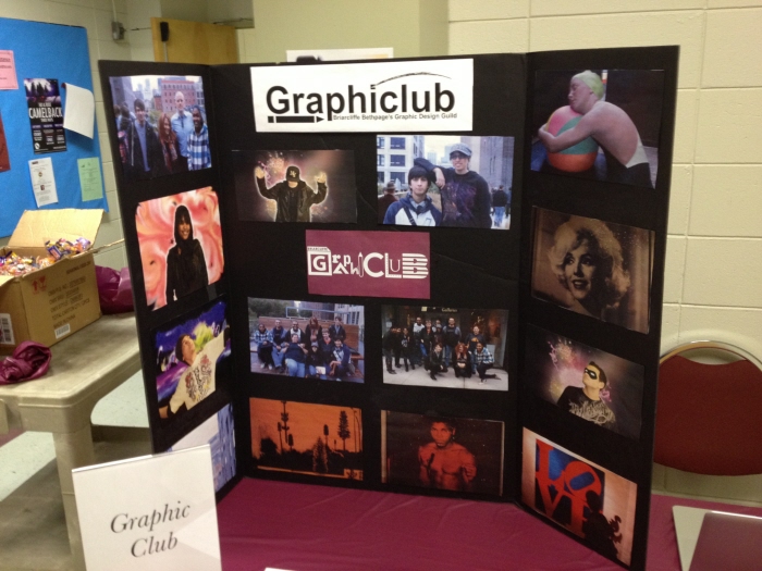
This a display board created by other club members to promote the club during the college's Club Fair on January 23, 2013. My new logo is in the center, with the previous logo - designed by another member - up top.
gLike
Briarcliffe Graphiclub Logo
This is the current logo of Briarcliffe Bethpage's graphic design club, appropriately called "Briarcliffe Graphiclub." I first designed this logo back in September 2012, to feature several elements related to graphic design, such as the Adobe suite icons for the "G," an L-square for the "L" and the IBM logo for the "B."