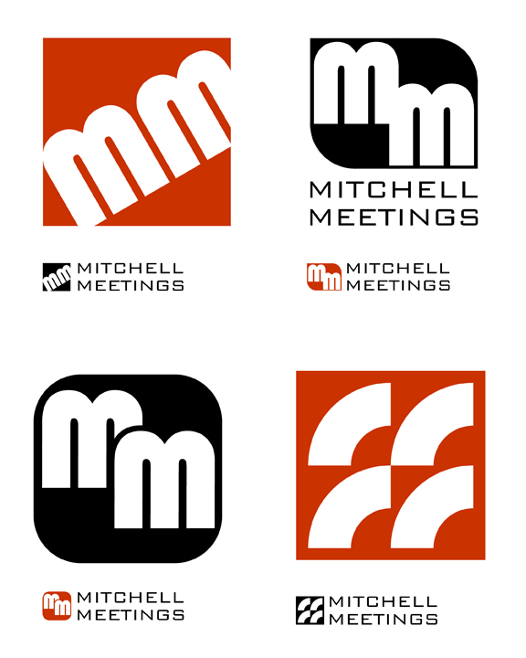

Adding an architectural substance to the letterforms which mimic some of the campus architecture.

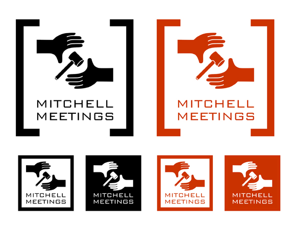
An abstracted logo process, derived from the hands & gavel design as seen previously.

A design deemed too humorous, as well as a misuse of the college logo.

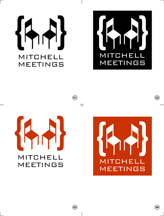
The final logo- an exercise in compromise.
gLike
Logo Designs William Mitchell College of Law
Logo designs for a recurring series of legal studies meetings.
The following images illustrate the design process for a logo for William Mitchell College of Law. The client desired a logo which communicated the informal, "hands-on", somewhat intimate atmosphere of an ongoing series of meetings dealing with the future of legal education. The process started with elements derived from a literal interpretation of the design brief and then moved into the more abstract before returning to a slightly more formal and somewhat literal conclusion.
Creative Direction: Pamela Belding