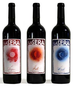
Wine lables - Hand created labels to create a cohesive feel between the three bottles, yet still keep their individuality by the use of color. The images not only describe the name of the wine company, La Sera, meaning night but also the name of the wines, el sogno (dream), el falo (fire), el cielo (sky).
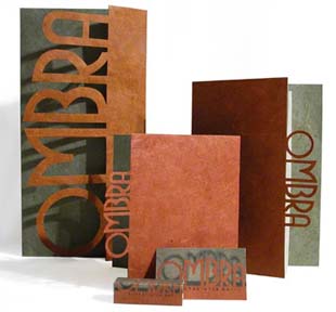
Restaurant Identity - Hand created logo including menus, business cards, and matches. The word Ombra means shadow in Italian. I played on this idea and made the menus dicut so that the logo itself would create shadows.
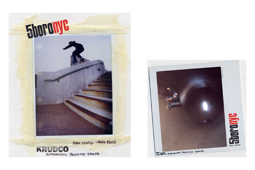
5boronyc Posters - Promotional in store posters approximately 34" wide.
Being a small skateboard company, with a family feel, I wanted to create a series of posters that conveyed that identity. I chose a hand done collage style of design, to give a more involved and personal feeling.
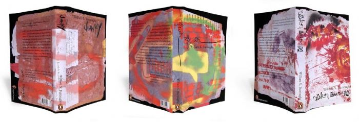
Trilogy books - With the use of Burroughs' art work for the covers, I incorporated hand type for the titles, to illustrate each individual book. For each book, I chose specific type faces for the back text as well as lay out to farther convey that feeling.
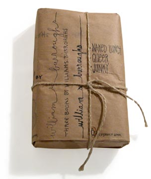
Package - This package is what the three Burroughs books come in. It represents the bag that Bourroghs would have used to carry his junk, which is prevalent to his writings. Again this is hand written to create a feeling of his style of writing and intimacy.
gLike