
Mountain Arts Pottery - The client was looking for a vintage illustrative look.
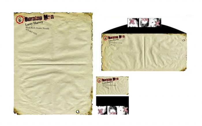
Burning Man, Identity - Burning Man is a anti-corporate event. In school I took it upon myself to come up with an identity for them, though they do not like to advertise. I thought it was cool to add the "dont speak, don't see us, don't hear us" image. The background is supposed to mimic a desert which is where it takes place every year. The burn holes and fire are because they burn down a 40 foot sculpture of a man annually.
Nest - A logo designed to evoke comfort and home, for a up scale home goods store for urban culture.
Totaro's Restaurant - A logo to refresh the identity of a 50 year old restaurant.
The Tolfin Group Logo
Lone View Ridge Logo
gLike
Identities