
Brand Guidelines for Employees — The definitive manual to steer employees toward correct color, photography and logo usage, plus product naming conventions and common copy writing questions. 15-page digital guide.
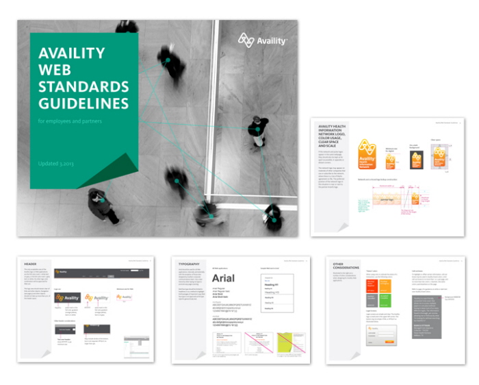
Web Standards Guidelines — A guide to logo, style and typography use for both employees and business partners on the Web. Includes standards for common Web elements like tables, icons, forms and links. 17-page digital guide.
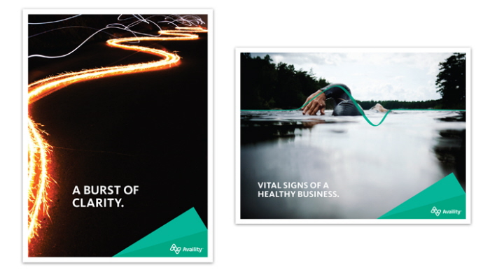
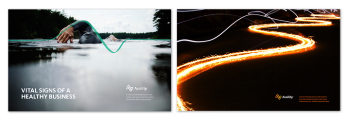
Brand Launch Posters — Two of four posters created to generate excitement around the internal brand launch. Posters were hung in all three offices, in hallways, stairwells and cubicles, and were available to take home. 18x24.
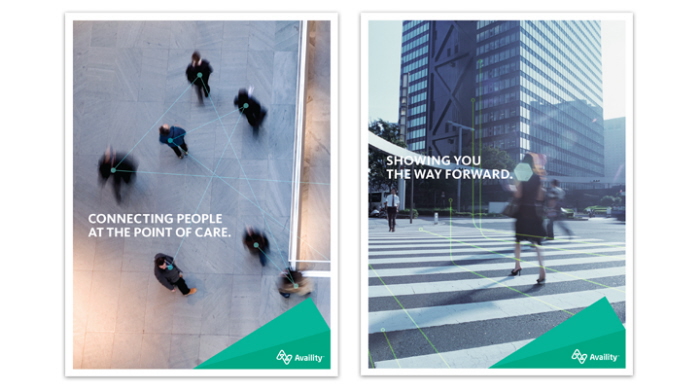
Brand Launch Posters — Two of four posters created to generate excitement around the internal brand launch. Posters were hung in all three offices, in hallways, stairwells and cubicles, and were available to take home. 18x24.
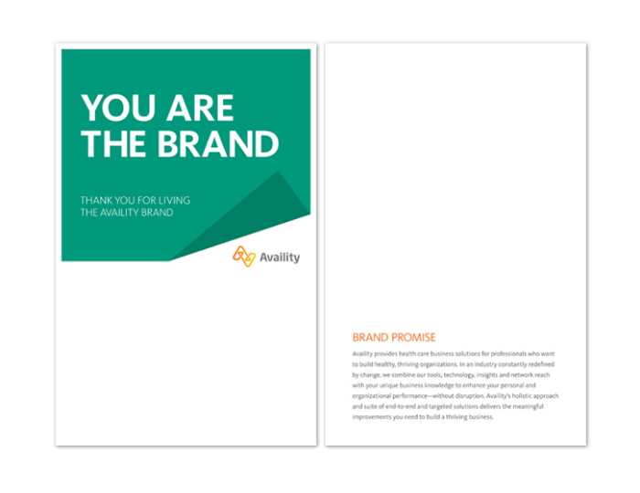
Living the Brand Card — A postcard created for the internal brand launch, to encourage employees to recognize their peers for efforts to adopt the new brand. With room to write a personal note, these quickly became a popular tool to encourage and thank those who helped implement the new brand. 5.5 x 8.5.
Branded Desktop Wallpaper — Newly-branded desktop wallpaper that pushed out to all employees on launch day. The swimmer was an especial favorite. Multiple sizes for multiple screen dimensions and resolutions.
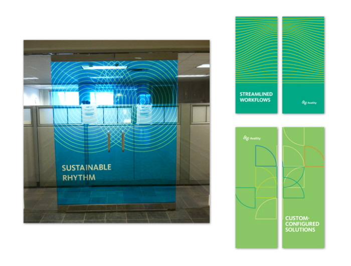
Brand Launch Day Door Decals — Installed the weekend before Brand Launch Week, these door decals greeted employees on Monday morning in all three offices; two-three main-entry doors in each office. They were meant to be temporary, but created so much buzz and enthusiasm we've left them up, 7 months and counting. Perforated film on glass doors, various sizes custom to each entry.
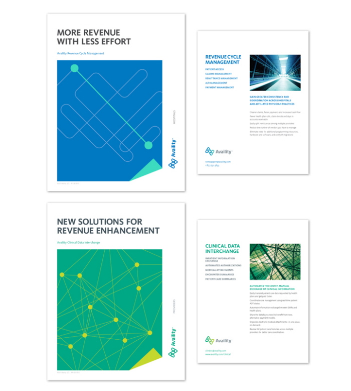
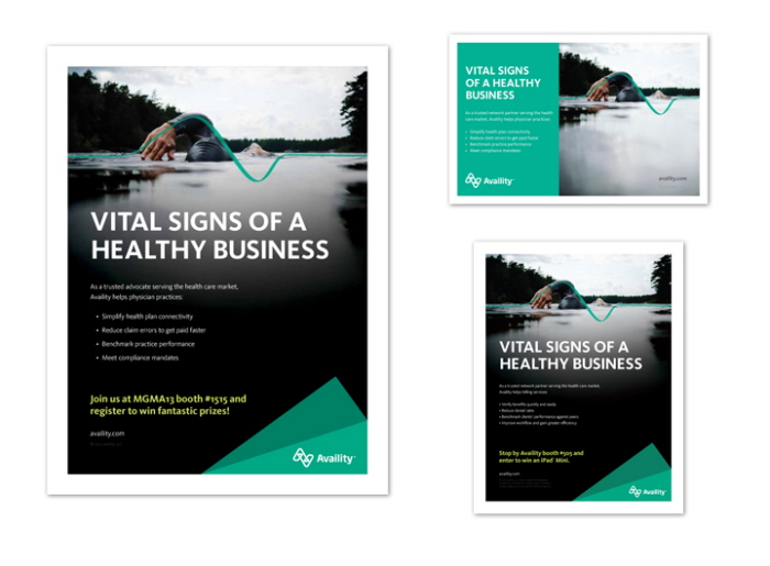
Product Flyers — A consistent look is designed across all product promotion flyers, each featuring a line-art illustration customized to the content and on-brand photography mimicking the illustration. 7x9.
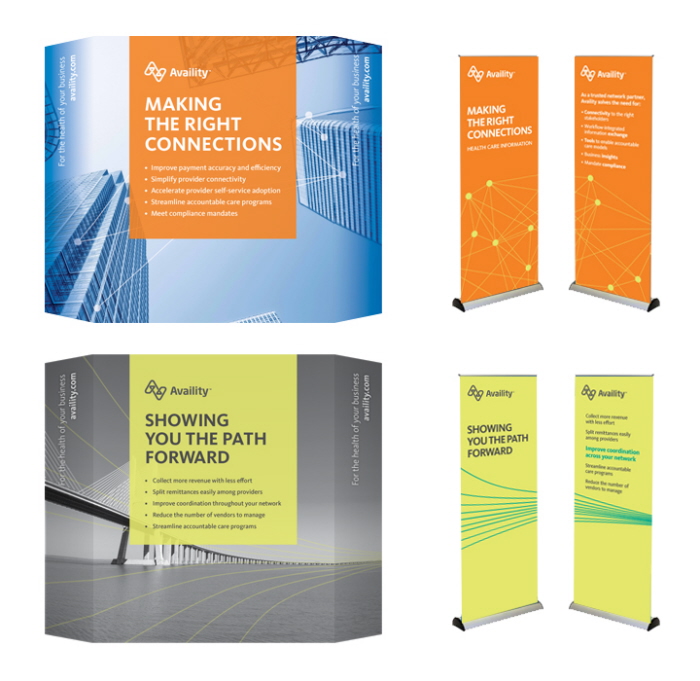
Tradeshow assets — A small sampling of pop-up displays and banner stands, all coordinated to mix-and-match across different audiences for different shows.
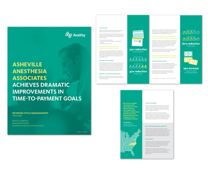
Case Study — A printed piece describing a small practice's time and money savings. Graphics punctuate the story's key elements. Folded 8.5 x 11.
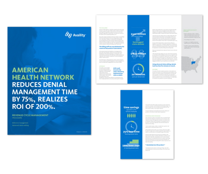
Case Study — A printed piece describing a health network's reduction in time spent managing medical claim denials. Graphics punctuate the story's key elements. Folded 8.5 x 11.
Consistency across advertising outlets — primarily trade show programs and health care publications.
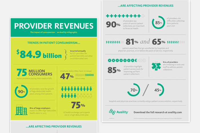
An infographic based on a longer research report.
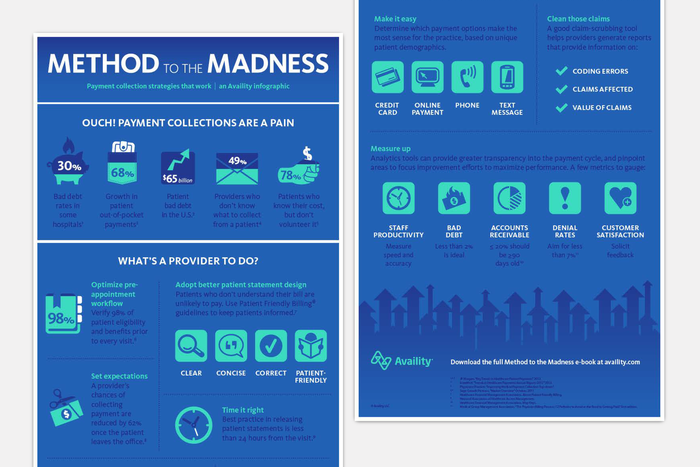
An infographic based on a longer eBook about patient payment collection strategies.
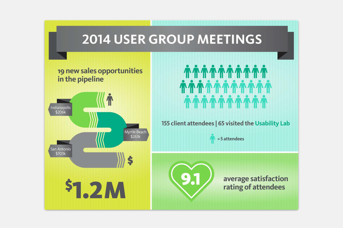
Internal infographic highlighting the success of a series of client events.
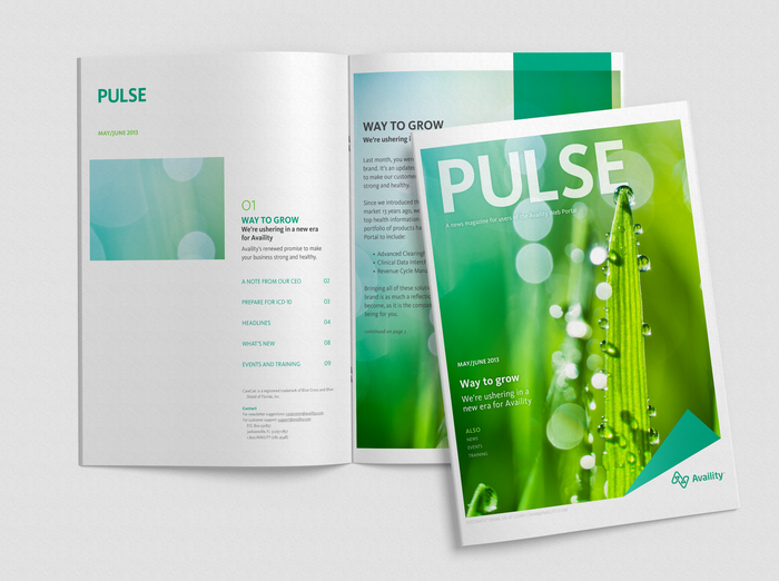
PULSE Newsletter — Inaugural issue launching the new brand. 10-page digital (PDF) newsletter including industry and company news.
gLike
Availity
We worked with branding agency Siegel + Gale to rebrand Availity in 2013. As the only graphic designer on staff, I had the opportunity to translate the brand across all channels and lead adoption throughout the organization.