
The brand refresh required a tie-in to an existing product brand featuring a flower, so here a single petal stands in for a power button — empowering patients and their providers to take control of their behavioral care
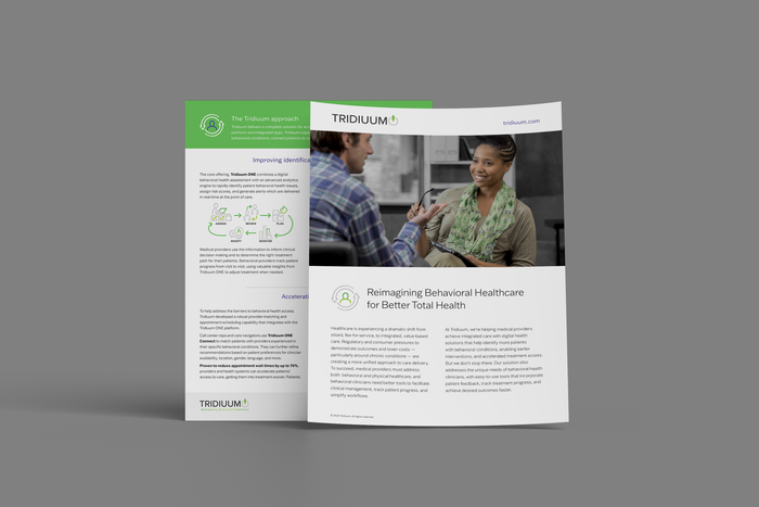
Sales flyers featured new iconography and photography focused on patient experience instead of tech
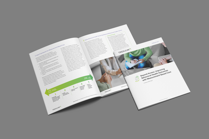
Long form content (a white paper)
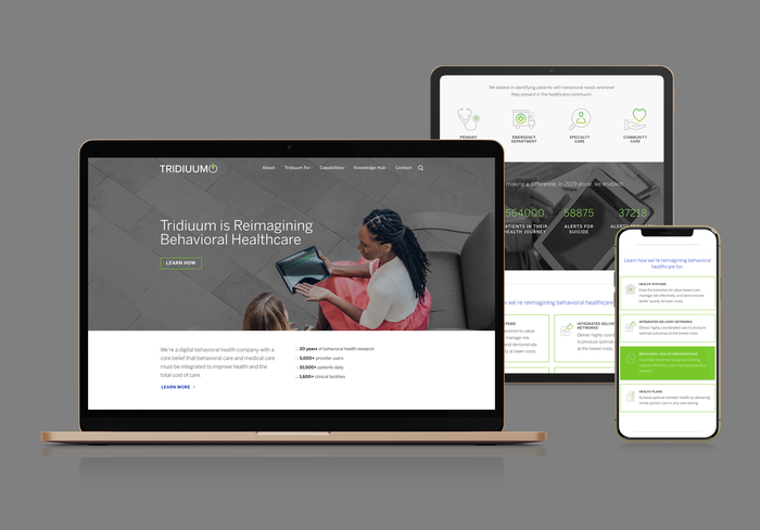
A new website
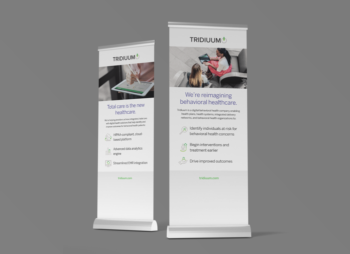
Banner stands
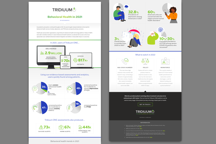
An annual infographic

Iconography
gLike
Tridiuum
Tridiuum (now part of New Dimensions Behavioral Health) is a software platform allowing behavioral health providers to measure and track patient progress.
View Website