
logo - the LOgo IS designed keeping in mind the shape of the brake (its railway brake which the above company is specialised in .)

letter pad - the letter pad is kept simple but attractive, generally very official, but tried out vt a very different kind of font

visiting card - 2 different visiting cards, the border is such which showcase "G" , the term for GROUP

envelope - yaa, generally envelopes doesnt contains these type of pic, but if an envelope can giv u an idea abt the company , whats wrong vt it. which makes marketing more easier

hoarding - i dont need to giv any description for it, it says it all.....isnt it
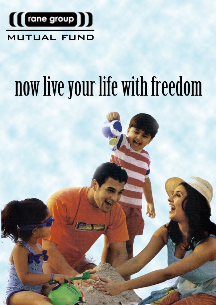
magazine ad. - here i have thought of this freedom idea for promoting mutual funds , ..... a family in a holiday mood ,according to me is a perfect freedom example
anything more left to describe in it ????

press ad. - frame type design ....

brochure inside

brochure outside

website - plz comment on this website design....

poly pack - a polypack designed , keeping in mind the construction work done by the company

perfume pack
gLike
ARENA 1st sem project