
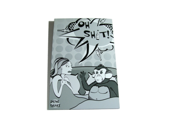
Drink Smart Campaign: illustrated series - I created all of the images for the pieces in Adobe Illustrator. I added statistics to each piece for credibility. These were designed to reach college students/young adults and get the serious message across through fun illustrations that don't talk down or try to persuade through depressing imagery. To develop this campaign, I created a unified appearance with repeated images that appear in each piece (dots and figures, the Drink Smart logo, the lamp and the thought/speech bubbles).
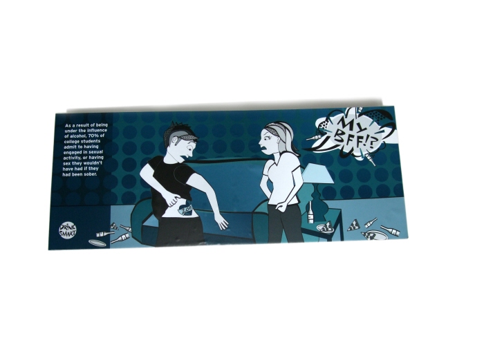
Drink Smart Campaign: illustrated series - I created all of the images for the pieces in Adobe Illustrator. I added statistics to each piece for credibility. These were designed to reach college students/young adults and get the serious message across through fun illustrations that don't talk down or try to persuade through depressing imagery. To develop this campaign, I created a unified appearance with repeated images that appear in each piece (dots and figures, the Drink Smart logo, the lamp and the thought/speech bubbles).
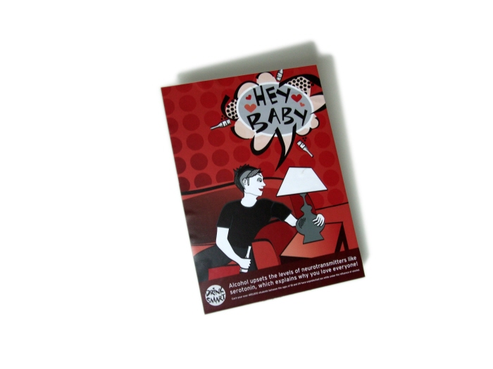
Drink Smart Campaign: illustrated series - I created all of the images for the pieces in Adobe Illustrator. I added statistics to each piece for credibility. These were designed to reach college students/young adults and get the serious message across through fun illustrations that don't talk down or try to persuade through depressing imagery. To develop this campaign, I created a unified appearance with repeated images that appear in each piece (dots and figures, the Drink Smart logo, the lamp and the thought/speech bubbles).
Drink Smart Campaign: illustrated series - I created all of the images for the pieces in Adobe Illustrator. I added statistics to each piece for credibility. These were designed to reach college students/young adults and get the serious message across through fun illustrations that don't talk down or try to persuade through depressing imagery. To develop this campaign, I created a unified appearance with repeated images that appear in each piece (dots and figures, the Drink Smart logo, the lamp and the thought/speech bubbles).

Bellezza Lingerie wordmark
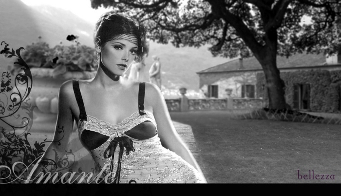
Bellezza Lingerie Campaign - For this project I designed the identity, magazine advertisements and invitation for a fictional group created lingerie company, Bellezza. Bellezza was designed to compete with Victoria's Secret and consists of 3 lingerie lines, Amante, Carina and Sempre. Each line has a different target market and I designed the advertisements to reach each line's specific customer base.
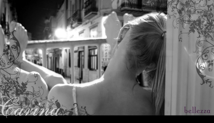
Bellezza Lingerie Campaign - For this project I designed the identity, magazine advertisements and invitation for a fictional group created lingerie company, Bellezza. Bellezza was designed to compete with Victoria's Secret and consists of 3 lingerie lines, Amante, Carina and Sempre. Each line has a different target market and I designed the advertisements to reach each line's specific customer base.

Bellezza Lingerie Campaign - For this project I designed the identity, magazine advertisements and invitation for a fictional group created lingerie company, Bellezza. Bellezza was designed to compete with Victoria's Secret and consists of 3 lingerie lines, Amante, Carina and Sempre. Each line has a different target market and I designed the advertisements to reach each line's specific customer base.

Gold Coast Identity and Campaign - Identity and Campaign design to reach a specific target audience of surfers and thrill seekers and persuade them to visit Gold Coast, Australia. The final logo design and alternates were designed to be bold while the symbol relates to the Ace of spades card to symbolize extreme thrill seeking. The symbol consists of two waves to show the surfing and coastal side of Gold Coast and a mountain on the bottom to symbolize the adventures that can be sought in the hinterland regions.

Gold Coast Identity and Campaign logos - Identity and Campaign design to reach a specific target audience of surfers and thrill seekers and persuade them to visit Gold Coast, Australia. The final logo design and alternates were designed to be bold while the symbol relates to the Ace of spades card to symbolize extreme thrill seeking. The symbol consists of two waves to show the surfing and coastal side of Gold Coast and a mountain on the bottom to symbolize the adventures that can be sought in the hinterland regions.

Galvani Electronics Wordmark

Galvani Electronics Logo - Galvani Electronics is a fictional company that sells high-end luxury electronics. The wordmark was designed to be elegantly simple and the symbol was made using the G letterform from the wordmark. It mimics circuitry to relate to the company's product base. The entire identity relies on simplistic design, including a limited color palette of black, white and silver/grey.
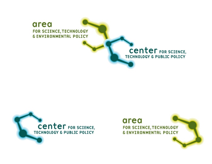
Area/Center for Science, Technology & Policy - The identity system logo uses an abstract carbon molecule to represent science. Green relates to the Environmental Policy of the Area and blue relates to the Public Policy of the Center. The logos work together and can even be connected to show collaboration.
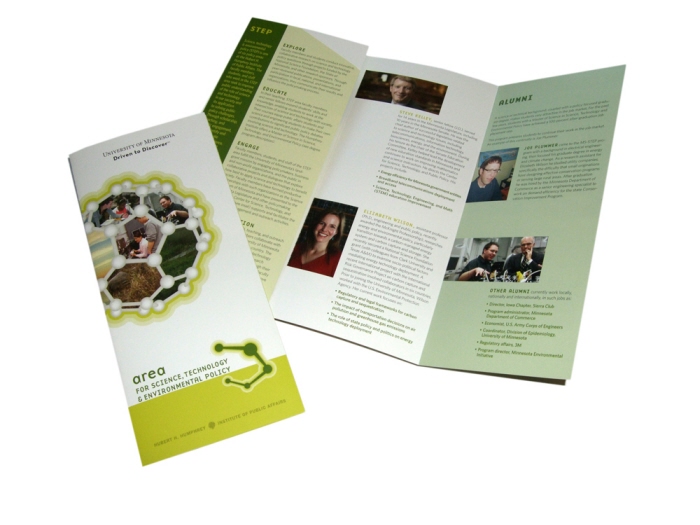
Area/Center for Science, Technology & Policy - The brochure for the Area was designed to inform potential students about the program and faculty. It appeals to students while building the new visual idenity. Other applications include a banner, table runner, stationery and PowerPoint templates.
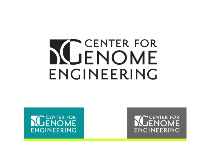
Center for Genome Engineering Identity - Logo designed be modern/cutting-edge and to show stability and chromosomal targeting and change.

Galvani Electronics business system - Galvani Electronics is a fictional company that sells high-end luxury electronics. The entire identity relies on simplistic design, including a limited color palette of black, white and silver/grey. The business system includes a letterhead with metallic silver accents, a silver lined envelope and a business card. Both the business card and letterhead have a black matte coated back printed with the Galvani logo.

Galvani Electronics Packaging - Galvani Electronics is a fictional company that sells high-end luxury electronics. The entire identity relies on simplistic design, including a limited color palette of black, white and silver/grey. The packaging for a Galvani mobile phone is a black matte hinged box with a silver embossed magnetic fastener. The inside is lined with black velvet and has a form fitting groove that keeps the phone in place.

Bellezza LIngerie campaign
gLike