
Letterpress Type - I hand set the type and used a letterpress to create the prints.

Vandercook Prints - I created the "Homemade" prints using polymer plates of my hand-drawn, 1950s inspired illustration and type on a Vandercook printing press. 2 plates were used to create the final piece, one using pink ink and the other using green.

Rock & Roll 1 - Rock and Roll bursting through it's own definition.
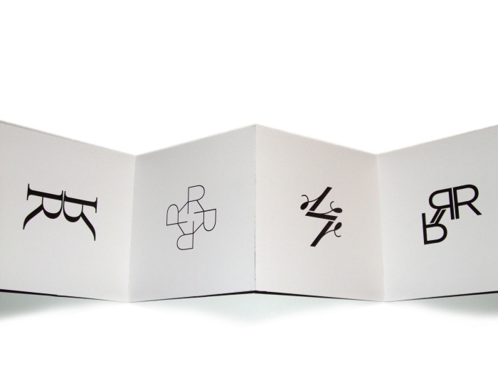
Just Rs - Experimenting with different R letterforms.

Rock & Roll 2 - Expressive rock and roll typography using only Rs from the Gotham font family.

Sun of Ss - Using S letterforms from various typefaces to create an abstract sun design.

The City is at War - An expressive typographic representation of "The City is at War" lyrics. The purple ampersands and clean type represent the "young and rich" where as the grungy brown type contrasts the young and rich and represents a counterculture of society.

Collage designed using magazine clippings to visually express the type poem (see next image). Individual letters "rain" used to illustrate rain.

Designed using clippings from one sheet of newspaper.
gLike