
The challenge: to bring unity to the brand without diluting the equity the name had established.
Design Solution:
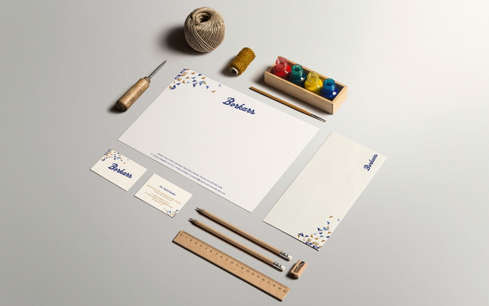
From Cartons-a primary product of Borkars' Corrugated Boxes---came the Square. The Square simplified gave us the Triangle… and our design inspiration. Triangles represent equilibrium, and growth.
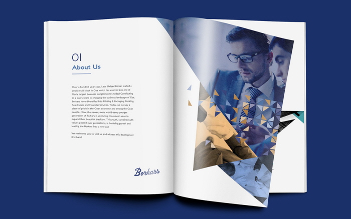
Multiple triangles create new shapes, while retaining the characteristics of each piece. As Borkars many businesses so successfully did.
The Logo: The stylized signature symbolizing the brand’s promise gave shape to the customer-trust they had built over the years.
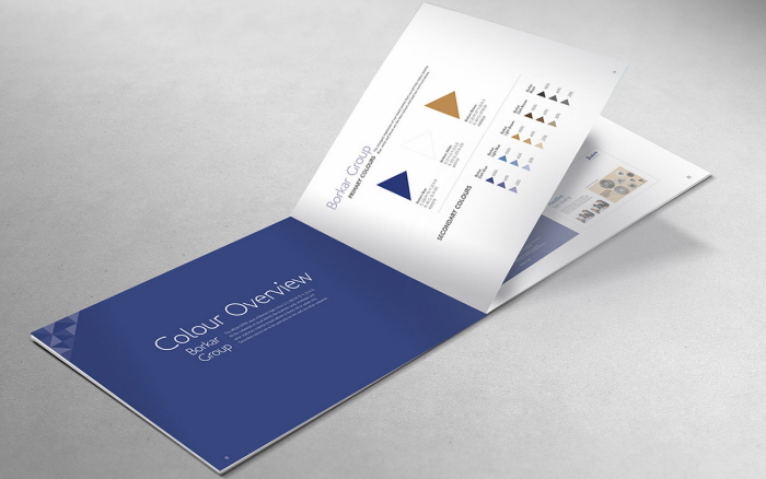
Building Synergy: Going forward, each disparate SBU within the group would use the same design, with the logo colour changing according to industry segments.
@ Velocita Brand Consultants