Band posters and Gig Guides featuring our made up bands, venues and record labels (and lots of my friends and family!) ranging from DIY photocopied flyers to glossy, professional promotional materials. The brief was to give this background dressing for our clubs and venues a cool, scuzzy atmosphere
Development of the D&ME logo. Combining the bold font Amanda liked from option 1 with the incorporated "and" from option 3, then experimenting with different ampersand ideas until we arrived at the final logo.
Here are some selected highlights from the various issues of our music magazine D&ME (any resemblance to the NME is purely coincidental.) It was great fun developing the house style and coming up with all those terrible puns. We were lucky enough to get permission to use some fabulous images of real bands from Mark Tilson (all images his copyright) as well as some cleared album artwork of the era. The rest are illustrations, photos, bands and brands made by me (with the exception of Arrowsmiths cigarettes, designed by wonderful Graphics Assistant Gail Pearce) The Classified Ads page is my masterpiece.
An issue of D&ME in action (copyright Dolly Wilde Productions Ltd.)
At the opposite end of the scale to D&ME we had 'Culture, Alienation, Boredom and Despair' the amature zine produced by Dolly's brother. This is a classic case of Be Careful What You Wish For because in the original division of labour, I was not given the zine, I lamented this decision vociforously, then was asked to do it afterall at the last minute! So, with zero time or preparation I frantically threw anything and everything into it, typing, snipping, scribbling, pasting and photocopying like my life depended on it, and this was the result. Hopefully it adds an element of fidelity to the real zine-making process! (Happy Mondays photography copyright Mark Tilson)
The next issue (80s special!) was never actually seen as a finished zine, but rather as odd pages for Krissi to be working on - these were all produced at various degrees of completion to be used as needed
The final zine was Dolly's love letter to John Kite and contains a whole host of Easter Eggs from the source novel - of course you never see the inside pages, but I know they're there!(photography by Sven Arnsen)
Zines in action (copyright Dolly Wilde Productions Ltd.)
For our fictional musician, John Kite, I made four album sleeves working with the great images produced by Sven Arnstein and adding in photography and graphic elements of my own. The brief was "Bob Dylan meets Jeff Buckley, but distinctively Welsh working-class."
For John Kite's singles, I wanted to expand upon elements from album sleeves to tie them together as a collection. I also used one of the rejected logo versions, to show a progression of the style over time. (John Kite photography by Sven Arnsen)
I offered three different ideas for the John Kite logo, of which Amanda liked the scribbly handwritten one. We developed this a bit further before settling on the final design.
One of the most challenging graphics to produce was a bus stop tour poster, on which the image of John Kite comes to life. The original concept was to use the photograph which had already been selected as the album cover and have Alfie Allen dramatically leaping out of the poster. SFX were worried about the way his head would overlap the logo as he jumped, so it was moved into a box. There were still concerns about the unpredictability of the jumping movement (and we also discovered that the bus stop was much narrower than we'd been told, so to keep to scale, his hands would have had to be chopped off!) So we chose a different image from the same photoshoot, allowing Alfie to smoothly step out of the poster instead! SFX still felt the text was too close, so I simplified the design to leave plenty of safe, blank space. As a natural maximalist, this was very hard for me!
The poster in action (copyright Dolly Wilde Productions Ltd.) There was a tremendous amount of pressure on this. The dimensions in the image - particularly head size and height (yes, I did have to ask someone in wardrobe to measure Alfie Allen's head!) and stool height *had* to match the real proportions, otherwise the shot wouldn't match up. No one screamed at me about it being ruined, so I assume it all went alright on the day!
The *other* animated poster for the film involved a fictional Bjork (later to become Un-named Icelandic Singer, any resemblance to Bjork purely coincidental.) Luckily, for this one we already had the green screen footage of the actress, so could take a still from that and work the poster around it. My original design for the poster was intense and surreal inspired by Bjork's early-90s music videos, but Amanda wanted something much softer and more ethereal, with the actress almost blending with the landscape. Eventually we had to lose the logo entirely, due to the afore-mentioned legal concerns.
Development of our Bjork logo. This needed to be in quirky Bjork-world, but not similar enough to any versions of her existing logo to get us into trouble.
Logo designs for our fictional record labels
Zine-style montage backgrounds created for end credits, but unused.
Zine-style hand illustrated HOD credits
Proposed type and lettering styles for use in end credits.
"Prop" items and credits, designed to give some hints about what happened next in Dolly's life. I think most of these ended up not being used.
The logo for Dolly's dad's slightly over-ambitious solo musical project
Coming up with the somewhat naff identity for Mayonnaise was possibly one of my favourite tasks for this job. I heard a rumour Paddy Considine wanted to play Pat Morrigan as a 50s greaser until he saw my mock ups for this - which were his head Photoshopped onto Brad Pitt's 80s modelling shots! - and realised Phil Collins was the way to go (Photography copyright Sven Arnsen)
A (hopefully) suitably 90s hair dye box
Another clearance headache involved a copy of 'The Female Eunuch' by Germaine Greer. We couldn't get permission to use the original cover artwork, so I put together some rough ideas in a similar vein. Unfortunately, we had to get approval from Ms. Greer herself, who found my humble attempts to be "an embarassing representation" of the original cover and refused to engage further! Eventually we had to use a vanilla cover to avoid any issues.
Thank fully there were no such problems with the film's other scripted novel. A rare example of a prop with absolutely no design changes from start to finish!
Large corporate artworks for the LCP foyer. The brief was "retro op-art." Idea 3 was chosen, with a tweak of the colour scheme to match other elements in the foyer.
Logo development for Central Publishing UK, later to become London Central Publishing
The development of the 'Today in the Midlands' logo is a great example of the process we go through when there isn't a fixed concept at the beginning. The original brief was "90s regional news, with some kind of visual representation of the midlands," which evolved into "90s magazine/chat show, with a sun" which got some colour scheme input as the set design emerged and then somehow looped back to the blue and peach midlands diamond we started with!
The Today in the Midlands set (copyright Dolly Wilde Productions Ltd.)
Another fun little job was making some very blocky 90s content for the computer screens in the D&ME office
A lovely idea in the script, which ended up not being used, was to have hand-drawn captions at certain points, almost like a visual diary. These were my mock-ups when we were experimenting with different ideas for this.
gLike
How to Build a Girl (Feature Film, 2018)

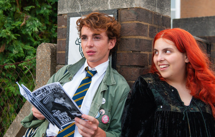
As a massive indie music fan, How to Build a Girl - a British feature film set in 1993, based on the novel by Caitlin Moran - felt like a perfect job for me.

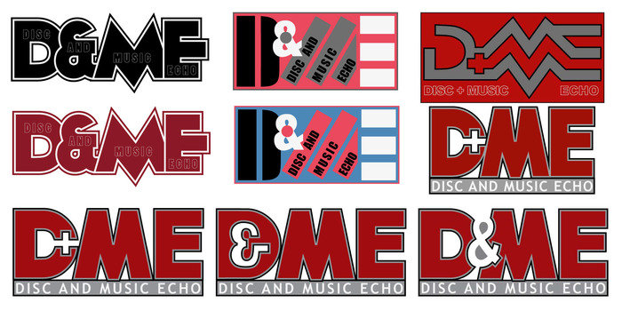
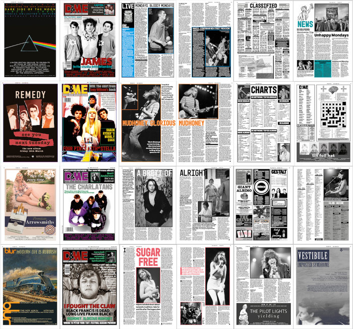
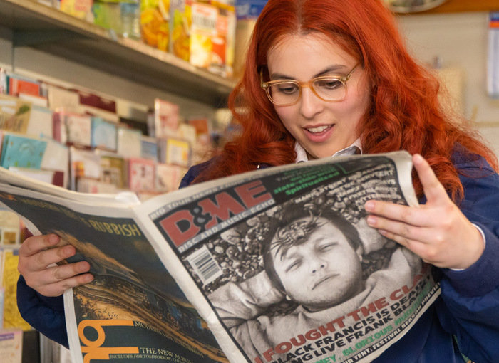
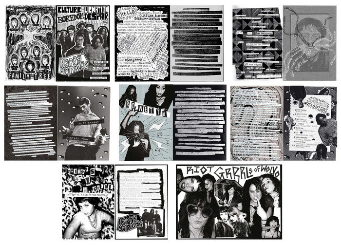
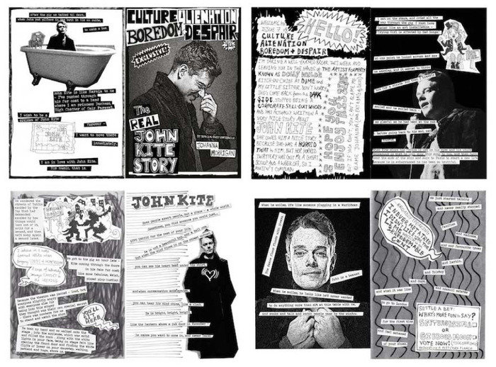
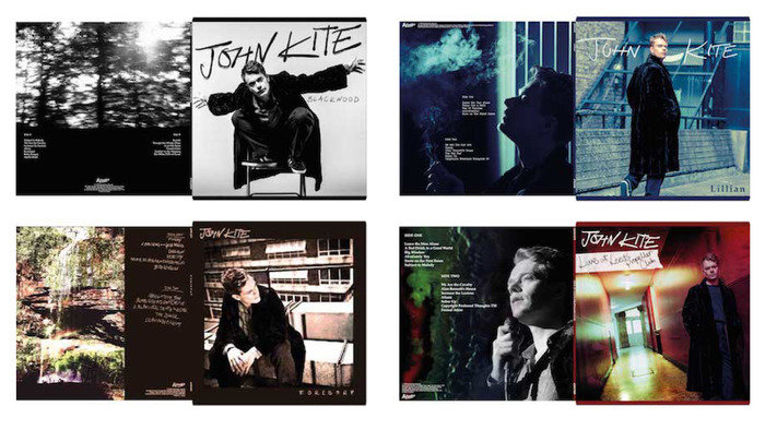
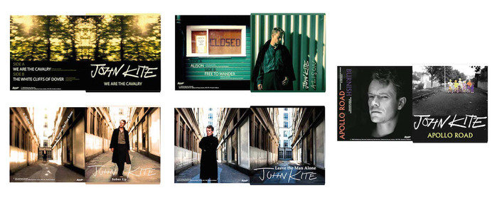
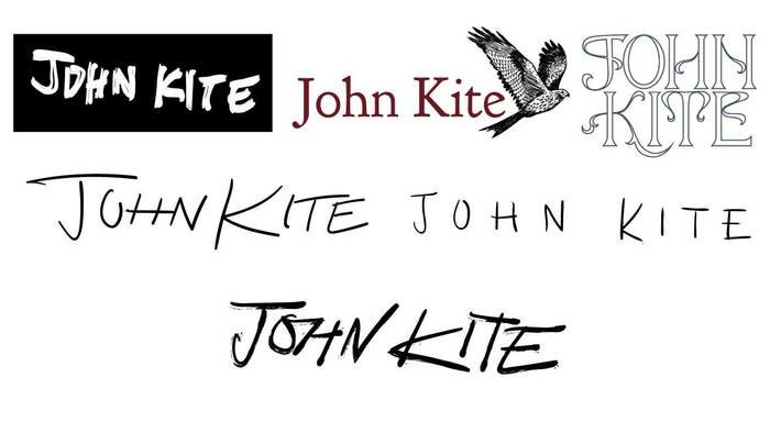
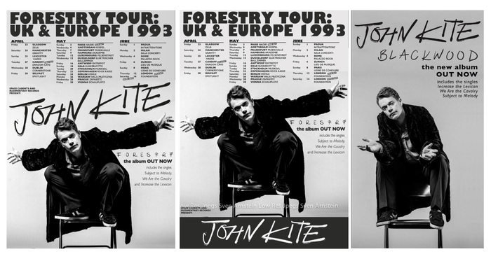
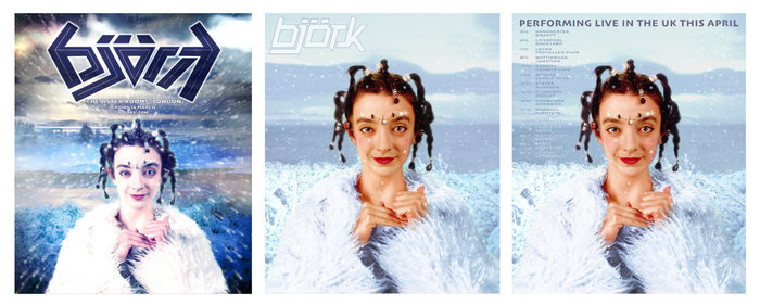
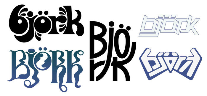
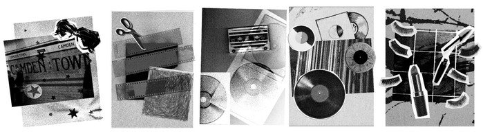
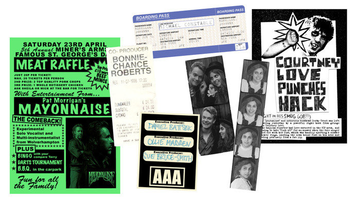
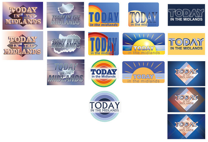
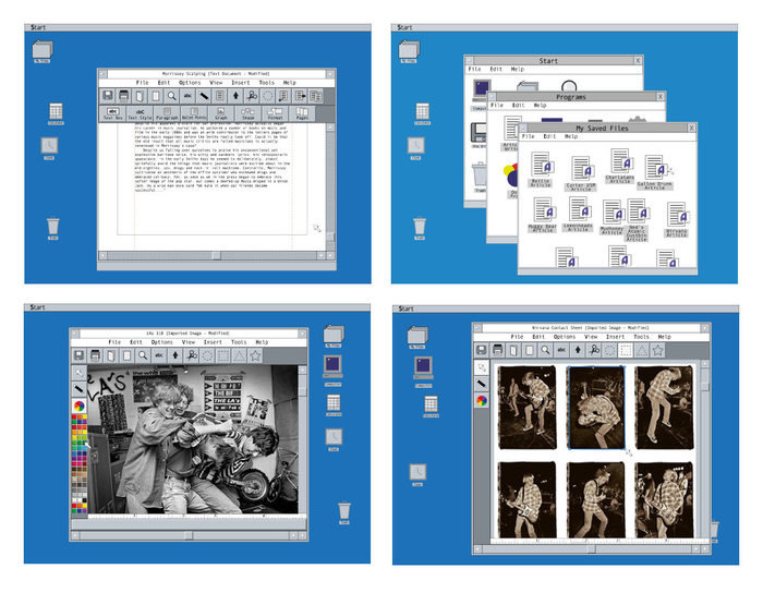
I worked as Lead Graphic Designer, producing the full gamut of music press from published magazines to amateur zines, featuring real and imagined artists; posters, albums and ephemera for hero character John Kite; band logos, record companies, music venues, and a local news magazine show.

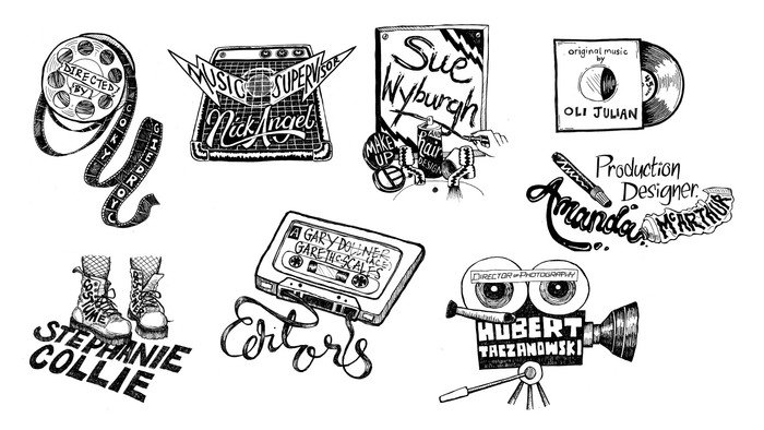
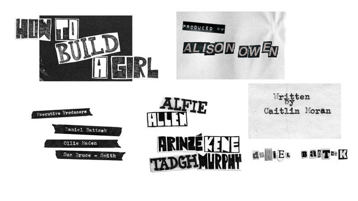
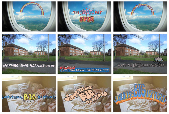
A couple of exciting "firsts" on this job: I was closely involved in the post-production phase, as several graphic elements were animated in post, so had to be created with this process in mind. I also contributed a number of bespoke graphics and images for the closing credits.

View Website
Available
Freelance, Full-time
Lucy Bullen
Prop Maker, Illustrator and Graphic Designer Sheffield, United Kingdom