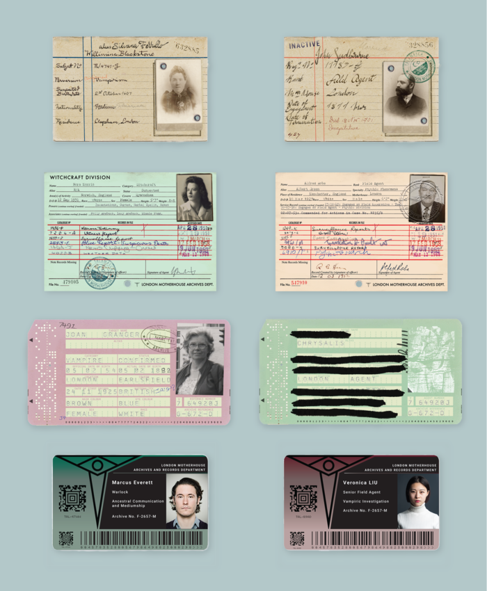
My first task was to come up with concepts for the Motherhouse Archive, which contained record cards detailing Agents and the subjects they were observing over hundreds of years. We created four distinct record card styles showing the development of the archive over time: Victorian, 1940s, 1980s and present day with a colour coding system for Witches, Vampires and Agents. I had loads of fun researching different record keeping systems.
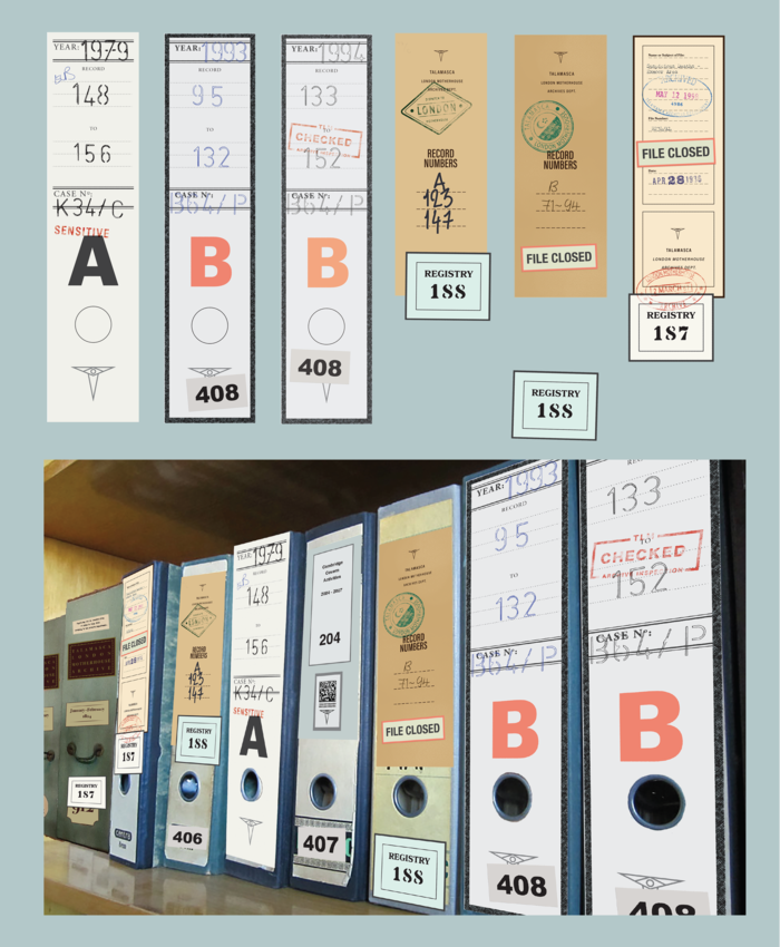
The paper records in the archive of course needed to be stored in files, so we devised another set of filing systems developing through time. It was great to be able to create layers of graphics with older files being repeatedly relabelled, stamped and reclassified by subsequent systems.
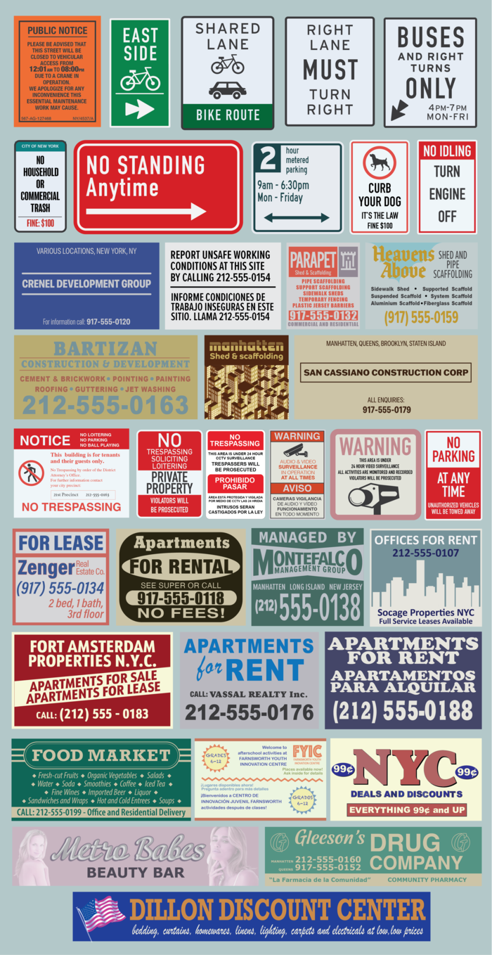
My next task was to create dressing and cover-up signage to help sell a Glasgow (that then became Manchester!) location as a New York City street
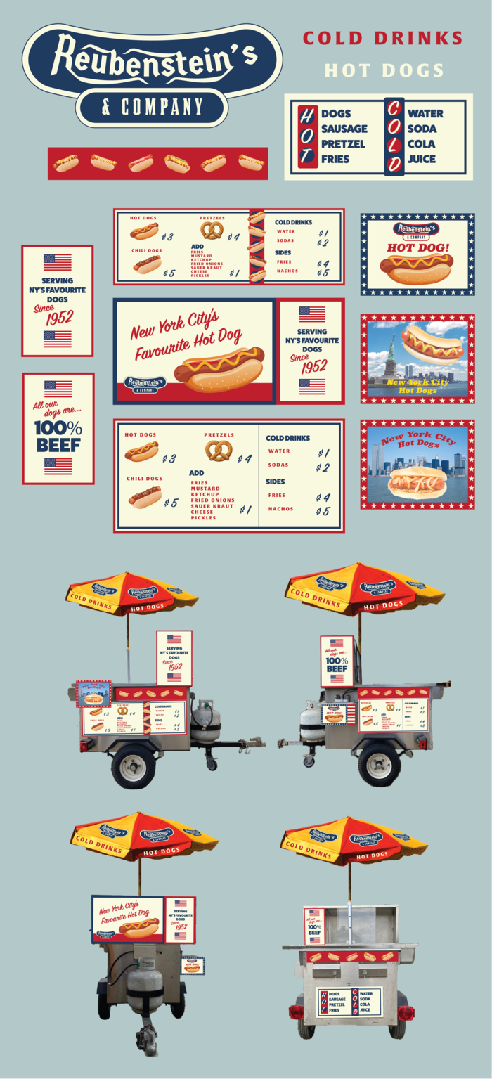
Nothing immediately says "New York street" quite like a hot dog cart and we had not one, but two, to make graphics for. To differentiate them, we made this one a neater, more corporate design (although I was still keen to add a small personal touch with the faded hot dog on NY skyline photos, to say this stand has been here forever!)
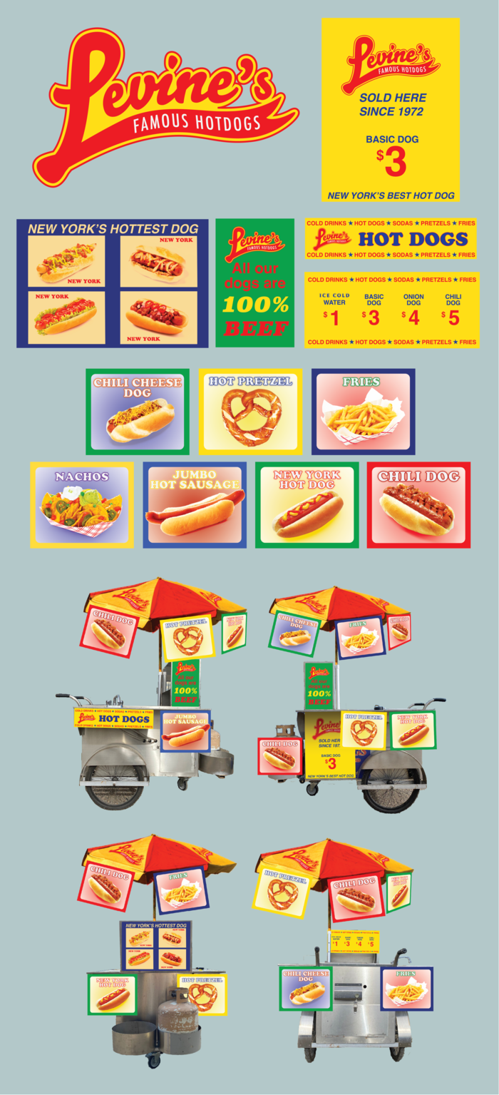
And this stand was a more chaotic, one man band kind of hot dog stand. In the research my favourite stands were the ones with very basic graphics, almost weighed down with the amount of faded photographs stuck on every available surface that looked like they hadn't been updated in decades. That was the look I was trying to capture here.
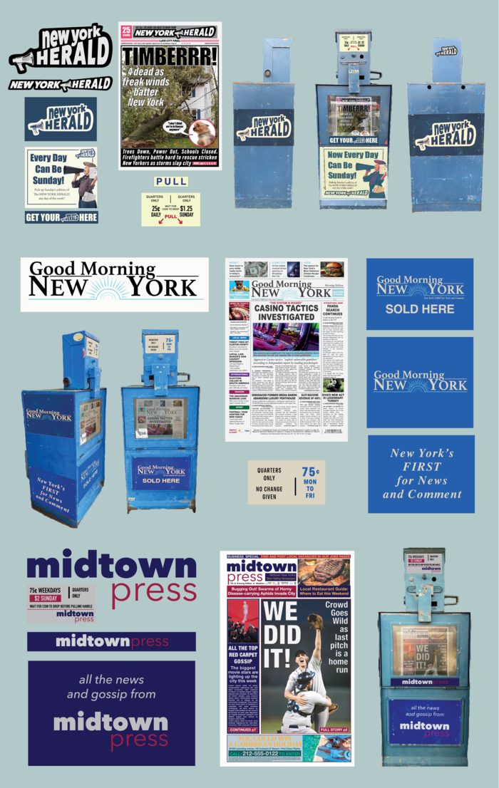
Another feature that shouts America is the newspaper dispenser. I designed branding for three different New York papers, as well as signage for the dispensers themselves and newspaper front pages to be displayed inside.
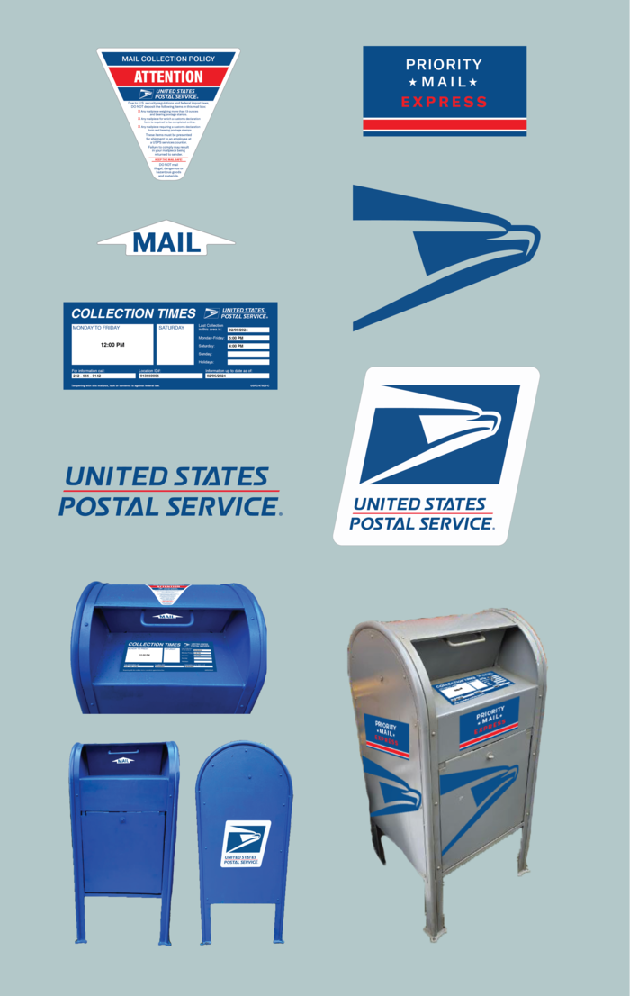
My final pieces of street furniture were a pair of postboxes. This was just a case of replicating the real thing, including all the little details a postbox should have.
gLike
Talamasca: The Secret Order (TV Series, 2024)
A really fun little project helping out the Talamasca Graphic Design team, working under Lead Designer Thomas Love. The Talamaca is the Secret Society that observes Vampires, Witches and other supernatural creatures in Anne Rice's Interview with a Vampire/Mayfair Witches universe.

Available
Freelance, Full-time
Lucy Bullen
Prop Maker, Illustrator and Graphic Designer
Sheffield, United Kingdom