
The initial concept was just a half balcony with type in the negative space.
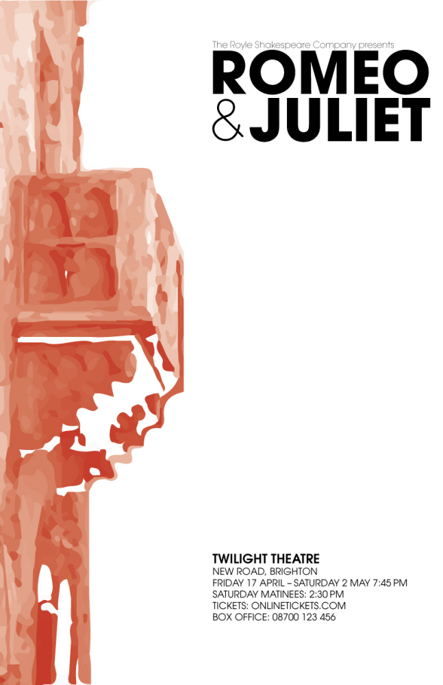
After receiving criticism from my peers, I decided to extend the bleed on the balcony to encompass the entirety of the page.
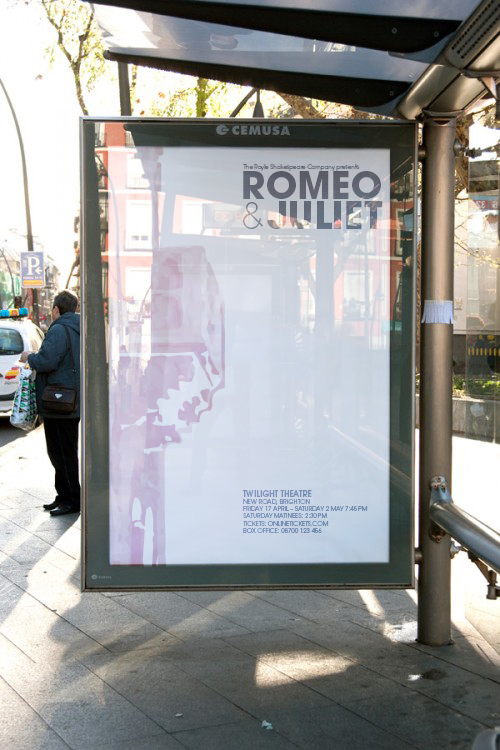
I created this mockup using Adobe Photoshop so that the client could envision the poster in a real setting so that they could get a sense of the scale.
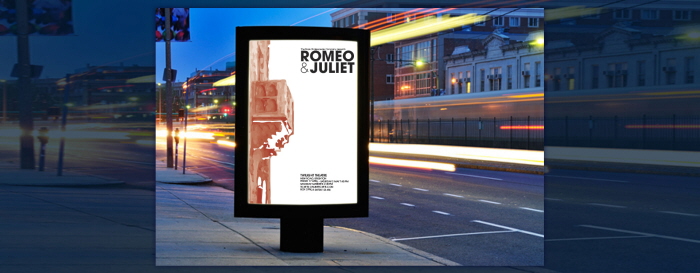
Another mockup.
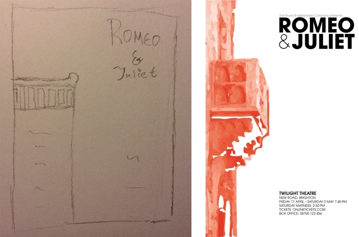
Before and After.
View PDF
View PDF
gLike
Romeo And Juliet Poster
In this poster challenge, we were supposed to create a new poster for a fictitious company. In this assignment I had to take a sketch and create a poster based on it. Using Adobe Illustrator, I was able to bring my idea to life and give it a visual impact. I also mocked it up so that the client could envision how it would look mounted.