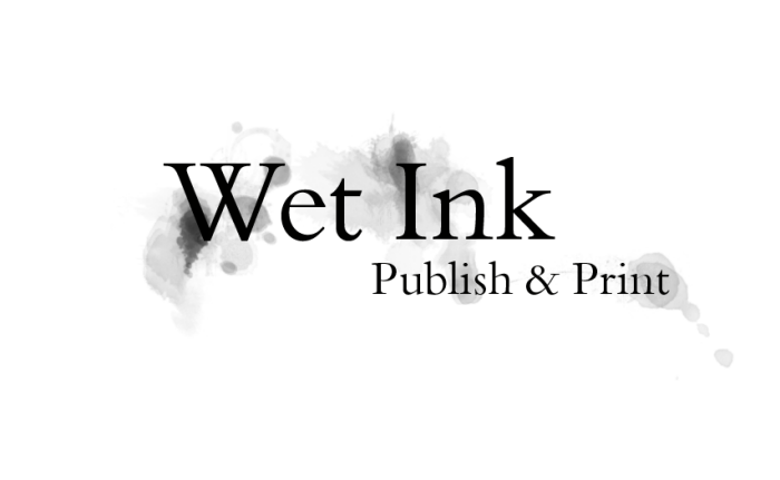
Logo design for niche on-demand publisher.
The client had initially requested a simple cartoon of spilled ink, but I felt that did not fit the generally more sophisticated tone of the materials they published, from corporate reports to contemporary poetry. The client took to this design instantly upon seeing it.
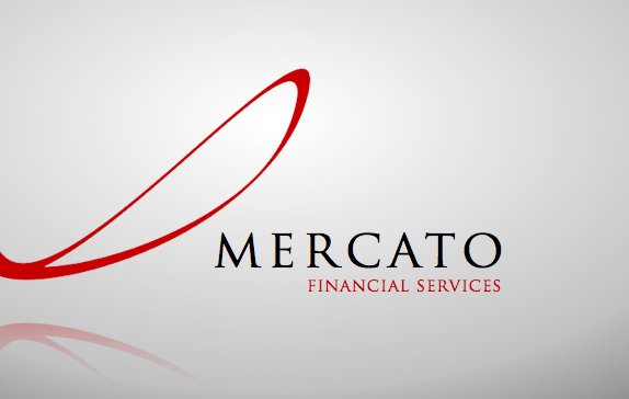
Brand/logo for finance company.
The client requested a sleek, businesses-like yet dynamic look. This design established the corporate palette of bold red and cool grey. The loop continually leads the eye back to the name, and its shape suggests a growth line, a tick and an infinity symbol.
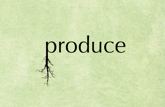
Brand/ logo for a gourmet organic-food cafe.
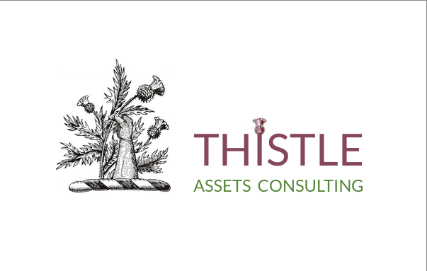
Brand/ logo for assets consulting firm.
The client requested a bold design that referenced his fierce Scottish heritage.
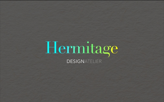
Rebranding/ logo for design studio.
The client wanted a design that used elegant, classical lettering with a modern twist, and expressed a preference for blue and gold. Modifying the typography slightly gave the design a contemporary edge.

Rebranding/ logo for design studio, 'white' version.
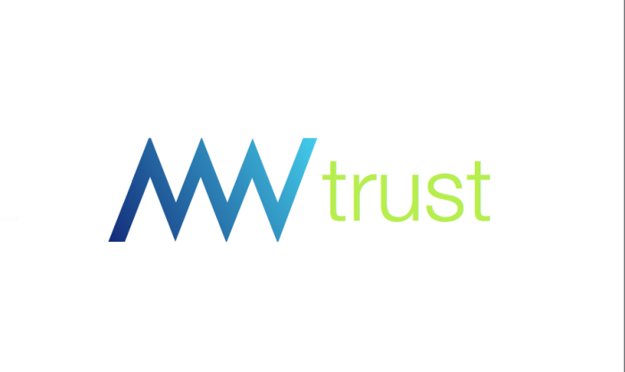
Brand//logo for Mountains Waters trust, an ecological agency monitoring mountain wetland environments in the Blue Mountains, Australia; a world heritage area of incredible natural beauty.
The combined initials form the iconic peaks of the Three Sisters, a celebrated Mountains landmark. The colours refer to still and flowing waters and the green of new growth for a very clean look.
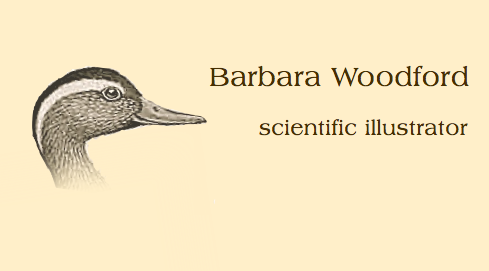
Brand/logo for a freelance scientific illustrator.
Although the client had initially suggested a simple monogram, I felt using one of her own illustrations would be more eye-catching. The client kept a variety of ducks and geese, including a particularly handsome drake who kept wandering into the house to inspect our meeting...so he became the poster duck for her business.
The client later has this design made into a literal shingle for her gate, with pyrography on wood.

Identity design for Altitude, an interior design company based in the Blue Mountains.
The typography is modified so the letter 'l' in 'altitude' suggests an altimeter, with the brand name 'rising'. The taupe colour with a pop of red was suggested by the client, in line with the philosophy that good design should be unobtrusive.

Brand/identity design for a reiki usui school.
At my first meeting with the client, I had brought some sketches and Asian-style brush paintings, to introduce a distinctive, hand-crafted element. The client eventually settled on a painting of mountains, but thoughout the meeting I had noticed his eyes being continually drawn back to the bamboo. That evening, I painted some stalks of bamboo, rather than mountains.
The next morning, I bumped into the client in the street- just as he had finished leaving me a message changing his mind and requesting the bamboo design instead!
This was my first presented design.

Second presented design for reiki usui school.
Although the client had liked my initial design, he requested it be simplified for reasons of print cost. I decided to retain the red of the seal, to emphasise the vitality of reiki. The bamboo was rendered in a half-tone grey, still evocative of Asian philosophy but also suggesting the mountain mist, giving a sense of place that was satisfying.

Third design for reiki usui school.
After using the grey-and-red design for a few months, the client was able to return to the two colour design. This became the basis for their hand-designed grade certificates as well.

The clients requested a strong logo that would be easy to reproduce on uniforms.
As a great many security logos use shields, I decided to play on the company name and use a portcullis, the barbed steel gate of the castle, as a bold, graphic design. The simplified graphic and the colours were chosen to tie in with, and be easy to reproduce on, existing uniforms.


Brand identity for Melbourne games and media development agency, incorporating a digital manipulation of an Asian-style ink painting.
gLike
Brand/ logo design
A selection of brand identity/ logo designs, with the stories behind them.