The inspiration: The Prayer Book of Charles the Bold, Christ Appearing to Saint James the Greater, c.1469-1471. Illuminated by Lieven van Lathem, Antwerp. Tempera colors, gold leaf, gold paint, silver paint and ink on parchment. I was taken by the 'shadow box' effect created by white and gold designs against the smoky-blue border, that made the miniature seem even more like a window into the medieval world.
Border elements in the medieval period were often traced or copied from a model book. In this case this was not practical; as was presumably practice with all dark backgrounds, the figures were painted freehand. The figures were drawn with a brush, in barely visible strokes of the watered shadow tone. Care had to be taken to place the drawing strokes exactly, as there was little margin for error. Once the form was established, highlights were placed in white, thinly mixed and applied with very fine, almost invisible strokes with an almost-dry brush. This method of shading, called limning, was the mainstay of illumination technique in fifteenth and sixteenth centuries, and achieving remarkable technical sophistication. A second, more viscous layer of white provided two light tones for each figure; the shadows were limned the same way, with the ground colour forming the middle tone.
Rather than a simple dark blue, the shadow tone was alizarin crimson laid over ultramarine, a painter's trick from the Gottingen Model Book later adopted by artists such as Titian as it provides a richer and more visually recessive tone than simple dark blue, making it ideal for trompe-l'oeil modelling.
Rather than designing the vignette (as borders were called during the 15th century) as a whole, each element was completed separately. Incomplete manuscripts indicate that this was a period practice, allowing the arrangement sufficient flexibility to adapt to the available space. Detailed drawings were made only of tricky areas, to ensure that the elements would work together within the overall design.
The client's coat of Arms in argent, azure and sable (white, blue and black) could fortunately be rendered well in the blue tones of the border. The Peer's cap of maintenance on the helmet is delicately coloured the traditional crimson, surmounted by a coronet of rank. The shield rests on a skull, a common medieval memento mori - a reminder that all worldly honours are fleeting.
Progress around the border, with the lion and badge in gold. You can see the dragon starting to be drawn in at the top.
Border completed, with a bird, a lion, a wyvern and two butterflies all detailed in shell gold amid acanthus foliage. The "blue" flowers (iris, borage and heartsease) fit well into the colour scheme of the border, and were chosen for their late medieval symbolism of devotion, courage and joy in love. Behind the main design, shell gold stars peep through a tangle of briar rose, in arcs and sprays which echo and complement the larger elements.
Miniature of St Catherine in progress, easuring just 72mm x 52 mm (3" x 2"). St Catherine was one of the most popular saints of the Middle Ages, and was chosen as the namesake of the patron and her infant daughter. She is identified by the infamous wheel lying broken on the ground. "Stock" images of St Catherine in numerous manuscripts reveal period illuminators' reliance on model books. With only minor alterations, the same image was used interchangeably for several female saints, although more often in iconic "antique" clothing of the previous century rather than the fashionable Burgundian gown here. The vase of pinks beside her completes the floral parergon, revealing the patron's qualities of devotion, courage, felicity and self-sacrifice. I was aware that I was working backwards here- medieval practice was normally to start with landscape and background and move forward into figures, finishing faces last.
Completed manuscript.
Detail, badge. The border measures only 157 mm x 108mm (6" x 4"), and 39mm (1.5") at the widest. As a badge of the honour, I needed to include pelican in its piety. The border also needed a focal point; logically, that needed to be the badge. I was inspired by contemporary books of hours that showed painted jewels and pilgrim tokens cunningly "pinned" to the pages; handling the badge this way seemed the ticket. I followed medieval practice in laying a ground of ochre, then building up three layers of shell gold over it. The pelican was modelled after a contemporary silver-gilt cup in the form of a pelican in its piety (one drinks from the bird's bottom!), painted with a very dry brush to capture the highlights and shadows a relief design would cast. Finally the pin "through" the page- and the illusion worked.
Detail, lion and Arms.
Finished miniature, with the fairy-tale castle modelled after the ethereal Chateau de Mehun-sur-Yevre. The distorted perspective combined with delicately observed tracery of the tower lanterns and chapel steeple deftly combines the stylistic transitions in late medieval art. I laboured not to overwhelm these delicate areas. Behind, the landscape recedes seemingly for miles, with views of a port city and distant forested crags. Difficult to see here, the moat and river is actually laid silver washed with translucent green to give the effect of shimmering water. This type of distinctive, atmospheric landscape was characteristic of Ghent-Bruges miniatures. The suggestion of space is created by a slightly "impressionistic" handling so that distant objects appear indistinct, and by carefully observed merging of tones in the rich but restrained colour palette.
Completed manuscript, to scale.
gLike
St Catherine Manuscript

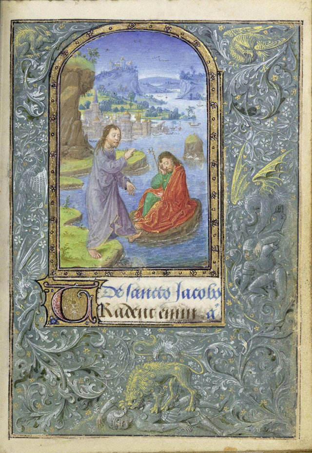
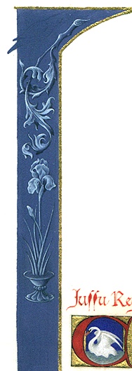
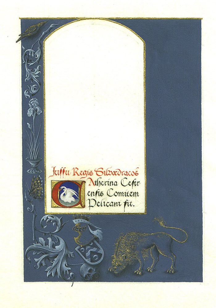
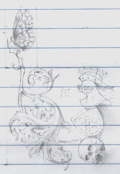
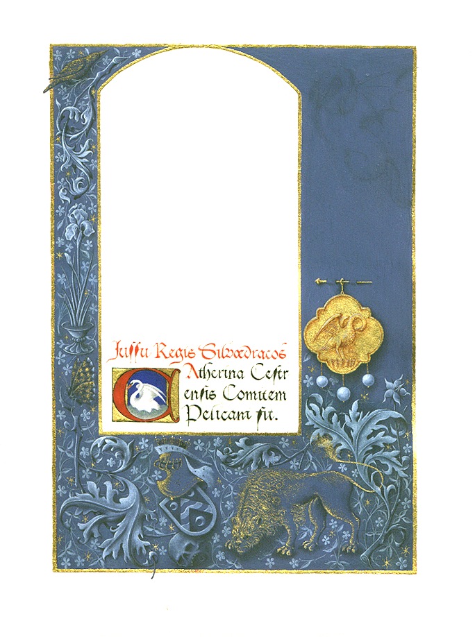
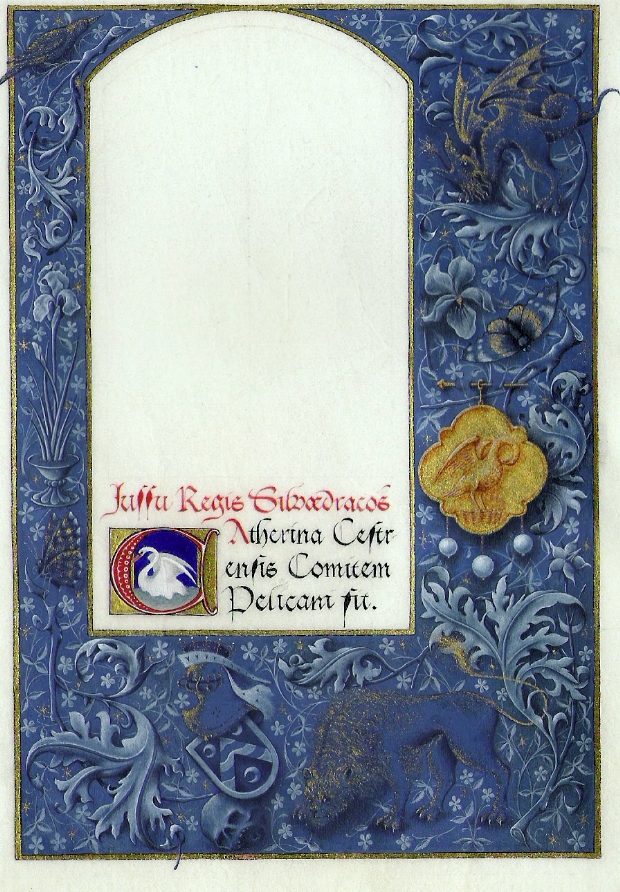
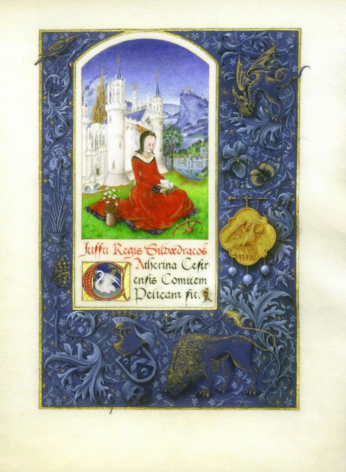
A commission to create an authentic medieval manuscript in celebration of a public honour.

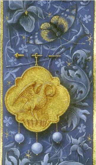
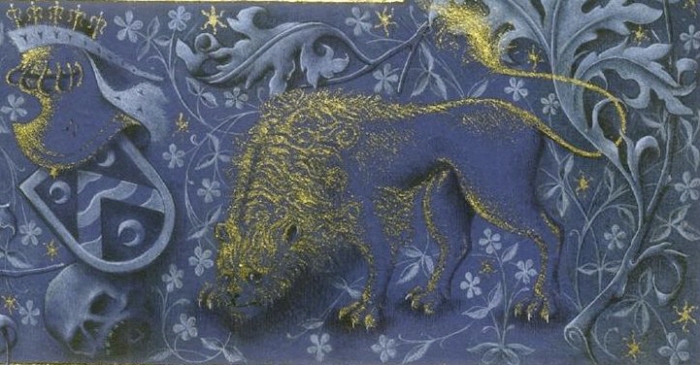
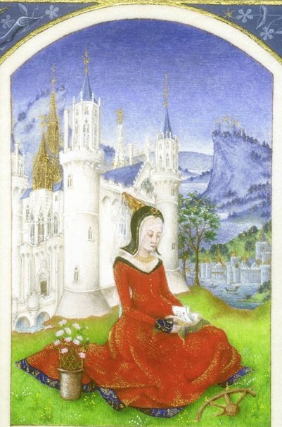
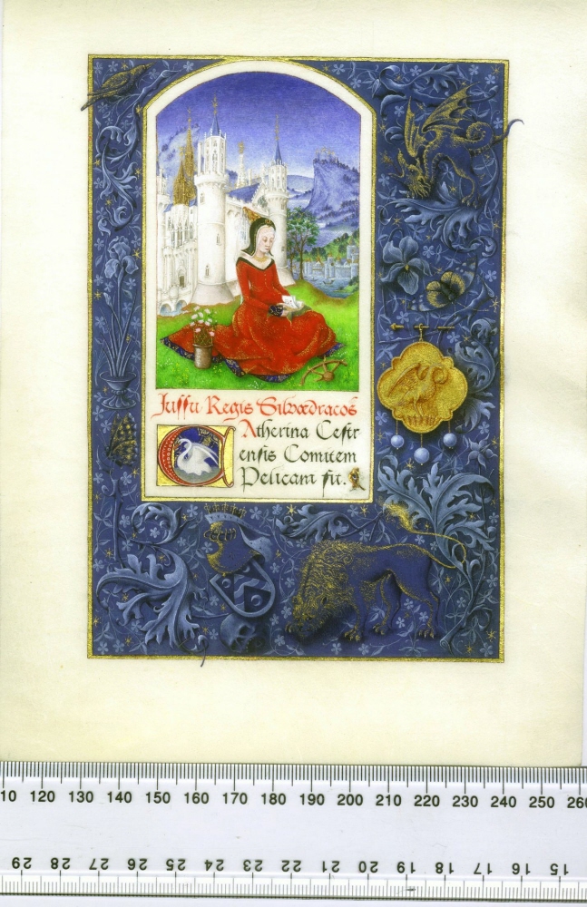
My aim was to emulate as closely as possible to the working process of the medieval illuminator. I especially wanted to include the fashionable "intertextual" relationships between the layers of the image, and the optical tricks which were part of the illuminator's trade.

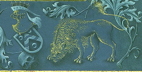
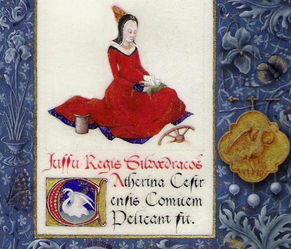
Chinese ink, gold leaf, shell gold and mineral pigments were used on a piece of very fine vellum, measuring 203mm x 152mm (8" x 6").

The script was written with a hand-cut goose quill, the first line rubricated in vermilion. I used top quality 000 sable brushes for the illumination, completely wearing out three during the project.

The project was completed in January 2005, with over 700 hours invested in research into medieval scribe's work. It was an enormous challenge, but an educational and still incredibly rewarding one.