
The jagged fraktur script and elaborate Cadel capitals were favourites in Central European typography. These are based on the album 'Werke der Schönschreibmeister' by FH Brechtel, 1573.
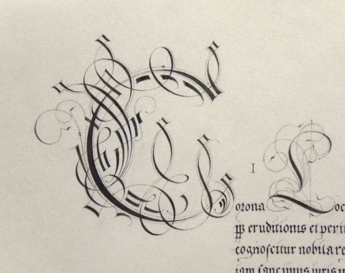
Detail of Cadel capital. These were the mark of the writing master, requiring precision and graphic flamboyance to execute properly,
Although many writing masters' albums eschew painted decoration in favour of pen graphics, a number of important manuscripts feature painted plants, insects and similar. The Brechtel album contained very faint preparatory sketches of a butterfly, a flower and a shell, so I decided to carry that through to offset the client's coat of Arms.
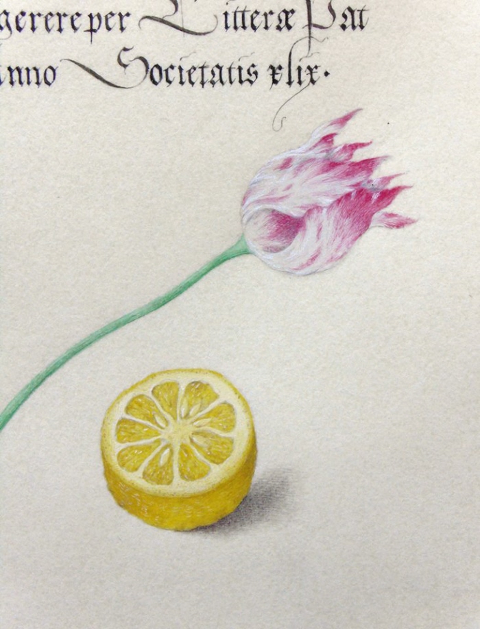
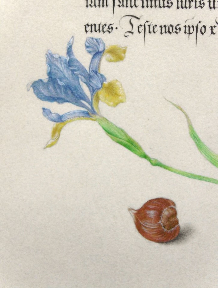
The plants all have symbolic meanings specific to the late middle ages. Contemporary audiences were highly adept at reading nuances of symbol and allegory, and delighted in unriddling the parergon, the secondary visual narrative that such objects formed. I love this idea, such are the depths of my geekdom.
Here, the overall conceit of the decoration is "the virtues of an artisan": iris for devotion and inspiration, as the flower that embodies the trinity in its heaven-blue flower; the tulip stood for accomplishment- shown only partly open, to suggest achievements to come. The lemon symbolises fidelity and temperance, and the hazel with its spiky covering symbolised triumph over sin, and fertility. (The play here is scholarly fertility, drawing on the hazel's pre-medieval association with knowledge.)
gLike
Writing Master's Manuscript
A commission to create an authentic medieval manuscript in celebration of a public honour.
The inspiration was several 16th century manuscripts, including writing masters' albums and books of illuminated naturalia by Joris Hoefnagel.
Chinese lampblack ink and authentic mineral pigments were used, on archival parchmentine paper. Measures 18cm x 26cm.
The project was completed in December 2014, with around 150 hours investing into research and refining late medieval techniques.