
3 colour artwork

Visual created in Cinema 4D and rendered using Redshift
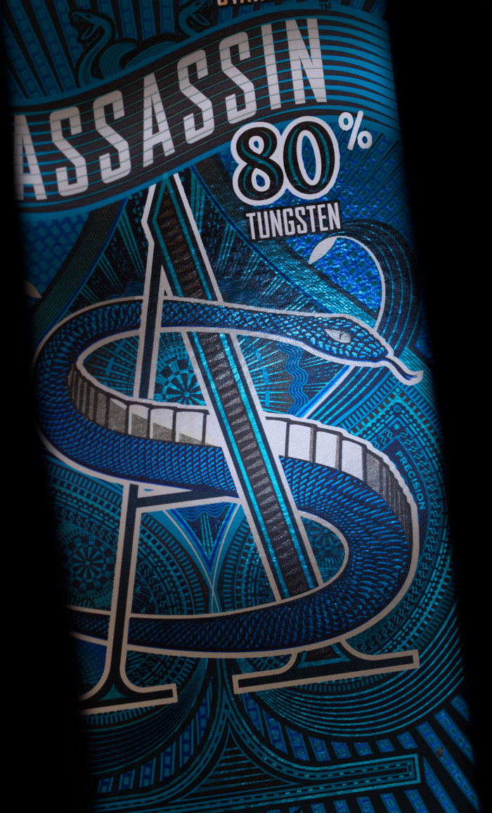
To create the shadow on the snakes belly, I used the natural colour of the substrate.

Product design, graphic design, artwork and product photography. A “double hit” of base white is often needed on foil board.

This is a detailed photo of overprinted pantones on foilboard and base white ink


These Images shows how I have enhanced the graphics by using Pantone colour and varnishes.

By overprinting fine tints of pantone silver on solid black, dark tones that often “fill in” on press can be reclaimed.

Wine label based on a myth local to the Brewery
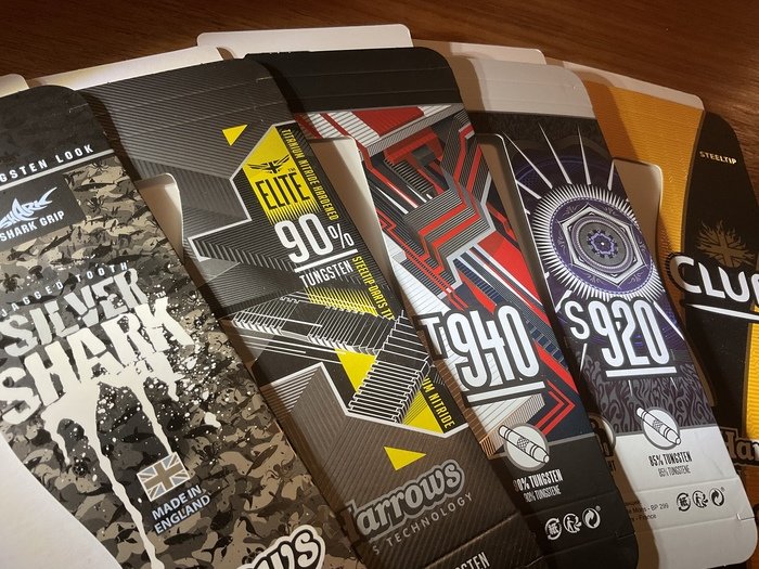
Graphic design and artwork packs on box board and foilboard

Darts look very similar. Strong pack graphics and special print finishes add perceived value

Cutterguide, design and artwork - Base white + cmyk
View PDF
View PDF

Cutterguide and graphic design - Base white, Reflex blue and process cyan
gLike
DESIGN & PRINT
The tactile nature of packaging design does not translate very well on the web. Metallics inks, varnishes, foils and laminates all play a vital role in the work displayed here. I have tried to show a diverse range of design that reflects the global markets where these products are aimed. Particularly the Far East, where the "Made in England" brand is still very strong.