
I designed this for the City of Mooresville's annual street fair with the central sun emphasizing the "outdoors", the colored flags the "festival", and the checkered pennants the "racing".
I really liked this design for the simplicity of the art and the messaging.

This client administers a website devoted to his love of classic spy novels.
The client offered a streamlined package of HR and accounting services aimed at small businesses and municipalities. I pared down the logo design to its barest elements, displaying in black on white and white on black.
This was/is the central branding for a successful race for NC Senate.
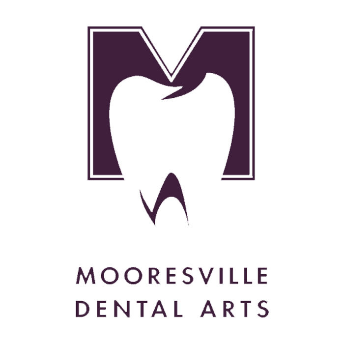
This logo was the beginning of a larger rebranding project for a local dentist, used for stationery and various signage applications. The client really wanted a combination of tooth design and capital "M".
This client is a vendor for custom dyes.

The client is a 'farm to table" restaurant. They wanted a promotional image to complement their existing "Fork!" logo.


This logo was designed for a line of exercise equipment based on tools with wheels.

The client was a candidate for the NC Senate.

"Our Schools First" is a citizens advocacy group formed to promote education in Iredell County. The group was instrumental in the passage of a school bond initiative in the 2014 elections. The signature "school bus yellow" was a dominant element in ads and other promotional materials.

My client is creating a hydraulic lift chair for customers with limited mobility. The goal was to create an effective logo that pleased all parties involved while adhering to Serta's brand guidelines.

This logo was designed for a line of prepackaged middle eastern style foods to be sold in America and abroad. This was the winning concept of six product names and designs.

The client was a (successful) candidate for town commissioner. I emphasized the distinctive "Q" in her last name for the primary visual element.

I developed this name and logo for an artisanal furniture maker.

Beach Lane Collections is an online furniture retailer. The goal was to create an elegant logo that referenced the company name in a clean and modern way.

This logo is for the parent company of the "Copper River" furniture line.

The logo incorporates the candidate's name inside a stylized map of the county.

This client is a magician/performer who does frequent trade show events.

This is one of a number of logo designs I did for the Town of Mooresville. They adopted a branding strategy of a common "M" for all town institutions. This logo for the Chamber of Commerce echoed some aspects of the original design.
This new logo was adopted for the Economic Development Corporation.

This design was presented for the Mooresville Downtown Commission.

The Mooresville-South Iredell Developers Council is a monthly meeting of business and political leaders in the area.

I designed these logos for various political factions in SID MEIER'S ALPHA CENTAURI, a computer game.

Carousel Games produced a line of puzzles, drawing slates, and board games.

This was a proposed design for a planned sports entertainment complex. The owner wanted a strong design element that would allow branding with or without text.

The client wanted a mermaid graphic that incorporated her astrological sign (Pisces) and her son's (Cancer).

This is the original logo I designed for Firaxis Games, a computer gaming company.

The logo started from a computer generated fractal image that I manipulated to get the final design I wanted.
This is the most frequently used iteration of the Langtree logo.

These are standard variations for Langtree and its various offshoots.
Logo design for an event for the Mooresville Senior High School Blue Devils.

Advertising Design Concepts was a marketing company focusing on unusual promotional strategies including "Magic Slate" drawing pads and illustrated floor panels for convention booths. It was through ADC that the State of Racing project came about.

Hospice of Iredell County asked for a logo for their capital campaign that would work with their existing materials.

Fair View Church wanted a fresh approach for their signage and presentation materials. I began with the gothic arch and abstracted it that could be read as the roofline of a classic white frame Methodist church against a blue sky or as road leading to a far horizon.

Area growers formed a coalition to raise their profile among developers and landscapers. The logo I designed was the starting point for a wide range of materials I created for a tour/reception for political and business leaders.

This one-color version was used for applications like embroidery.

These are proposed logos for a company formed to advocate strengthening the nation's electrical grid and promote disaster preparedness.

This is a proposed logo redesign for the town's cable company.

I designed the convention button for 2012's Democratic National Convention in Charlotte.

This was the central design for a candidate for the NC State House of Representatives.

The client wanted a clean but traditional logo to update his company image and be the basis for future branding.

This logo was designed for an early computer package aimed at medical students.

I designed this logo for a fictional news organization in a computer game with a turn of the (20th) century feel.
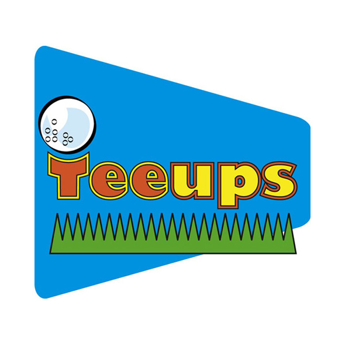
Designed for a mechanical practice aid for golfers.

The Walking Tree was designed for a physical therapist's office. This was a tricky visual to create.
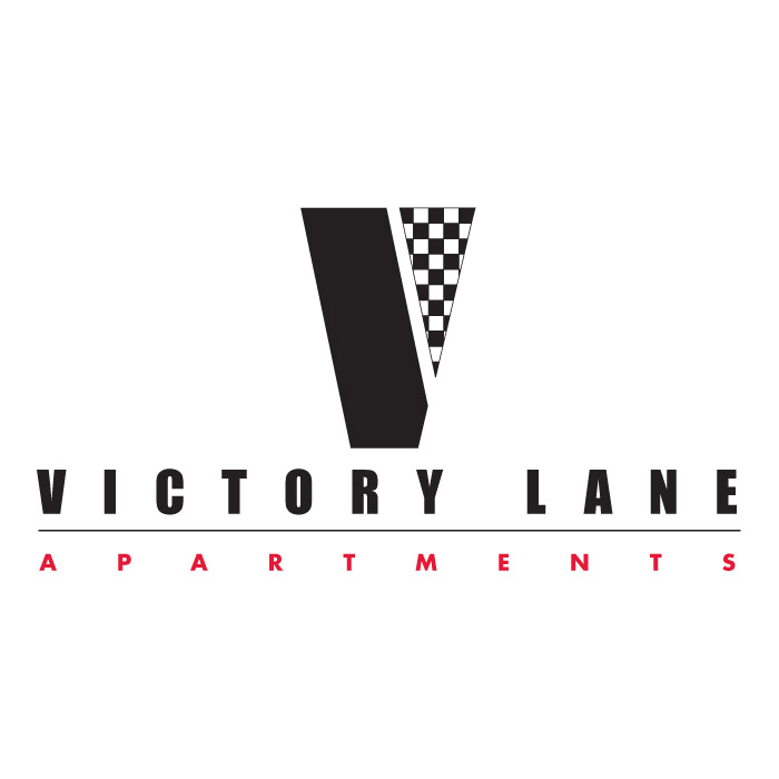
This logo was for a proposed apartment complex aimed at students attending the NASCAR Technical Institute.
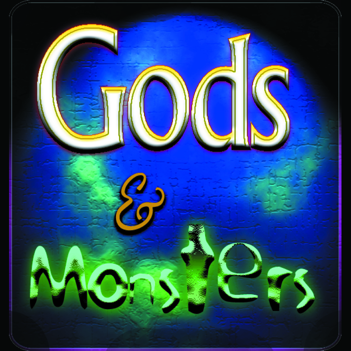
This was a logo for a proposed computer game with a mythological theme.

I designed this for a candidate for the NC Senate.

This was a coalition formed to promote development in these six neighboring counties.

The "Arrow C" logo was done for a mountain cabin rental.

A logo for an independent real estate agent.

This LLC was an arm of a larger development company.

The client needed a logo suitable for her various businesses.

Proposed design for a political consulting company and is a play on the client's last name (Saine). I sourced out possibilities for creating a custom "bishop" as a promotional piece.

I created this logo for a fundraising calendar to benefit a battered women's shelter.

The client is a commercial pool builder in the Southeast.

The client wanted a logo that referenced middle eastern culture with a modern feel.

"Ride The Dragon" is one of my earliest logo designs done for Med Systems (later ScreenPlay), my first computer game company. The company published a line of D & D style fantasy games, I created the tag line for a magazine ad and the logo followed.


Solutions FYS (For Your Success) is a compliance/best practices testing and training business owned and operated by women.
gLike
Logos, Logos, Logos
Here is a broad sampling of logos I created for a variety of clients.