
Redesigned logo for The Rye City Review—a Home Town Media publication—formerly The Rye Sound Shore Review.
Alternate logo for the Rye City Review to be used when a more compact logo is needed.
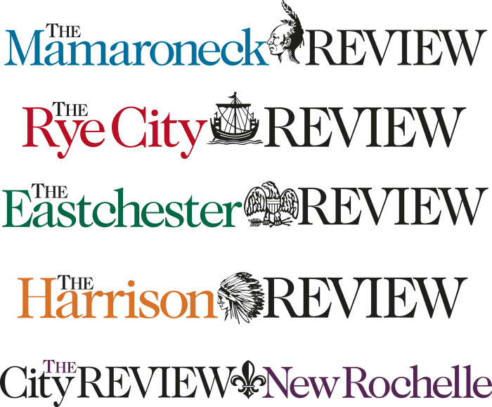
Redesigned logos for all of Home Town Media's publications. The overarching theme of each logo uses the main icon from each of the town/village's city seal which is then incorporated into the logotype of the papers, creating a united identity for all publications. Each paper also has its own alternate logo, similar to the Rye City Review logo above, that is used when an a more compact logo is needed.
gLike
Newspaper logo design