
Axis Logo - This is a logo I designed for a telecommunications firm. Using a radial gradient, I blended two shades of blue to form an interesting tint for the ocean. For the gray effect around the edge, I used the same technique with a gray-black gradient on a circle behind the globe. I traced the continents from a globe photo and used a gray-white gradient on the upper left corner to add some shine. The “X” is made of two cell towers. Finally, the lettering was given a 3D effect to make them stand out.
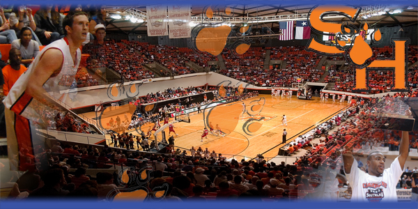
College website banner 1 - This is one photo blending project of two I did for a college basketball team. In this work, I used layer and image masks to blend the photos into one another. I used the orange paw prints to draw the eye across the screen, going past the photos and aiming at the team logo in the upper right corner. Finally, I added a blue tint to the top and bottom of the work to offset the amount of orange used elsewhere in the picture.
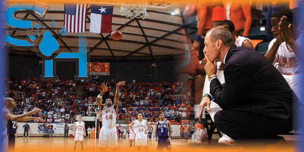
College website banner 2 - Here, I created a photo blend for a college basketball team. I used masks to seamlessly blend the two photos together. I faced the coach towards the center, as if watching the game, as well as looking towards the team logo in the upper left corner. Finally, I finished the blend with blue gradients on the sides and orange gradients on top and bottom, representing the team colors.

Shark-Eating Man Productions - Here is a logo I designed for a production company. A comical logo, I went with a major size difference between the hungry man and the scared shark. Using mostly blue throughout the work, the man and the company title are able to stand out a bit more than anything else. I also used as many simple shapes and lines as possible, so as to keep the eye focused on the more important, more detailed areas of the logo.

Sweet Tea logo - A simplified vector logo, I went for an old country feel, using brown and tan as often as possible. The sun has an outer glow and the sky has a slight blue gradient.
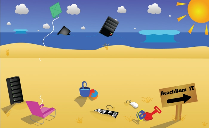
BeachBum - This is a web header design I created for an IT firm. I used simplified shapes and gradients all around to give a "Webby" feel to the overall work. A few filters and effects were added throughout.

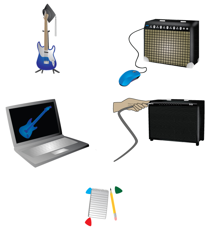
Guitar Academy - This is a collection of 5 web icons I created for an online guitar academy. I used a range of filters and effects, primarily drop shadows and gradients.
My Graphic Design Business Card
gLike