
Maruko Hotel Catering/Corporate Folder - Folder is designed using blind and foil deboss techniques. A flap strap lock was die-cut into the folder layout.
Interior sheets included a fold-down that listed the hotel contact information. When opened, the list of hotel banquet and catering information. The amenity sheets were staggered and die-cut to allow ease of identification for each category.
View PDF
View PDF
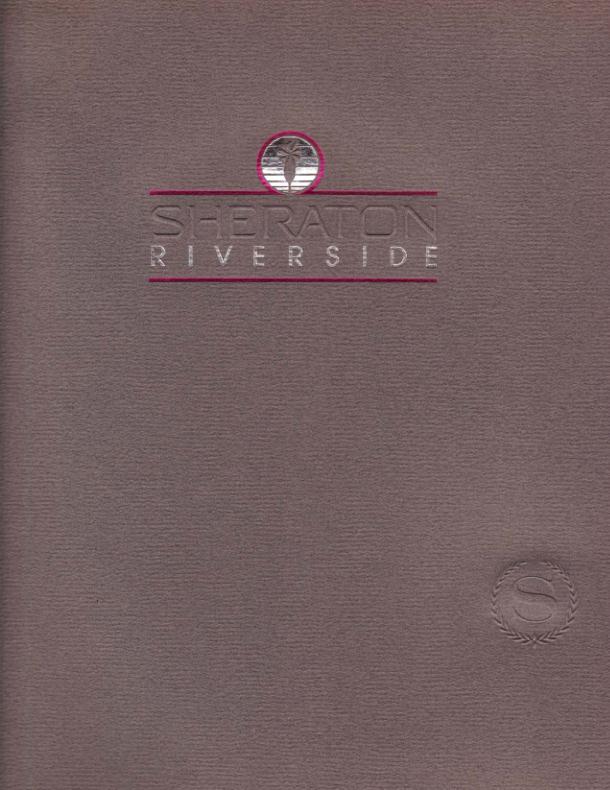
Sheraton Hotel - Designed using the corporate colors in stock, foil, embossing and debossing techniques.
Interior pages were printed using the Sheraton logo as a running theme along the left side and stagger cut to allow identification of the categories listed on each sheet.
View PDF
View PDF
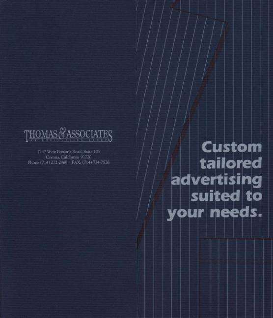
Thomas & Assoc. Advertising Brochure - The folder was designed to use heavy color stock and a combination of single hit and double hit printing of white ink, in addition to a black screen overprint to give the illusion of cloth material. The pinstripe uses a single hit of white, while the type is a second run through the press that included the black screen on a second print head.
The interior used a single hit of white ink to simulate a "tailor's chalk" markings and would include a business card and note about contact information.
View PDF
View PDF
gLike
Corporate Sales Tools