
Dark Chocolate. I transformed Lake Champlain Chocolate’s Adirondack based company design to be more contemporary while keeping their imagery which refers to the area where they are locoated. The chocolate comes off as luxurious and natural, but is also more trendy and intruiging. Fall 2011.
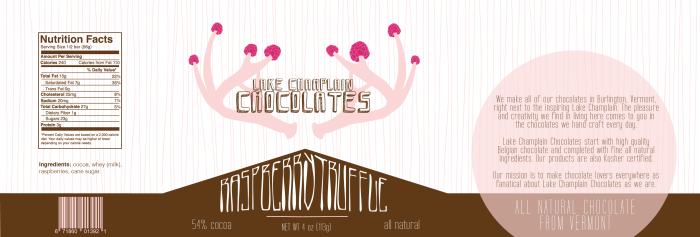
Raspberry Truffle. Fall 2011.
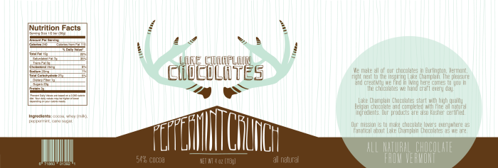
Peppermint Crunch. Fall 2011.
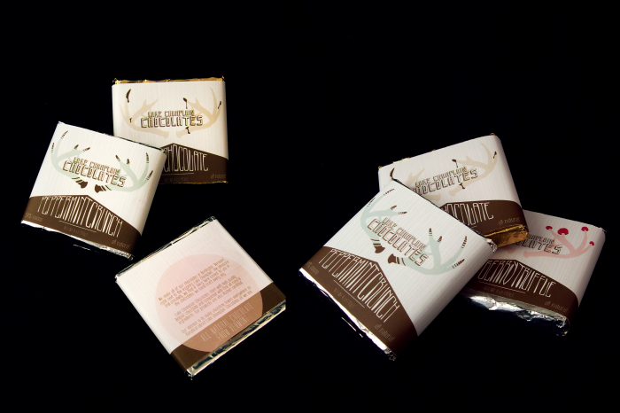
3D View. Fall 2011.
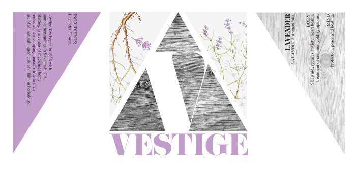
Lavender. This is a fictional company which started natural and local. In keeping with this aspect of their goal, I aimed to design to bring out the importance of the
herbology behind the teas and draw in a larger group of consumers who would
enjoy a natural, down to earth tea. Fall 2011.
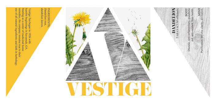
Dandelion. Fall 2011.
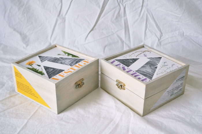
3D View. Fall 2011.
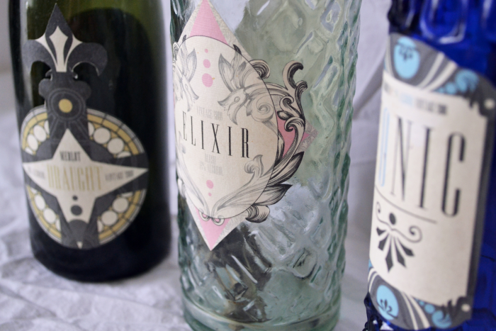
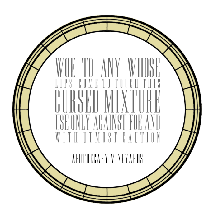
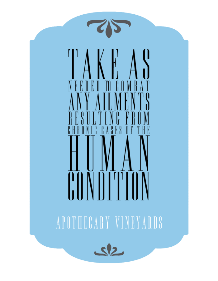
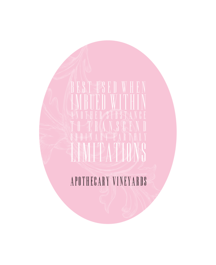
Apothecary Wines: Labels. This package design project demonstrates my process well. I chose a antique and decadent design approach. I also themed them to my vineyard, Apothecary Vineyards; Tonic, Elixir and Draught. I approached it as amusing, whimsical and dark. Fall 2011.
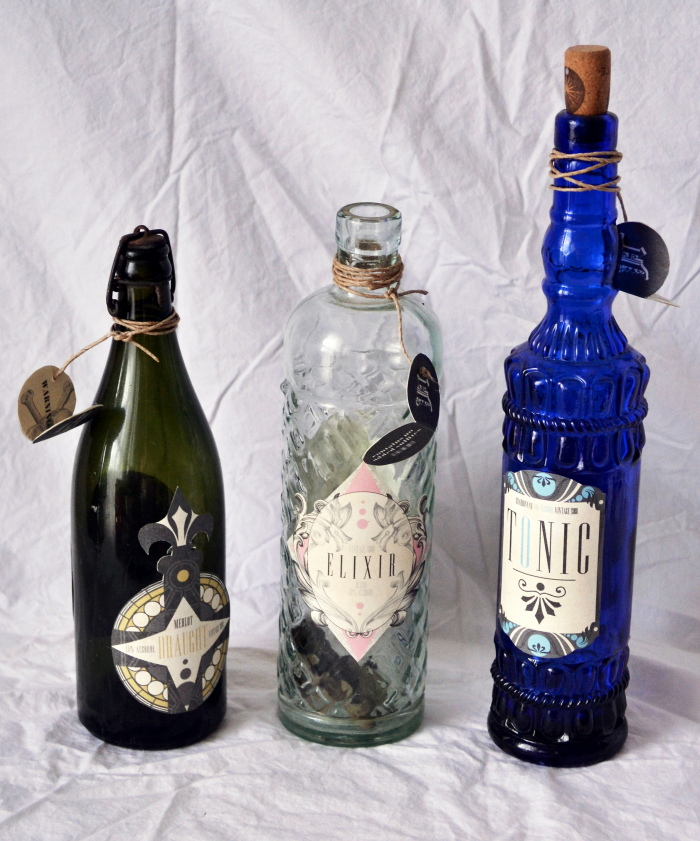
Apothecary Wines: Bottles. Fall 2011.
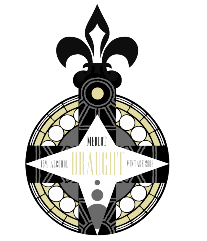
Apothecary Wines: Draught Front. Fall 2011.
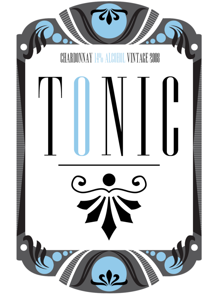
Apothecary Wines: Tonic Front. Fall 2011.
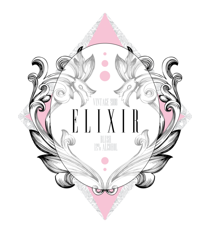
Apothecary Wines: Elixir Front . Fall 2011.
Apothecary Wines: Draught Back . Fall 2011.
Apothecary Wines: Tonic Back. Fall 2011.
Apothecary Wines: Elixir Back. Fall 2011.
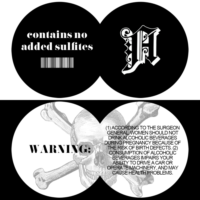
Apothecary Wines: Label Tag. Fall 2011.
gLike
Design: Package
Mock projects done for school.