
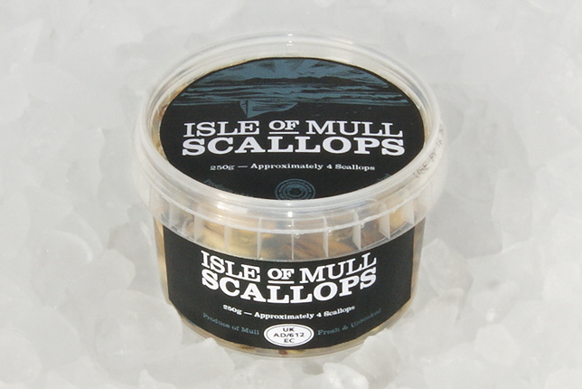
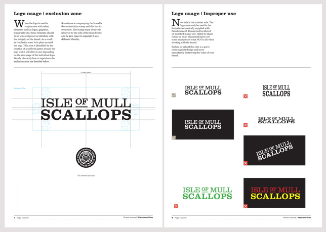

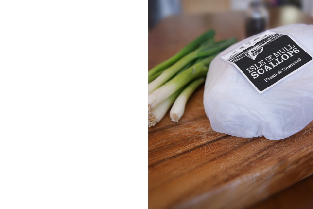
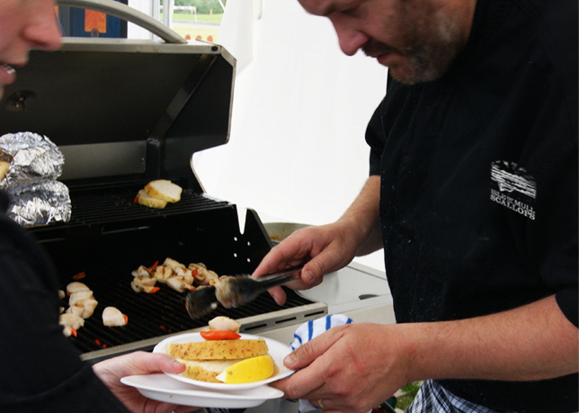
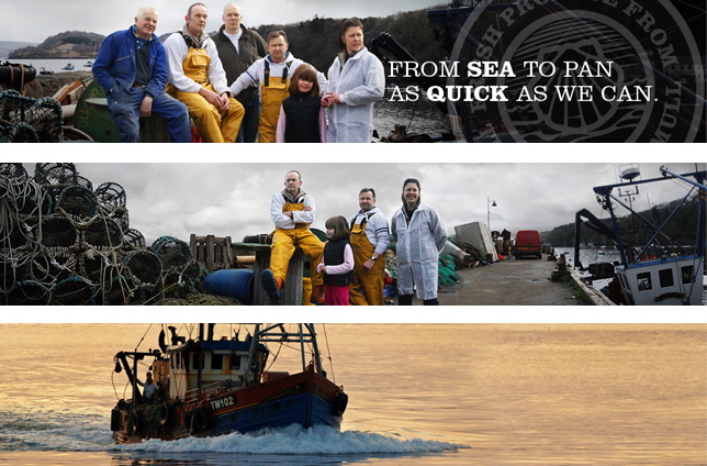
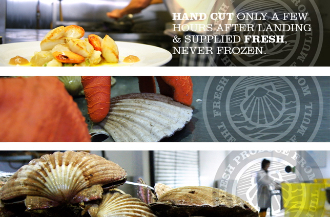
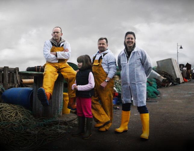
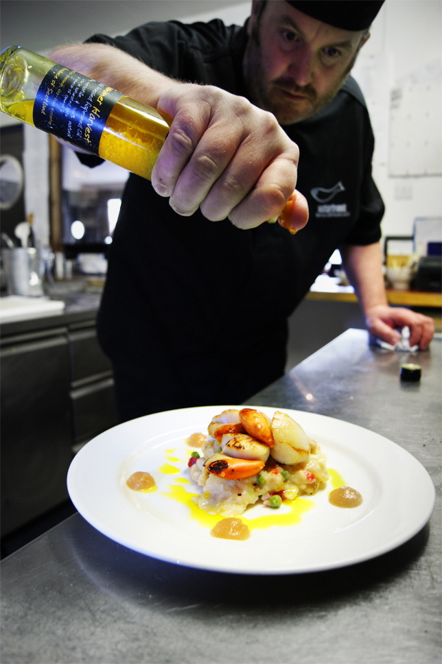
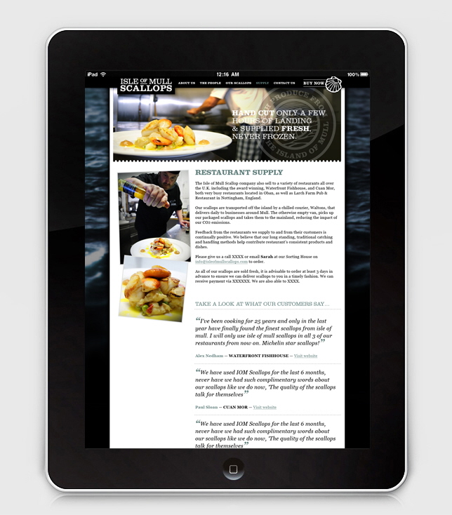
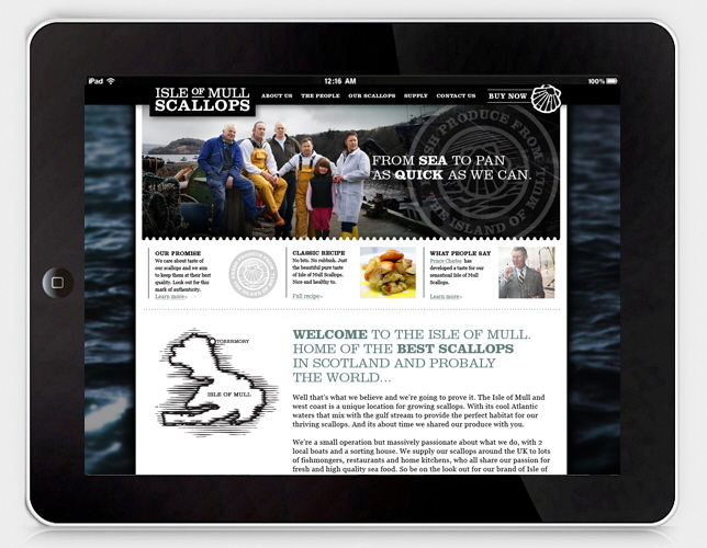
Isle of Mull Scallops wanted to build on their reputation for quality seafood by building a brand that would rase their profile to restaurants, suppliers and the public. They needed labeling, packaging and a set of branding tools that would fit their brief of being authentic, honest and of course delicious.
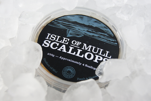
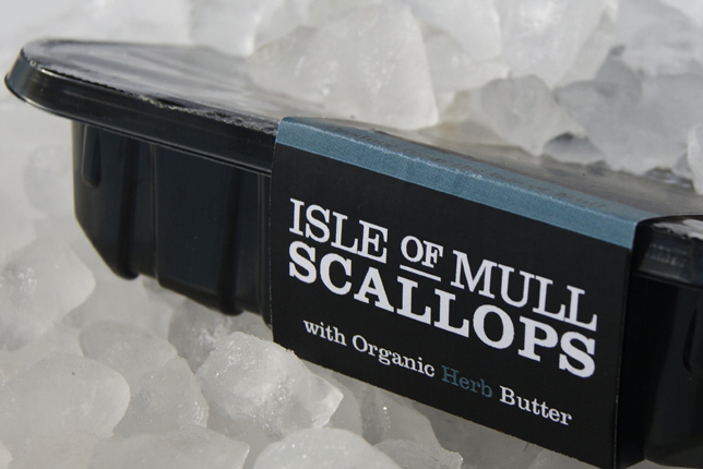
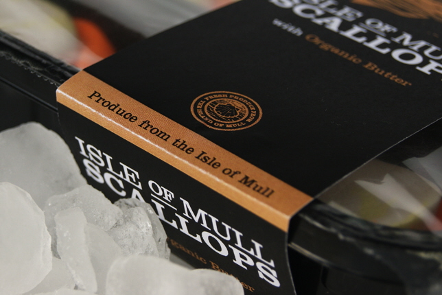
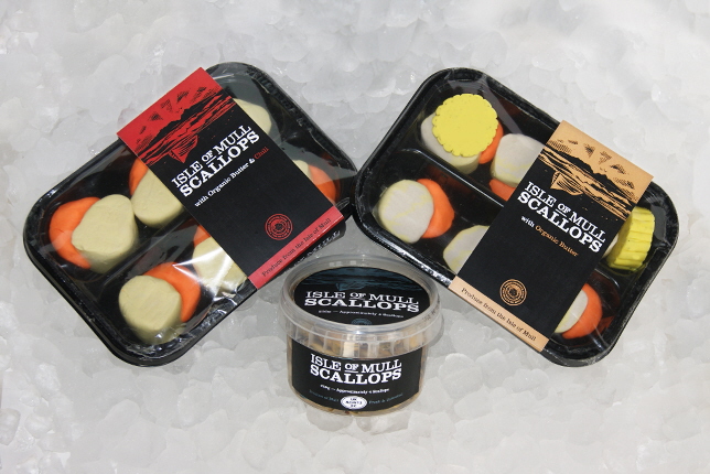
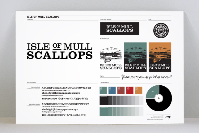
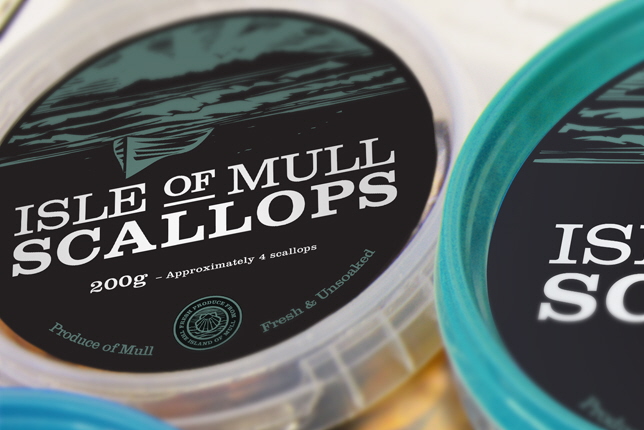
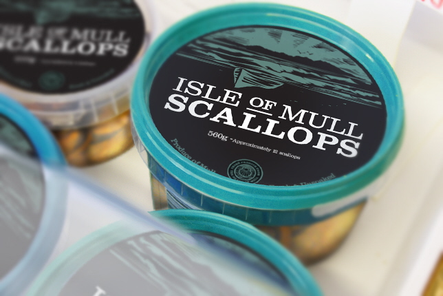
The overall feeling of this brand represents a rustic outdoor vibe that carries a Scottish quality. The logotype design makes a bold statement on the packaging with the typography conveying a direct message of what the company produce in a very clear manner. A set of complementary colours where produced for each product - Chili & Butter, Organic Butter and Herd Butter.
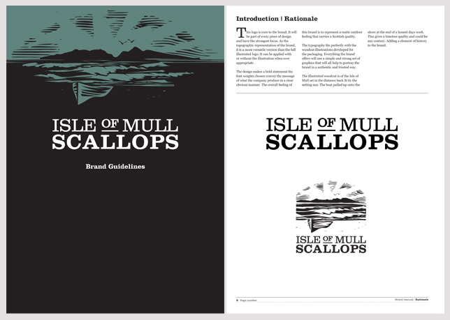
The composition of the woodcut illustration is of the Isle of Mull in the distance back lit by the setting sun. The boat pulled up onto the shore at the end of a honest days work, gives a timeless quality and could be any century. Adding a sense of history to the brand.