
boom. CRASH by Vox Cameli - 6-Panel Digipak cover design and on-CD print design for popular a capella group, finished in Feb 2008. Inside views in following images. CD can be purchased at www.voxcameli.com

boom. CRASH by Vox Cameli (inside I) - Interior view of 6-Panel Digipak cover design for popular a capella group Vox Cameli, finished in Feb 2008. CD can be purchased at www.voxcameli.com

boom. CRASH by Vox Cameli (inside II) - Full inside view of 6-Panel Digipak cover design and on-CD print design for popular a capella group, finished in Feb 2008. CD can be purchased at www.voxcameli.com

Uncle Vanya by Anton Chekhov - The client wished to steer away from the representational, citing earlier posters that depicted Vanya or trees (popular in Chekhov's writing). For her, this play was about hope amidst decay, oppositional forces, and the script's gradual physical and emotional movement from the outside inwards. Distressed Faberge egg motifs, English alphabet that reveal Cyrillic reflections, and subtle homage to Chekhov's trees, make this poster more connotative than literal.

Uncle Vanya by Anton Chekhov (detail) - This is a detail from the poster image, showing my decaying Russian wallpaper motif inspired by Faberge eggs.
This was part of a set of publications that included a poster, program, promotional postcard mailers, and a local advertisement.

Redesign for DC&P report, Final - August 2007

Redesign for DC&P report, option I - August 2007 - My client, a compensation consulting firm based near Boston, needed a fresh new layout for their quarterly corporate studies. The design had to reflect their recent branding overhaul, with a new four-square logo and palette of blues, gray, and purple. The company's keywords were "professional","clean" and "corporate" among others, and had to be able to hold their own among the competition's studies and reports. These images represent several of the options I designed as part of Phase One.

Redesign for DC&P Reports Option II - August 2007 - My client, a compensation consulting firm based near Boston, needed a fresh new layout for their quarterly corporate studies. The design had to reflect their recent branding overhaul, with a new four-square logo and palette of blues, gray, and purple. The company's keywords were "professional","clean" and "corporate" among others, and had to be able to hold their own among the competition's studies and reports. These images represent several of the options I designed as part of Phase One.
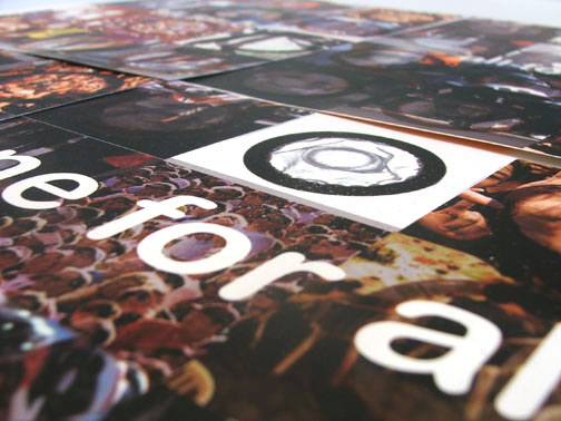
One For All(detail) - This was an awareness campaign promoting the global use of condoms as a preventive against AIDS. It was executed as a series of condom-sized collectible pamphlets that described different kinds of condoms in a fun and accessible way, with statistics, facts, and anecdotes about condom use and global viewpoints regarding sex and contraceptives. The back of each pamphlet created part of a large poster emblazoned with the slogan "all for one...one for all".
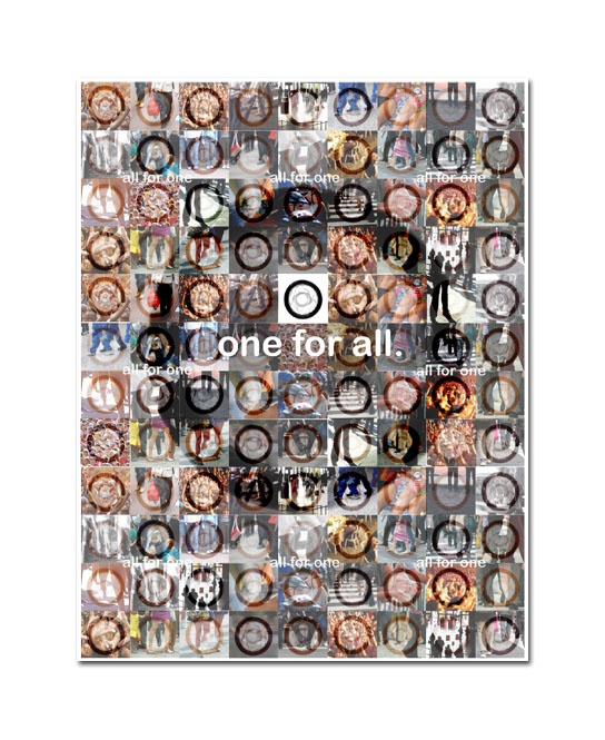
One For All - This was an awareness campaign promoting the global use of condoms as a preventive against AIDS. It was executed as a series of condom-sized collectible pamphlets that described different kinds of condoms in a fun and accessible way, with statistics, facts, and anecdotes about condom use and global viewpoints regarding sex and contraceptives. The back of each pamphlet created part of a large poster emblazoned with the slogan "all for one...one for all".
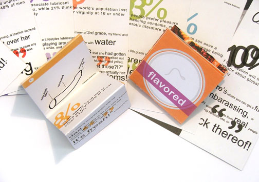
One For All (detail) - This was an awareness campaign promoting the global use of condoms as a preventive against AIDS. It was executed as a series of condom-sized collectible pamphlets that described different kinds of condoms in a fun and accessible way, with statistics, facts, and anecdotes about condom use and global viewpoints regarding sex and contraceptives.

Poster for Company by Stephen Sondheim - Better image coming soon!

A Servant to Two Masters by Carlo Goldoni - This comedy, set in Venice, outlines the adventures of a cunning servant who illegally takes on two jobs, and the hilarious confusion that ensues when he tries to serve two nobles simultaneously without being found out. My poster, designed for an enactment of the play in November 2006, reflects this duality, along with all of the pastel decadence, foppishness, and floridity of Renaissance-era Venetian nobility.
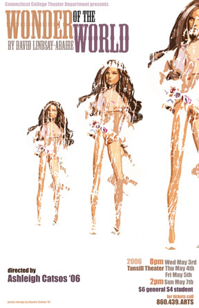
Wonder of the World by David Lindsay-Abaire - A poster for 'Wonder of the World', a dark comedy about a woman who leaves her mundane life and husband to find herself by taking a cruise. I created the disturbingly pastel yet gritty imagery as a cheeky reference to one of the characters' - let's leave it at 'inappropriate usage' - of Barbie heads.
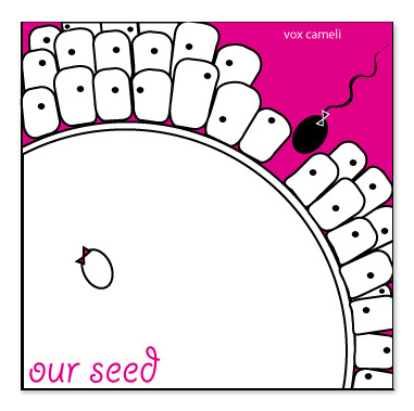
Our Seed - I created this whimsical and tongue-in-cheek CD cover for Vox Cameli, an a capella group that is self-professedly "so co-ed it hurts". Containing a variety of musical styles from 20's crooners to early 90's hits blended together to perfection, this CD is miles away from ordinary, and the cover had to reflect it. The title and images were based on an inside joke, but they also represent the risque quirkiness of the singers' personalities.
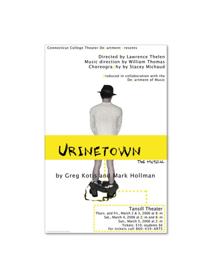
Poster for Urinetown, a musical comedy - Previous attempts at publicizing Urinetown have resorted to simply capitalizing upon the shock value of the play's title. While the director wished me to retain that, he also wanted the slapstick humor and cheap jokes that the script employs. In accordance with this, I used a rich golden yellow, tinted all of the 'p's, and used subtle yet risque puns of line and placement (ie. the title 'T'), for a minimal, humorous poster that stood out among a host of college flyers.
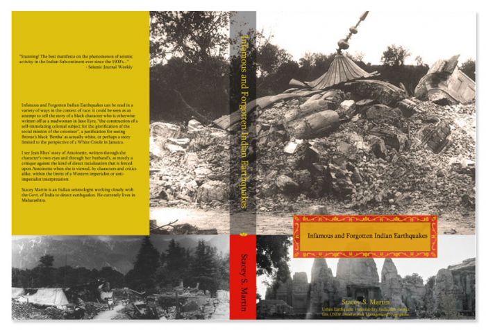
'Infamous and Forgotten Indian Earthquakes' by Stacey S. Martin - I designed this bookcover for an up-and-coming seismologist whose work has earned him high national standing. He wanted the cover of his manifesto to reflect both the deep history of India and its seismic activity without resorting to colonial or exotic stereotypes. I designed the cover to reveal the flavor and interest value of his subject, distinguishing his work from stuffy, textbook-style tomes on the shelf.
gLike
Print/Publications