

Corporate Branding: Eodum
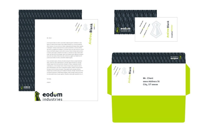
This is a corporate branding project for a company that markets to musicians and roadies. The concept is a tie representing a business sense but in a dynamic and wild color scheme that speaks to an adventurous nature. Using Corbel as a starting point, the typeface was manipulated to invoke a musical sense, the u mimicking a sound board.
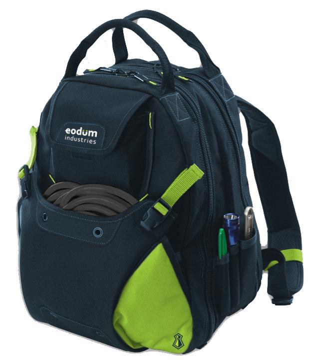
The bag, a giveaway for events and promotions, is filled with sound chords, eodum themed playing cards and a day planner specifically designed for musicians and road tours.