
Final logo with color ways.
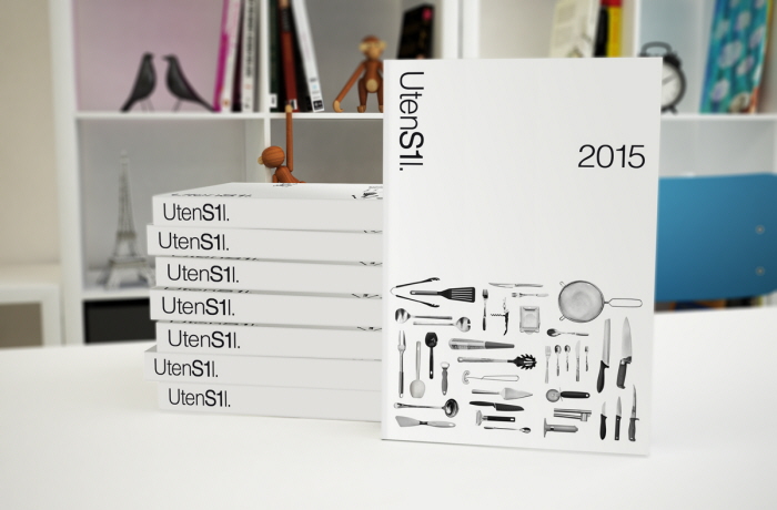
The 2015 catalog.
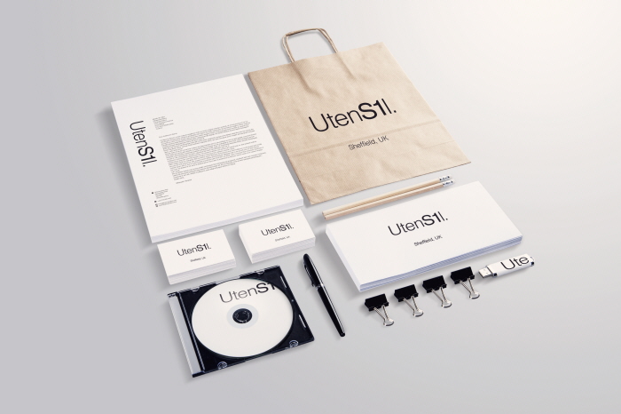
Stationery examples.
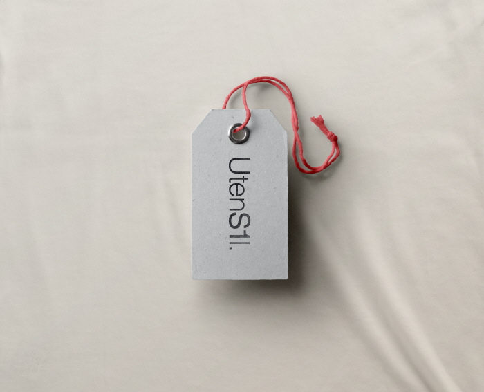
Pricing label.
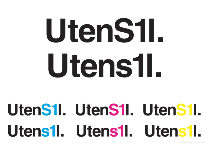
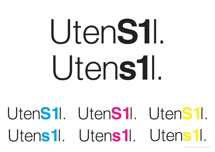
The client specified an exact font requirement so a simple typographic solution was used. This is an alternative design in different font weights.
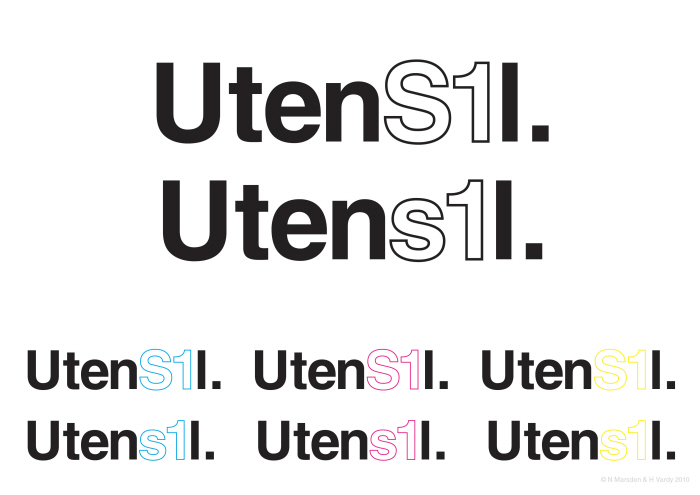
The client specified an exact font requirement so a simple typographic solution was used. This is an alternative design in different font weights.
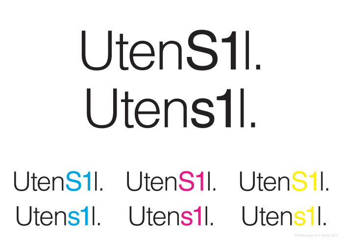
The client specified an exact font requirement so a simple typographic solution was used. This is an alternative design in different font weights.
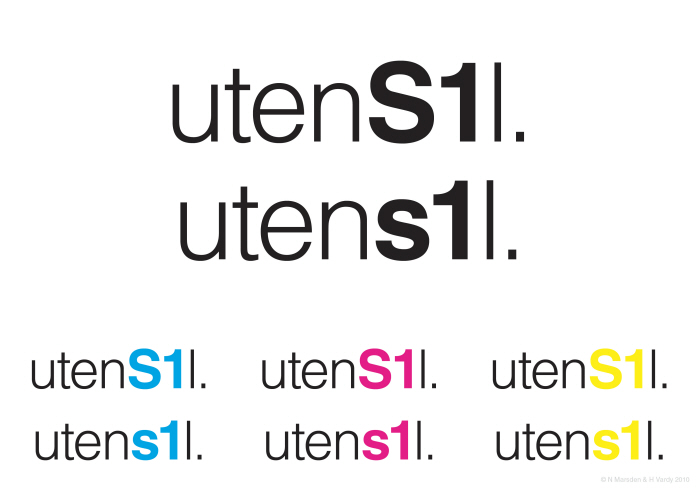
The client specified an exact font requirement so a simple typographic solution was used. This is an alternative design in different font weights.
The client specified an exact font requirement so a simple typographic solution was used. This is an alternative design in different font weights.
gLike
UtenS1l Branding
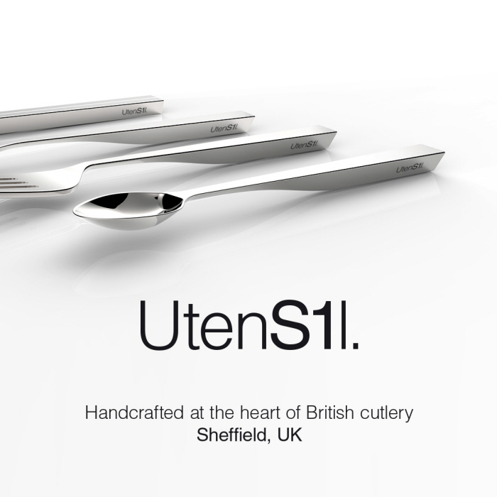
Based in the centre of Sheffield, UK. Utensil is a company specializing in handmade cutlery and utensils.
Sheffield is known for its rich history in metalwork and the client wanted to depict a sense of this history within their logo. The S1 within the logo indicates the downtown Sheffield postcode and as such, subtly suggests a company at the heart of this world famous industry.
Available
Full-time
Nicholas Marsden
Creative Direction | Project Management | Production Management
Seattle, WA